
Scroll-Linked Content Reveal Animation
Learn how to create a scroll-linked animation with Framer Motion.
In this article, you'll learn how to create a scroll-linked animation with Framer Motion.
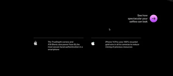
Using the iPhone 14 Pro landing page as inspiration, we'll be building an animation similar to the “chip reveal” effect seen below.
Getting Started
Begin by installing the latest version of framer-motion in your React project. The version used while writing this article was v7. Make sure you’re also using at least React 17.
Spinning up a Codesandbox instance can be a quick way for you to get started.
Now let’s see how the animation will work.
For this type of animation, the first thing we need is the users scroll position.
The code we write is contained in a React component, so the scroll position should be in the context of that component, and not the entire page. This allows us to have multiple types of different animations on one page if we wanted to, each contained in their own section.
After we have the scroll position, we can move some elements across the screen, each at a slightly different speed and starting point.
Fortunately, there’s a hook included with Framer Motion, useScroll, that provides the values we need to get started.
Component Markup
Let’s start writing some code. First, create a new file named ScrollAnimation.js and inside the file, add a React component with the same name.
import { useRef } from 'react';
import { motion, useScroll } from 'framer-motion';

export const ScrollAnimation = () => {
  const containerRef = useRef(null);

  return (
    <section className="scroll-container" ref={containerRef}>

    </section>
  )
}
In the component, import motion and useScroll from framer-motion, then useRef from react.
Next, a container element is needed. This element is what triggers the animation when scrolled through, and it’s also where the scroll values come from. We need a reference to it named containerRef.
Then we have some copy and an image. The copy should be short enough to fit underneath the image, but can otherwise be anything.
The copy will be inside a div with a className of copy, and the image within a div of img-container. More on the actual image element in a second.
const ScrollAnimation = () => {
	...

  return (
    <section className="scroll-container" ref={containerRef}>
      <div className="copy">
        <h2>Lorem ipsum dolor sit amet</h2>
      </div>
      <div className="img-container">

      </div>
    </section>
  )
}
Finally we need to add some motion components for the elements that are animating.
We won’t cover much about the
motioncomponent here, but check out the docs, and these past articles to learn more - Getting Started with Framer Motion, Animated Tabs with Framer Motion
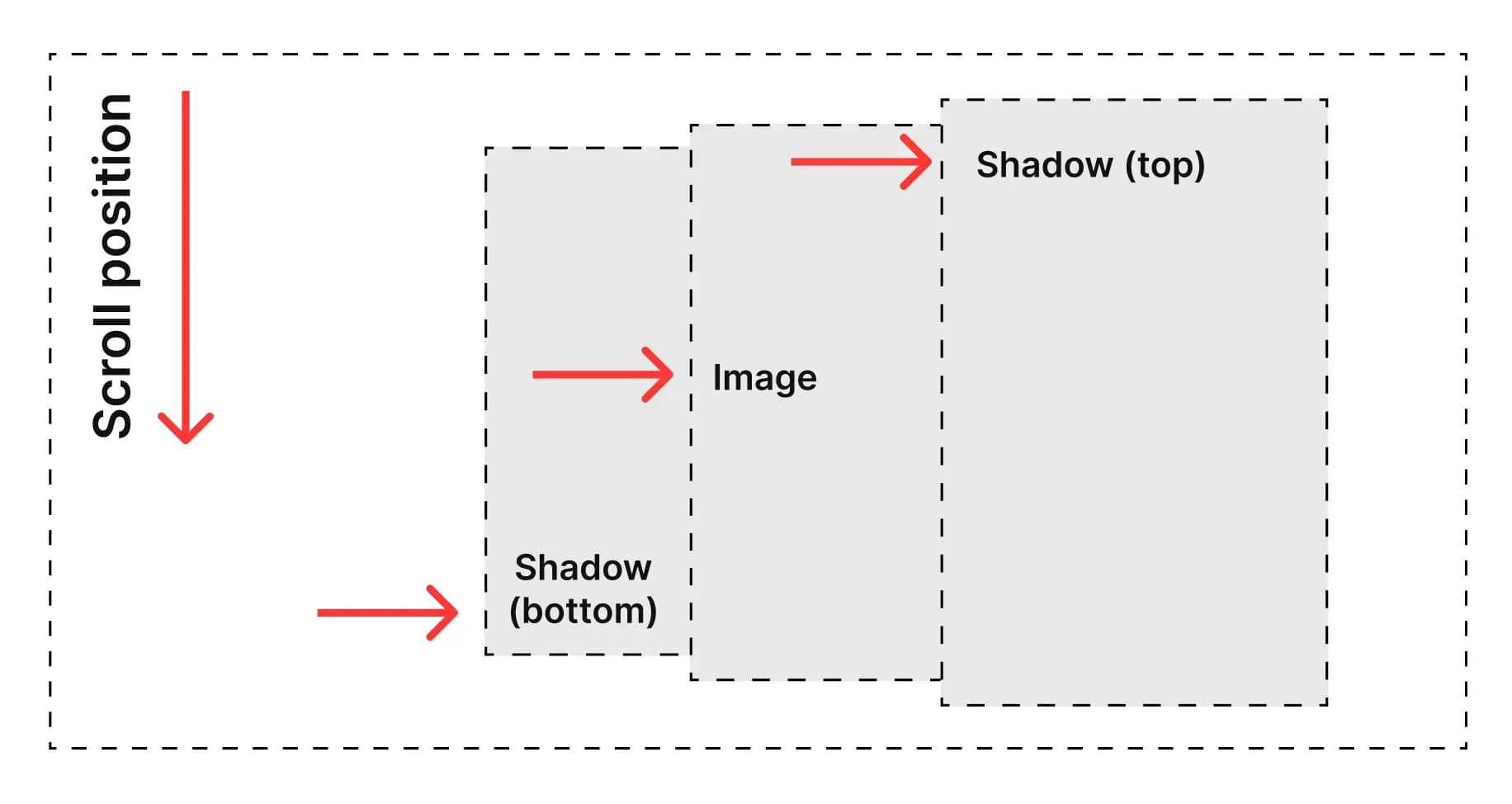
<div className="img-container">
  <motion.div className="img-inner">
    <motion.div className="bottom-shadow" />
    <img src={plant1} alt="a green plant" />
    <motion.div className="top-shadow" />
  </motion.div>
</div>
An img-inner div will be moved horizontally to the right based on the scroll position. Within this are two additional divs that are the shadows above and below the image: top-shadow and bottom-shadow. All three of these elements should be referenced as motion.div because they will receive translateX values to move them across the page as you scroll.
The image element itself doesn’t need to be set as a motion component because it moves along with the img-inner component. However, the bottom and top shadows should be motion components because they’ll have different translateX values in order to achieve the parallax-type of animation. This will be more obvious in the next section.
Basic Styling
Before we get any further, let’s add the layout styling. Create a new file named styles.css.
First, some styling for the basic HTML elements.
body {
  background: #000;
  color: #fff;
}

img {
  max-width: 700px;
  width: 100%;
  height: auto;
	position: relative;
  z-index: 1;
}

section {
  min-height: 100vh;
}
Next, we’ll add a basic flexbox layout to have the image beside the heading copy.
.scroll-container {
  display: flex;
  justify-content: space-between;
  max-width: 1200px;
  margin: 100vh auto;
  /* This is needed to prevent the image from "jittering" during
  the transition */
  overflow: hidden;
}

.img-container {
  width: 50%;
  display: flex;
  align-items: center;
  position: relative;
}

.copy {
  display: flex;
  align-items: center;
  flex-direction: column;
  justify-content: center;
  width: 40%;
  font-size: 24px;
  margin-left: 5%;
  text-align: left;
}

.copy h2 {
  font-size: 70px;
  margin-top: 0;
}
The
100vhmargin on thescroll-containeris to make sure there’s enough scrollable area above and below the component to see the animation.
Last, we have some styling for the top and bottom shadows. We’re intentionally setting the background color of the bottom shadow to blue and the top shadow to red to better visualize the next few sections.
.bottom-shadow {
  background: red;
  height: 100%;
  width: 100%;
  position: absolute;
  left: 0;
  z-index: 0;
}

.top-shadow {
  background: blue;
  height: 100%;
  width: 140%;
  position: absolute;
  left: 0%;
  top: 0;
  z-index: 2;
}
Don’t forget to import the CSS file we just added into the ScrollAnimation component.
import './styles.css';

const ScrollAnimation = () => { ... }
The useScroll Hook
Now that we have some styles in place, let’s discuss the Framer Motion useScroll hook and how to use it.
From the Framer Motion docs:
useScrollis used to create scroll-linked animations, like progress indicators and parallax effects.
We use this hook to get the scrollYProgress value that it returns.
First, we pass the containerRef we added earlier as the target.
const ScrollAnimation = () => {
  const containerRef = useRef(null);

  const { scrollYProgress } = useScroll({
    target: containerRef,
  });

	return ( ... );
}
Next, we need an offset value.
offsetis an array of at least two intersections. From the Framer Motion docs, an intersection describes a point when thetargetandcontainermeet. So for example,"start end"means when the start of the target meets the end of the container.
The offset value is the same as the demo code in the docs: ["start end", "end end"]. This occurs when the start of the target meets the end of the container.
const { scrollYProgress } = useScroll({
  target: containerRef,
  offset: ["start end", "end end"]
});
There are several different types of values you can pass in the scroll offset array. Strings (like above), numbers (like 0 or 1), or pixel values. Check out the docs for more info.
Now that we have the scrollYProgress value, let’s apply it as a style property to the bottom-shadow element.
<div className="img-container">
	<motion.div className="img-inner">
	  <motion.div
	    className="bottom-shadow"
	    style={{ translateX: scrollYProgress }}
	  />
	  <img src={plant1} alt="a green plant" />
	  <motion.div className="top-shadow" />
	</motion.div>
</div>
If you scroll the page with your browser devtools open, you should see the transform: translateX() value updating between 0px and 1px depending on which direction you’re scrolling. Nothing is actually moving on the page yet though because this is such a small value.
When passing property values to
motioncomponents, you should pass it shorthand liketranslateXinstead oftransform: translateX(). Framer Motion takes care of the rest for you.
Transforming Scroll Values
So we have a scrollYProgress value between 0px and 1px, but what do we do with that?
Framer Motion includes a hook specifically to transform one set of values into another: useTransform.
useTransformis the primary way to compose chains of motion values. That is, to take the output of one motion value, change it some way, and then output that as a new motion value. - useTransform docs
useTransform is perfect for this scenario because now we can take scrollYProgress and turn it into a percentage. Then we can apply this percentage to the motion component elements.
To use the useTransform hook, pass the scrollYProgress as the first argument. Since we know the range from scrollYProgress is between 0 and 1, the next argument is an array with that range.
import { motion, useScroll, useTransform } from 'framer-motion';

const ScrollAnimation = () => {
  ...
	const bottomShadowValue = useTransform(scrollYProgress, [0, 1], ['-100%', '0%']);

	return ( ... )
}
The last argument we pass is the range that’s output from the hook. In this case, we want a percentage starting at -100% and ending at 0%.
Now apply the transformed bottomShadowValue value to the bottom shadow element.
<div className="img-container">
	<motion.div className="img-inner">
	  <motion.div
	    className="bottom-shadow"
	    style={{ translateX: bottomShadowValue }}
	  />
	  <img src={plant1} alt="a green plant" />
	  <motion.div className="top-shadow" />
	</motion.div>
</div>
As you scroll, the red bottom shadow should be moving from left to right.
Now that we have this working, transforming the values for the image and the top shadow are very similar.
For the image animation, we want to work in a range of -100% and 0%. The imageValue constant should then be applied to the img-inner motion component.
const ScrollAnimation = () => {
  ...
	const imageValue = useTransform(scrollYProgress, [0, 1], ['-100%', '0%']);

	return (
		<div className="img-container">
			<motion.div className="img-inner" style={{ translateX: imageValue }}>
			  ...
			</motion.div>
		</div>
	);
}
Finally, for the top shadow, the range is -25% and 100%. The movement of the top shadow doesn’t extend as far to the left as the other elements, but it should cover the image completely, and move past the right edge of the screen. This is also why we set the width of the top-shadow element to 140% in our CSS earlier.
const ScrollAnimation = () => {
  ...
	const topShadowValue = useTransform(scrollYProgress, [0, 1], ['-25%', '100%']);

	return (
		<div className="img-container">
			<motion.div className="img-inner" style={{ translateX: imageValue }}>
			  ...
			  <motion.div className="top-shadow" style={{ translateX: topShadowValue }} />
			</motion.div>
		</div>
	);
}
Now all three of the motion components should animate as we scroll up or down through the section.
Finishing Touches
We’re almost done! Now that the scroll animation is working, let’s replace the background colors and use gradients for each shadow.
.bottom-shadow {
  background: linear-gradient(90deg, rgba(0,0,0,0) 0%, rgba(0,0,0,1) 40%);
  ...
}

.top-shadow {
  background: linear-gradient(90deg, rgba(0,0,0,0) 0%, rgba(0,0,0,1) 25%);
  ...
}
Considering Accessibility
Scroll animations like these can definitely add a spark of joy for your users and make “flat” content feel a bit more interesting. But we should have alternatives in place for users that would prefer not to see animations.
Apple handles this in their animation effect by suppressing it completely when the Reduced Motion setting is enabled (Windows has a similar setting), and we can do the same thing easily.
To do so, there’s one last hook that Framer Motion provides that we can use - useReducedMotion.
To learn more about the topic of accessibility and animations, be sure to check out Reducing Motion in Animations.
useReducedMotion returns true or false, depending if the user has Reduced Motion settings enabled.
First, import the hook and set the boolean it returns to a constant named shouldUseReducedMotion.
import { motion, useScroll, useTransform, useReducedMotion } from 'framer-motion';

const ScrollAnimation = () => {
  ...
  const shouldUseReducedMotion = useReducedMotion();

	return (...);
}
On the img-inner motion component, we’ll only use imageValue if shouldUseReducedMotion is false, otherwise translateX is set to 0. This prevents any animation.
<motion.div
	className="img-inner"
	style={{ translateX: shouldUseReducedMotion ? 0 : imageValue }}
>
  ...
</motion.div>
Finally, we only need the shadow motion components if we show the animation. If not, then we can make a few code changes to prevent them from rendering.
<motion.div
	className="img-inner"
	style={{ translateX: shouldUseReducedMotion ? 0 : imageValue }}
>
  {!shouldUseReducedMotion && (
    <motion.div className="bottom-shadow" style={{ translateX: bottomShadowValue }} />
  )}
  <img src={plant1} />
  {!shouldUseReducedMotion && (
    <motion.div className="top-shadow" style={{ translateX: topShadowValue }} />
  )}
</motion.div>
Now the animation will only run if the user doesn’t have Reduce Motion enabled, and we don't bother rendering elements that aren't necessary.
Conclusion
You just learned how to build a scroll-linked animation similar to the effect seen on the iPhone 14 Pro landing page.
Framer Motion is the tool of choice in this series, though this same effect could have been achieved in many other ways.
The useScroll, useTransform and useReducedMotion React hooks provided by Framer Motion were especially handy so that we didn’t have to do any manual calculations and could keep our component as accessible as possible.