
Using Framer Motion For Complex Animations
Learn how to build staggered animation effects and more.
When building UIs as a frontend developer, you not only want them to look good, but also have that extra spark or "wow" factor. This usually means sprinkling some animations into the designs, which normally isn't too difficult to do with CSS alone.
Even though CSS gets more powerful every year, if you want to implement complex animations, you may need to reach for Javascript. Fortunately, an excellent library exists to create JS-based animations called Framer Motion.
In this article, we'll build a UI with React and Framer Motion that uses several of its features: animation variants, staggering, and much more!
If you need a refresher or are just learning about Framer Motion for the first time, I highly recommend you check out these other articles first: Getting Started with Framer Motion and Animated Tabs with Framer Motion.
This article will cover Framer Motion v4. Please check the docs to ensure feature parity with any future versions.
We won't be covering everything to make this UI completely production-ready. For example, we won't add styles to make this responsive on smaller devices, as the focus of this article is what you can achieve with Framer Motion.
What We're Building
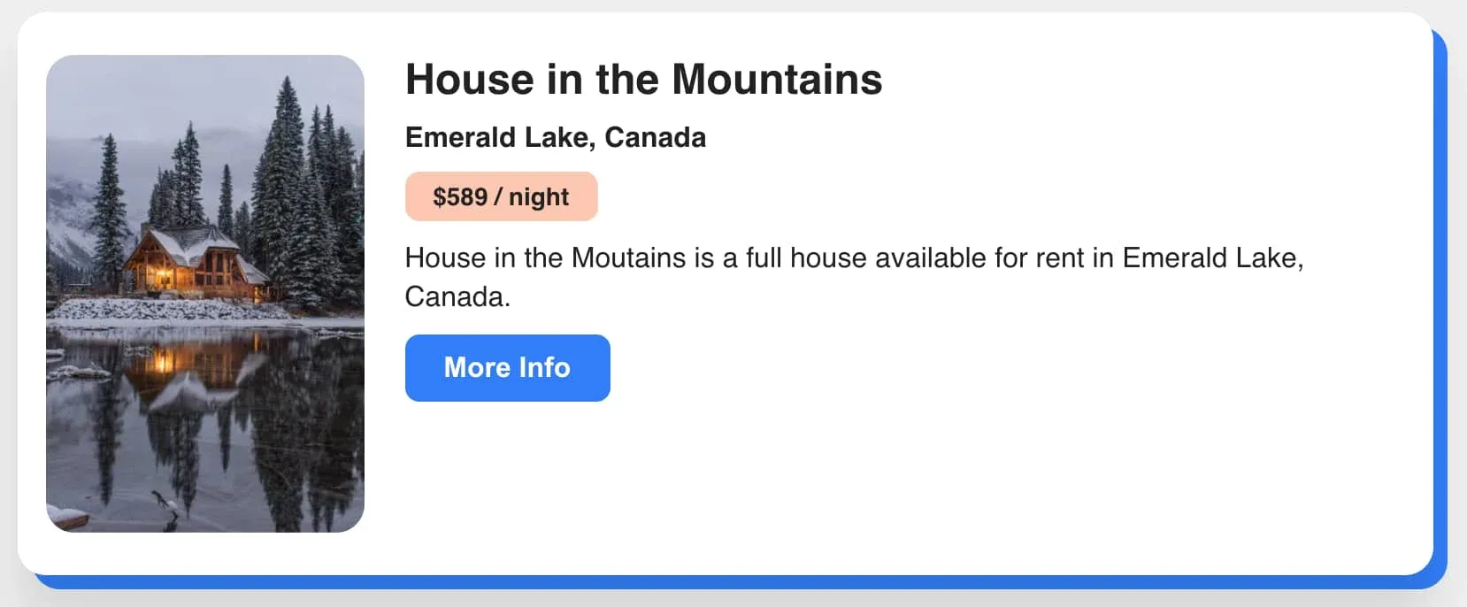
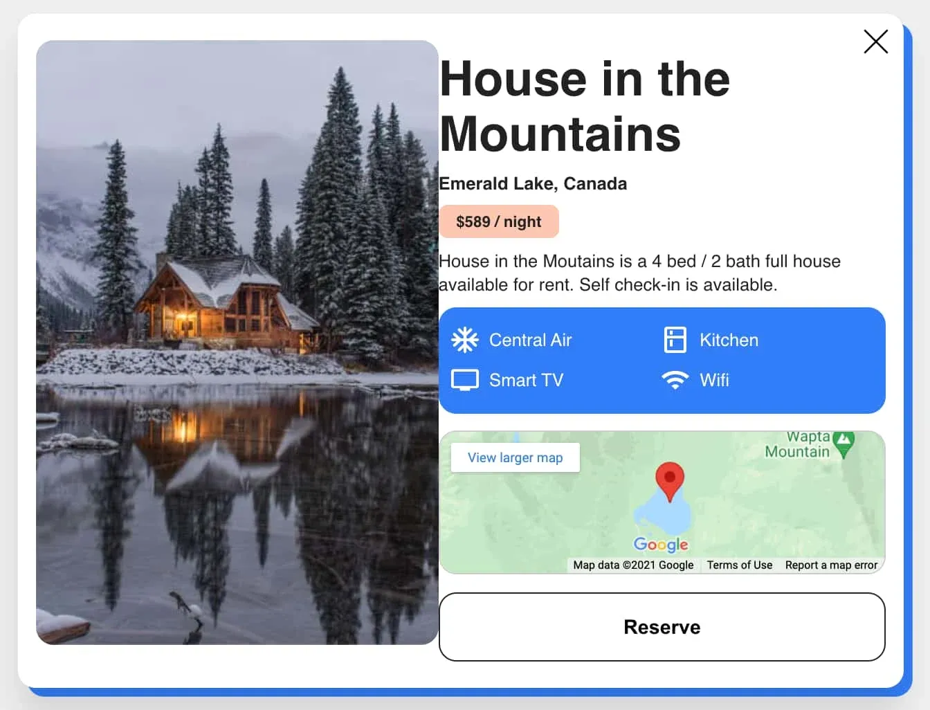
The UI we create will display a rental property card with some basic info. This card can be expanded to show additional details. When the card expands or collapses, we want to animate the card content as it's entering or leaving the document.
We will accomplish this by first adding the components, content, markup and styles, then defining the animations.
Rental Card Content
Let's first define some example content to show in the rental card.
Add a new file named data.js and within it create an object that will hold all of the content for our UI.
We're setting it up this way so that we don't need to repeat any content inside of the components we'll build.
import houseImage from './assets/house.jpg';
import { ReactComponent as AirConditioning } from './assets/ac.svg';
import { ReactComponent as Fridge } from './assets/fridge.svg';
import { ReactComponent as TV } from './assets/tv.svg';
import { ReactComponent as Wifi } from './assets/wifi.svg';

export default {
  imgSrc: houseImage,
  imgAlt: 'house exterior',
  title: 'House in the Mountains',
  location: 'Emerald Lake, Canada',
  mapUrl: 'https://www.google.com/maps/embed?pb=!1m18!1m12!1m3!1d9947.133297451766!2d-116.54188886062025!3d51.443772998228525!2m3!1f0!2f0!3f0!3m2!1i1024!2i768!4f13.1!3m3!1m2!1s0x5379df397c545cdb%3A0xfdc48e8bb4d734b9!2sEmerald%20Lake!5e0!3m2!1sen!2sus!4v1618319664103!5m2!1sen!2sus',
  price: '$589 / night',
  shortDescription: 'House in the Moutains is a full house available for rent in Emerald Lake, Canada.',
  longDescription: 'House in the Moutains is a 4 bed / 2 bath full house available for rent. Self check-in is available.',
  amenities: [
    {
      icon: AirConditioning,
      name: 'Central Air',
    },
    {
      icon: Fridge,
      name: 'Kitchen',
    },
    {
      icon: TV,
      name: 'Smart TV',
    },
    {
      icon: Wifi,
      name: 'Wifi',
    }
  ],
}
Rental Card Component
Next create another new file named RentalCard.jsx. This component serves as the main container for both the initial and expanded state of the card. A state value named isExpanded will be used to determine which child component should be displayed.
import React, { useState } from 'react';
import { motion, AnimatePresence } from 'framer-motion';
// Don't forget to import the content we created in the last section!
import cardData from './data';

const RentalCard = () => {
	const [isExpanded, setIsExpanded] = useState();

	return (
    <motion.div className={`card ${isExpanded ? 'expanded' : 'initial'}`}>
      <div className="content"></div>
    </motion.div>
	);
}

export default RentalCard;
Notice the usage of motion.div. Elements you want to animate via Framer Motion require the use of the motion component. These components exist for every HTML and SVG element and they open up the ability to pass props like animate, transition, etc. We'll look more closely at this later, but for now we want to make use of the motion component on anything we need to animate.
We'll also use the AnimatePresence component that Framer Motion provides to control the animation of components when they unmount. AnimatePresence allows the usage of an additional prop on child motion components to define exactly how to transition out of the DOM.
return (
	<motion.div className={`card ${isExpanded ? 'expanded' : 'initial'}`}>
    <div className="content">
      <AnimatePresence
        initial={false}
        exitBeforeEnter
      >
        {!isExpanded ? (
          // Initial
        ) : (
          // Expanded
        )}
      </AnimatePresence>
    </div>
  </motion.div>
);
AnimatePresence also accepts a few props itself. For the initial prop, we'll pass false to prevent any animations from occurring on page load. We also pass exitBeforeEnter to tell AnimatePresence to wait until each child component is done with its exit animation before rendering the other. This forces only one component to be rendered at a time, while also allowing animations to completely finish.
See the docs here for more info about AnimatePresence.
Let's add the two child components. Each of them will take the following props:
data- The content object we created in the previous section.onClick- Passes thesetIsExpandedstate updater function.key- A key prop is required on all immediate children ofAnimatePresence. Keys should be unique.
{!isExpanded ? (
  <CardContent
    data={cardData}
    onClick={setIsExpanded}
    key="content" // Children of AnimatePresence need a key
  />
) : (
  <ExpandedContent
    data={cardData}
    onClick={setIsExpanded}
    key="contentExpanded" // Children of AnimatePresence need a key
  />
)}
Now is also a good time to add the base CSS for our UI.
:root {
  --white: #fff;
  --black: #222;
  --blue: #317ff9;
  --pink: #ffc7b2;
  --border-radius: 16px;
}

body {
  font-family: Helvetica, Arial;
  -webkit-font-smoothing: antialiased;
  color: var(--black);
  background: #eee;
}

img {
  vertical-align: middle;
  border-radius: var(--border-radius);
}

button {
  border: none;
  cursor: pointer;
  font-weight: 700;
}

p {
  line-height: 1.4;
  margin: 0 0 10px;
}

h4,
h5 {
  margin: 0 0 5px;
}

h4 {
  font-weight: 300;
}

.flex {
  display: flex;
  justify-content: space-between;
  align-items: flex-start;
}
CardContent Component
Next let's add the CardContent component. This will display the initial content for the rental property. Create a new file named CardContent.jsx (also be sure to import it within RentalCard).
import React from 'react';
import { motion } from 'framer-motion';

const CardContent = ({
  data,
  onClick,
}) => (
  <motion.div className="flex">
    <motion.div className="thumbnail-container">
      <img
        src={data.imgSrc}
        alt={data.imgAlt}
        className="thumbnail"
      />
    </motion.div>
    <motion.div className="initial-content">
      <h2 className="title">{data.title}</h2>
      <h3 className="location">{data.location}</h3>
      <h5 className="price">{data.price}</h5>
      <p>{data.shortDescription}</p>
      <button className="info-btn" onClick={() => onClick(true)}>More Info</button>
    </motion.div>
  </motion.div>
);

export default CardContent;
Notice that certain elements are again defined as motion components. These are the ones we'll animate.
Now for some CSS for the card.
.card {
  margin: auto;
  max-height: 700px;
  min-height: 318px;
  max-width: 800px;
  position: relative;
  margin-bottom: 50px;
}

.card::before {
  content: '';
  overflow: hidden;
  background: var(--blue);
  border-radius: var(--border-radius);
  position: absolute;
  width: 100%;
  height: 100%;
  top: 0;
  z-index: 0;
  transform: translate(8px, 8px);
  transition: transform 0.4s ease;
}

.card:hover:not(.expanded)::before {
  transform: translate(14px, 14px);
}
The additional styles below are needed for the card content itself.
.content {
  background: var(--white);
  border-radius: var(--border-radius);
  box-shadow: 0 25px 25px rgba(0, 0, 0, 0.1);
  padding: 24px 16px;
  z-index: 2;
  position: relative;
  display: flex;
  height: 100%;
}

.info-btn {
  background: var(--blue);
  color: var(--white);
  padding: 10px 22px;
  font-size: 16px;
  border-radius: 8px;
}

.thumbnail-container {
  margin-right: 3%;
  align-self: center;
}

.thumbnail {
  max-width: 180px;
  height: auto;
}

.title {
  margin: 0 0 10px;
  font-size: 24px;
}

.location {
  font-size: 16px;
  margin: 0 0 10px;
}

.initial-content span {
  display: block;
  margin-bottom: 10px;
}

.price {
  font-size: 14px;
  background: var(--pink);
  color: #222;
  padding: 6px 16px;
  border-radius: 8px;
  display: inline-block;
  margin-bottom: 10px;
}
That's it for the CardContent component!
If you want to check the progress so far, just comment out the ternary we added earlier in RentalCard and in its place add CardContent.
ExpandedContent Component
Next we'll add a component to display the additional info when the rental card is expanded.
Start by creating a new file named ExpandedContent.jsx.
import React from 'react';
import { motion } from 'framer-motion';
import { ReactComponent as Close } from './assets/close.svg';

const AnimatedContentBlock = ({ children }) => (
  <motion.div>
    {children}
  </motion.div>
);

const ExpandedContent = ({
  data,
  onClick,
}) => (
  <motion.div>
    <button
      className="close"
      onClick={() => onClick(false)}
    >
      <Close />
    </button>
  </motion.div>
);
Within this file, we have the main ExpandedContent component, and also a small utility component, AnimatedContentBlock, to assist with animations that are going to be repeated. More on this later!
Adjacent to the close button, we have a motion.div that uses the flex CSS class to create a flexbox container that aligns the main image with the expanded content.
<button className="close" />
<motion.div className="flex">
  <motion.div className="image-container">
    <img
      src={data.imgSrc}
      alt={data.imgAlt}
      className="main-image"
    />
  </motion.div>
  <motion.div className="expanded-content">
    ...
  </motion.div>
</motion.div>
Finally, let's add the content into the expanded-content div. Each content section is wrapped with the AnimatedContentBlock component.
<motion.div className="expanded-content">
  <AnimatedContentBlock>
    <h2 className="title-large">{data.title}</h2>
    <h3 className="location">{data.location}</h3>
    <h5 className="price">{data.price}</h5>
    <p>{data.longDescription}</p>
  </AnimatedContentBlock>
  <AnimatedContentBlock>
    <ul className="amenities-list flex">
      {data.amenities.map((amenity) => (
        <li key={amenity.name}>
          <amenity.icon />
          <span>{amenity.name}</span>
        </li>
      ))}
    </ul>
  </AnimatedContentBlock>
  <AnimatedContentBlock>
    <iframe
      className="map"
      title="Rental Map"
      src={data.mapUrl}
      loading="lazy"
    ></iframe>
  </AnimatedContentBlock>
  <AnimatedContentBlock>
    <button className="reserve-btn">Reserve</button>
  </AnimatedContentBlock>
</motion.div>
There are some additional styles to go along with the JSX we just added.
.close {
  background: none;
  padding: 5px;
  position: absolute;
  z-index: 3;
  right: 0;
  top: 0;
}

.close svg {
  height: 40px;
  width: 40px;
}

.expanded-content {
  overflow: auto;
  max-height: 82vh;
  width: 55%;
}

.map {
  border: 1px solid #ccc;
  vertical-align: middle;
  width: 100%;
  height: 130px;
  border-radius: var(--border-radius);
}

.main-image {
  max-width: 380px;
  width: 100%;
}

.title-large {
  font-size: 44px;
  margin: 10px 0;
}

.amenities-list {
  border-radius: var(--border-radius);
  padding: 12px;
  color: var(--white);
  background: var(--blue);
  margin: 0 0 16px;
  list-style: none;
  flex-wrap: wrap;
}

.amenities-list path {
  fill: var(--white);
}

.amenities-list li {
  width: 50%;
  margin: 6px 0;
  display: flex;
  align-items: center;
}

.amenities-list svg {
  width: 24px;
  height: 24px;
  margin-right: 10px;
}

.card-bottom {
  margin-top: 16px;
}

.reserve-btn {
  width: 100%;
  margin-top: 16px;
  background: var(--white);
  border: 1px solid var(--black);
  border-radius: var(--border-radius);
  padding: 20px;
  font-size: 18px;
}
The animations we add next will resolve the spacing issues visible in the screenshot above.
We're finished with all of the CSS and JSX needed for this tutorial! Clicking the "More Info" and close buttons should now toggle between the initial and expanded states in our UI, but there's no animation yet. Let's fix that!
Framer Motion Variants
Framer Motion has a concept of "variants," which are objects containing different states an element can be in at any given time. Animations occur between the different variant states that you define.
Variants propagate down to child components to allow for orchestrating animations further down the component tree. Since variants can do so much, we will be using them for all animations in our UI.
The variants we write will be applied to the motion components that were added in the previous sections.
All of the variants we'll add are object keys (or "labels") named
active,inactive, orexit, and are used with theanimate,initialandexitprops that themotioncomponent provides. In some cases, you'll notice that we don't even need to explicitly define these props on child components because they propagate downwards from the parent. As long as the parent and child both use consistent variant names, they'll work! For more info, please see the docs.
RentalCard Variants
Before anything else, create a new file named variants.js. Everything we add will be exported from here.
Let's start by defining the variants for the RentalCard component.
Create a constant named cardVariants. This variant will be applied to the main rental card motion.div and is responsible for animating the card container inward or outward.
export const cardVariants = {
  inactive: {
    height: '300px',
    width: '500px',
    transition: {
      duration: 0.5,
      delay: 0.4,
    }
  },
};
The inactive state defines the height and width that the div will start at, and inside the transition object, the duration and delay.
Now for the active state. Similar to the inactive state, it defines the height and width the card should animate to, with a slight difference in delay.
export const cardVariants = {
  inactive: { ... },
  active: {
    height: '90vh',
    width: '100%',
    transition: {
      duration: 0.5,
      delay: 0.6,
    },
  },
};
We have the variant defined, so let's revisit the outermost card motion.div. There are some new props we need to add.
Back in the RentalCard component, import and apply cardVariants to the variants prop that the motion component provides. This tells the component that we'll be animating it with a variant.
import { cardVariants } from './variants';

const RentalCard = () => {
  const [isExpanded, setIsExpanded] = useState();
  return (
    <motion.div
      className={`card ${isExpanded ? 'expanded' : 'initial'}`}
      variants={cardVariants}
      animate={isExpanded ? 'active' : 'inactive'}
      initial="inactive"
    >
      ...
		</motion.div>
	);
}
We'll then define the animate prop using a ternary operator. Depending on the value of isExpanded, we want to use a different animation: expanding outwards to the active state if isExpanded is true, otherwise collapsing to the initial state.
Last, there's the initial prop value, which is the inactive variant. This initial prop is required to prevent animations from running on page load.
All we've done above is tell the motion component what variant to use, and which labels to look for when doing animations.
The remainder of the variants we write will follow this same pattern: defining the states inside of variants.js, and adding them to the motion components they apply to.
CardContent Variants
Now let's define the variants for the elements within the CardContent component.
First, add a new const cardContentVariants into the variants file. This variant controls the thumbnail-container and initial-content motion div animations and gives them instructions for staggering and delay.
export const cardContentVariants = {
  inactive: {
    transition: {
      staggerChildren: 0.3,
      duration: 0.4,
      delay: 0.4,
    },
  },
  active: {
    transition: {
      staggerChildren: 0.3,
      delayChildren: 0.3,
      duration: 0.4,
      staggerDirection: -1,
      delay: 0.4,
    }
  },
};
Using the staggerDirection value (either 1 or -1), child component animations can be staggered in different directions. See this page for more info.
Add another new variant const thumbnailVariants. This will be applied to the thumbnail image in the initial card layout. Right before the card expands, this image will animate downwards slightly and fade out as defined by the y coordinate and opacity.
Notice that we also defined an
xcoordinate. This is to allow the image to hang off the left edge of the card. Animating theycoordinate by itself would reset the value ofxso defining it with no change between the active/inactive state will keep it in place.
export const thumbnailVariants = {
  inactive: {
    x: -45,
    y: 35,
    opacity: 0,
    transition: {
      duration: 0.4,
    }
  },
  active: {
    x: -45,
    y: 0,
    opacity: 1,
    transition: {
      duration: 0.4,
    }
  },
};
Next there's the variant for the card content.
export const contentVariants = {
  inactive: {
    x: -35,
    y: 35,
    opacity: 0,
    transition: {
      duration: 0.4,
    }
  },
  active: {
    x: -35,
    y: 0,
    opacity: 1,
    transition: {
      duration: 0.4,
    }
  },
};
Back in the CardContent component, let's apply the three variants we just added.
import {
  thumbnailVariants,
  contentVariants,
  cardContentVariants,
} from './variants';

const CardContent = ({ ... }) => (
  <motion.div
    className="flex"
    variants={cardContentVariants}
    exit="inactive"
    animate="active"
    initial="inactive"
  >
    <motion.div
      className="thumbnail-container"
      variants={thumbnailVariants}
    >
      <img
        src={data.imgSrc}
        alt={data.imgAlt}
        className="thumbnail"
      />
    </motion.div>
    <motion.div
      className="initial-content"
      variants={contentVariants}
    >
			...
    </motion.div>
  </motion.div>
);
This should look similar to last time, with two differences.
- We added an
exitprop and passed it theinactivelabel. Because ourCardContentcomponent is a child of anAnimatePresencecomponent, it can use anexitprop to define how it should animate out of the DOM when unmounting. - As mentioned earlier, you'll see we only need to add the variant prop to the
thumbnail-containerandinitial-contentmotiondivs. This is because the variant label naming fromcardContentVariantspropagates down to them. Since they use the same variant label names ("active", "inactive" and "exit"), no redefinition is needed.
This is it for the rental card animations! Now let's define the animations that occur when the expanded card content is rendered.
ExpandedContent Variants
Onto the last few variants.
The first should be named expandedVariants and controls the animation staggering for the main image and the content blocks.
export const expandedVariants = {
  inactive: {
    opacity: 0,
  },
  active: {
    opacity: 1,
    transition: {
      staggerChildren: 0.3,
      delayChildren: 0.3,
    }
  },
};
Next we have another variant that controls the animation of the main image.
export const mainImageVariants = {
  inactive: {
    opacity: 0,
    y: -50,
    x: -65,
    transition: {
      duration: 0.8,
    }
  },
  active: {
    opacity: 1,
    y: -50,
    x: -35,
    transition: {
      duration: 0.8,
    }
  },
  exit: {
    opacity: 0,
		x: -35,
    transition: {
      duration: 0.4,
    }
  }
};
This one is a bit different as it contains an exit label which will be used specifically for the exit animation. The component we'll use this variant on has a parent that defined an exit prop, so we're able to use it here too.
You can think of the animation flow as: "inactive" to "active" to "exit".
Note the use of
x: -35,in the exit variant. This is to keep the image in the same spot on exit, as we want the exit animation to be a bit more simplified. We will do the same with the exit forcontentBlockVariantsin the next step.
Finally we have the last variant, contentBlockVariants. This one will be applied to the AnimatedContentBlock component we wrote earlier.
export const contentBlockVariants = {
  inactive: {
    opacity: 0,
    y: 20,
  },
  active: {
    opacity: 1,
    y: 0,
    transition: {
      duration: 0.5,
    }
  },
  exit: {
    opacity: 0,
    y: 0,
    transition: {
      duration: 0.4,
    }
  }
};
With the variants complete, import and apply them to the motion components in the ExpandedContent file.
import {
  expandedVariants,
  contentBlockVariants,
  mainImageVariants,
} from './variants';

const AnimatedContentBlock = ({ children }) => (
  <motion.div variants={contentBlockVariants}>
    {children}
  </motion.div>
);

const ExpandedContent = ({
  data,
  onClick,
}) => (
  <motion.div
    variants={expandedVariants}
    animate="active"
    initial="inactive"
    exit="exit"
  >
		<button
      className="close"
      onClick={() => onClick(false)}
    >
      <Close />
    </button>
    <motion.div className="flex">
      <motion.div
        className="image-container"
        variants={mainImageVariants}
      >
        <img
          src={data.imgSrc}
          alt={data.imgAlt}
          className="main-image"
        />
      </motion.div>
			...
	</motion.div>
);
Summary
Creating animations with Framer Motion is an overall different approach than using regular CSS, but as we've seen in this article, they are not too difficult to achieve.
Ultimately, the right tool for the job always depends on the project, and Framer Motion is certainly a good tool to add to your inventory.