
How to Build an Expandable Comment Box
Recreating the Medium comment box from scratch using React Hooks.
Today we'll be building a comment box component like the one on Medium.com. At a glance it looks pretty simple, but it's actually a bit more complex than it appears!
This article will leverage React and React Hooks, so some familiarity with them would be helpful. As always, there are certainly many ways to build a component like this. What follows is how I accomplished it.
Overview
Let's first take a closer look at how this component should function.
- There are two main states: collapsed or expanded. The comment box should be collapsed by default. When clicked, the comment box should expand. If the cancel button is clicked, it should collapse and remove any text that was entered.
- An additional state value should store the text entered into the comment box field.
- The comment box should grow and shrink depending on how much content is added.
State and Refs
Now that we know what we want to build, let's start by creating a new component named CommentBox.jsx.
Our component will use the useState and useRef hooks, as well as the classnames library to help manage the addition or removal of CSS classes.
import React, { useState, useRef } from "react";
import cn from "classnames";
import "./styles.css";

const INITIAL_HEIGHT = 46;

const CommentBox = () => {
  const [isExpanded, setIsExpanded] = useState(false);
  const [commentValue, setCommentValue] = useState("");

  const outerHeight = useRef(INITIAL_HEIGHT);
  const textRef = useRef(null);
  const containerRef = useRef(null);

  return ...;
};

export default CommentBox;
The isExpanded state is a boolean that determines if the comment box is expanded or not. Our second state, commentValue, will store the comment input.
For our refs, outerHeight will store the height of our comment box. Remember that useRef can store values as well, and this is a good example!
The other refs are textref, a reference to the textarea element, and containerRef, a reference to the comment box.
Event Handlers
With all of the state and ref values added, we need some event handlers.
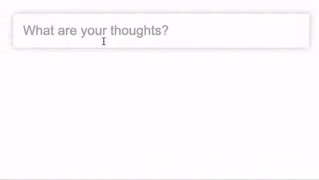
First we have onExpand that runs when the comment box is either clicked, or if it receives focus (ONLY if the comment box isn't already expanded). It sets the isExpanded state to true and the outerHeight ref value equal to the scrollHeight of the comment box. This is a way for us to store the height so we can transition the comment box to it in a later step.
const CommentBox = () => {
  const containerRef = useRef(null);
	...

	const onExpand = () => {
		if (!isExpanded) {
      outerHeight.current = containerRef.current.scrollHeight;
      setIsExpanded(true);
    }
	}

  return ...;
};
Next we have the onChange handler. All it does is update the commentValue state.
const CommentBox = () => {
  const containerRef = useRef(null);
	...

	const onExpand = () => { ... }

  const onChange = (e) => {
    setCommentValue(e.target.value);
	}

  return ();
};
Then we have the onClose handler, which will reset the commentValue state and set the isExpanded state to false when the cancel button is clicked.
const CommentBox = () => {
  const containerRef = useRef(null);
	...

	const onExpand = () => { ... }

  const onChange = (e) => { ... }

	const onClose = () => {
    setCommentValue("");
    setIsExpanded(false);
  };

  return ...;
};
Last we have the onSubmit handler. It doesn't do much for our purposes here, but you'd ideally use it for form validation or sending form data somewhere.
const CommentBox = () => {
  const containerRef = useRef(null);
	...

  const onSubmit = (e) => {
    e.preventDefault();
    console.log('send the form data somewhere')
  }

  return ...;
};
Component Markup
First we have a form element, which we'll add to the containerRef we created previously. Some CSS classes should be applied, expanded, or collapsed depending on the isExpanded state value. Additionally, we have a third css class, modified, which should be added once a comment starts to be typed.
return (
	<form
    onSubmit={onSubmit}
    ref={containerRef}
    className={cn("comment-box", {
      expanded: isExpanded,
      collapsed: !isExpanded,
			modified: commentValue.length > 0,
    })}
    style={{
      minHeight: isExpanded ? outerHeight.current : INITIAL_HEIGHT
    }}
  >
    ...
  </form>
);
We also want to set a minHeight, depending on the isExpanded state. If true, we want to use the outerHeight ref value, otherwise use the value in our INITIAL_HEIGHT constant (which is 46px).
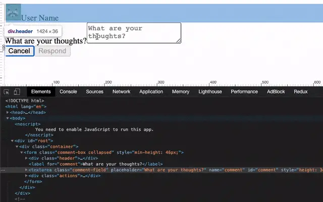
Next we have a header that displays a user avatar and name. This isn't actually required and has no functionality tied to it, but it adds a nice visual element to what we're building.
To take this header a step further, you could add
usernameandavatarprops that could be passed into the component.
return (
	<form ...>
		<div className="header">
      <div className="user">
        <img
          src="avatar/path"
          alt="User avatar"
        />
        <span>User Name</span>
      </div>
    </div>
	</form>
)
Next is the most important part of the component: the textarea element.
Add the textRef we created earlier to it, as well as the commentValue state. We want the onExpand function to run when the textarea is both clicked or focused, so be sure to include both.
return (
	<form...>
		<div className="header">...</div>
		<label htmlFor="comment">What are your thoughts?</label>
    <textarea
      ref={textRef}
      onClick={onExpand}
      onFocus={onExpand}
      onChange={onChange}
      className="comment-field"
      placeholder="What are your thoughts?"
      value={commentValue}
      name="comment"
      id="comment"
    />
	</form>
)
One additional thing: let's make sure the textarea has a label associated with it. We'll hide it visually, but it should be included to help with accessibility.
Instead of using a
textarea, another way to do this could be to use a div with acontenteditableattribute. There are pros and cons to both. One pro worth mentioning is that acontenteditableelement automatically resizes, which we'll talk more about later.
Finally we have some action buttons to close the comment box, or to submit a comment.
return (
	<form ...>
		...
		<textarea>...</textarea>

		<div className="actions">
      <button type="button" className="cancel" onClick={onClose}>
        Cancel
      </button>
      <button type="submit" disabled={commentValue.length < 1}>
        Respond
      </button>
    </div>
	</form>
)
That's it for the markup! So far we have a functioning comment box, although it doesn't look very good yet. Let's change that!
Styles
We'll start off by defining some some general styles and CSS variables. Some of the variables aren't absolutely necessary, but since we're using most of them more than once, it's helpful.
:root {
  --black: #333;
  --white: #fff;
  --gray: #aaa;
  --green: #1a8917;
  --border-radius: 4px;
  --transition: 0.4s ease;
  --font-family: Arial, Helvetica, sans-serif;
}

textarea {
  font-family: var(--font-family);
  border: none;
  resize: none;
}

textarea::placeholder {
  color: var(--gray);
}

label {
  height: 0;
  width: 0;
  visibility: hidden;
}

button {
  cursor: pointer;
}

button:disabled {
  opacity: 0.5;
  cursor: not-allowed;
}

button[type="submit"] {
  background: var(--green);
  color: var(--white);
  border-radius: var(--border-radius);
}
Next we have the styles for the comment box itself.
.comment-box {
display: flex;
flex-wrap: wrap;
max-width: 400px;
margin: 50px auto;
background: var(--white);
border-radius: var(--border-radius);
box-shadow: 0 0 8px rgba(0, 0, 0, 0.2);
overflow: hidden;
padding: 14px;
transition: min-height var(--transition);
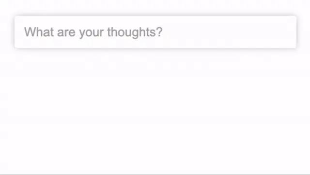
max-height: 46px;
}
.comment-box.modified {
max-height: unset;
}
A few important things to note here. We are initially setting a max-height on the comment box, and we unset it via the modified class when a user begins typing.
Additionally, we want to transition the min-height value between the default value we set in the previous step and one that is contained in the outerHeight ref we added earlier.
Next are some styles for the comment box header, which displays the username and avatar.
.header {
  transition: opacity var(--transition) 0.2s;
  opacity: 0;
  visibility: hidden;
  transform: translateY(-40px);
}

.user {
  display: flex;
  align-items: center;
}

.user img {
  border-radius: 20px;
  margin-right: 10px;
}

.comment-box.expanded .header {
  transform: translateY(10px);
  opacity: 1;
  visibility: visible;
}
Finally let's add the styles for the comment field, as well as the close and submit buttons.
.comment-field {
  color: var(--black);
  transition: transform var(--transition);
  font-size: 18px;
  width: 100%;
  outline: none;
  padding: 0;
  min-height: 60px;
  transform: translateY(-32px);
  line-height: 1;
}

.actions {
  width: 100%;
  display: flex;
  align-self: flex-end;
  justify-content: flex-end;
  margin-top: 50px;
  opacity: 0;
  transition: opacity var(--transition) 0.2s;
}

.comment-box.expanded .actions {
  opacity: 1;
}

.actions button {
  margin-left: 6px;
  font-size: 14px;
  padding: 12px;
  border: none;
  line-height: 1;
}

.actions .cancel {
  background: none;
}
Pause here for a moment and test out what we have so far. You should be seeing a transition now when clicking on the comment box. Things are looking much better, but we're not quite finished yet.
One More Transition
You'll notice in the previous section that we added a translateY property to the comment-field. We did this because we want to transition the comment field downwards as the comment box is expanding to make room for the avatar and username.
We can do this with the following CSS.
.comment-box.expanded .comment-field {
  transform: translateY(40px);
}
If you need a better visual when working with animations, check out this article I wrote: Inspecting Animations With Chrome DevTools. The Animation Inspector came in handy when writing the styles for this component.
Resizing the Textarea With a Custom Hook
We have one thing left to do: dynamically adjusting the height of the comment field. Since we're using a textarea, it doesn't resize when text content is added.
You'll see this occurring if you open the comment box and start typing: the text is cut off after a few sentences, and a scrollbar will appear. This is just how textareas work.
We need adjust the height ourselves, which we'll accomplish by writing a very minimal custom React hook.
Create a new file named useDynamicHeightField.js.
This function will take two params. The element is a reference to a textarea, and value will be the actual textarea state value.
import { useEffect } from "react";

const useDynamicHeightField = (element, value) => {

};

export default useDynamicHeightField;
We'll make use of Reacts useEffect hook to apply the resize anytime element or value changes.
useEffect(() => {
  if (!element) return;

}, [element, value]);
Lastly, there's the resize logic itself.
useEffect(() => {
  if (!element) return;

  element.current.style.height = "auto";
  element.current.style.height = element.current.scrollHeight + "px";
}, [el, value]);
What this is doing is first allowing the height of the textarea to be reset to the height of its content (via "auto"), then setting the height value to its scrollHeight.
I'll admit that this solution is somewhat "magic", and I can't take credit for it. It does exactly what we need though.
We use scrollHeight in this case because it gives us the total height of the element, including content that's cut off via a scrollbar.
The
Element.scrollHeightread-only property is a measurement of the height of an element's content, including content not visible on the screen due to overflow. - MDN Docs
That's it for our custom hook! Let's import it into our CommentBox component and pass it the textRef and the commentValue state.
import useDynamicHeightField from "./useDynamicHeightField";

const CommentBox = () => {
  const [isExpanded, setIsExpanded] = useState(false);
  const [commentValue, setCommentValue] = useState("");

  const outerHeight = useRef(INITIAL_HEIGHT);
  const textRef = useRef(null);
  const containerRef = useRef(null);

  useDynamicHeightField(textRef, commentValue);
	...
}
This is it for our CommentBox component!
Summary
Often times, the simplest looking components are the most complicated, and this was no exception.
In this article, we learned how to build an expandable comment box using React hooks that very closely resembles the one on Medium.com.
We also wrote a basic custom hook that could be reused any time we want a dynamically resizing textarea element.