
Fun with Custom Cursors
Two ways to change the default mouse cursor appearance.
We often get used to seeing the same mouse cursor icons when navigating around the web. The traditional arrow, pointer, text “I-Beam”. There’s many others available out of the box in CSS. But every so often, you’ll see a website use a custom mouse cursor. If done correctly, it can make a big impact on the user experience and set your project apart from the rest.
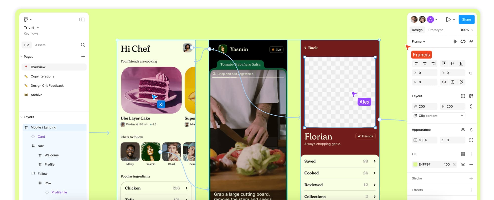
In this article, you’ll learn how to create custom mouse cursors. The inspiration came from this page on Figma’s website that uses a variety of custom cursor icons, and you can see other users' names attached to their cursor on the canvas.
As is the case for most things, just because you can doesn’t mean you should. Whether you opt to use custom cursors or not should fit with the overall design aesthetic for your project. Please also consider accessibility!
Getting Started
Let’s first revisit a common CSS property that you’ve most likely used or at least seen.
button {
  cursor: pointer;
}
The
cursorCSS property sets the mouse cursor, if any, to show when the mouse pointer is over an element. - MDN docs
The code above updates all buttons to show the traditional “pointer” icon when hovered.
This same property can accept many other types of values. For example, you can set the cursor as a path to an asset, like an image, SVG, or even an inline SVG.
body {
  cursor: url("./path-to-custom-arrow.png"), auto;
}

button {
  cursor: url("./path-to-custom-pointer.svg"), auto;
}

.some-div {
  cursor: url("data:image/svg+xml,%3Csvg width='24' height='24' ..."), auto;
}
Ending the property with “auto” will show a fallback cursor if for some reason the asset can’t be loaded. We definitely want that!
That’s pretty much it for displaying a custom cursor using CSS only, and this approach can go a long way. However, there are situations where you may want even more control.
Advanced Example
Now that we’ve covered the CSS cursor property, let’s define a few things it can’t do.
- The cursor itself doesn’t support animation.
- It can’t be updated dynamically. You could define a number of cursors ahead of time, but you can’t change things like the fill color or content.
With this in mind, let’s explore a more advanced example that does both of these things!
Instead of using the CSS cursor property, the approach we'll cover uses JavaScript to track the mouse cursor position, and replace it with HTML that can be animated and updated.
One thing to keep in mind with this approach is that the movement is not quite as smooth as using a native cursor. You won't notice it at the default zoom level, but you might when you zoom in.
This example uses React, but the most important parts of the code are the event listeners and CSS.
First start by creating a new file named CustomCursors.js.
In this file, we’ll set up some basic state to choose a name and color based on a button click. The selection determines what the custom cursor looks like.
import { useState, useEffect, useRef } from "react";
import "./styles.css";
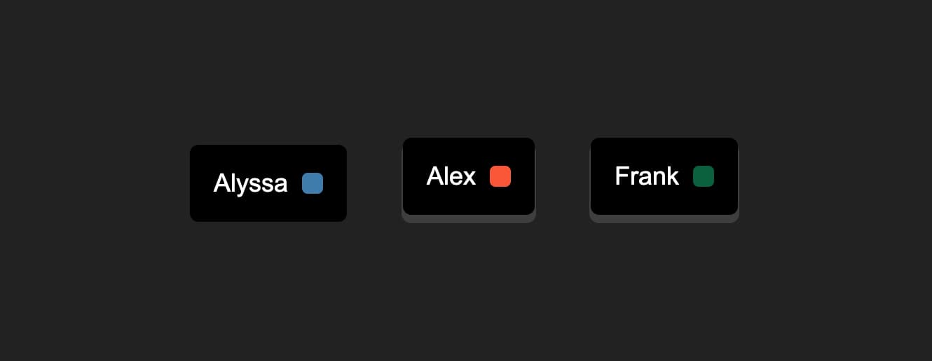
const users = [
{
name: "Alyssa",
color: "#3E7CAC",
},
{
name: "Alex",
color: "#F95738",
},
{
name: "Frank",
color: "#0B603E",
},
];
export const CustomCursors = () => {
const [activeCursor, setActiveCursor] = useState(users[0]);
return (
<section>
<div className="actions">
{users.map((user, index) => (
<button
key={user.name}
className={activeCursor.name === user.name ? "active" : ""}
onClick={() => setActiveCursor(users[index])}
>
{user.name} <span style={{ background: user.color }} />
</button>
))}
</div>
</section>
);
};
We also have some basic CSS to go along with this example to be added into a styles.css file.
:root {
  --white: #fff;
}

body {
  background: #222;
  height: 100vh;
}

section {
  display: flex;
  min-height: 100vh;
  align-items: center;
  justify-content: center;
}

.actions {
  display: flex;

  button {
    margin: 20px;
    padding: 16px;
    display: flex;
    align-items: center;
    background: #000;
    color: var(--white);
    border: 1px solid #000;
    font-size: 18px;
    border-radius: 6px;
    box-shadow: 0 5px 0px 1px rgb(90 90 90 / 50%);
    cursor: none;
    transition: all 0.3s ease;

    &.active,
    &:active {
      transform: translateY(5px);
      box-shadow: 0 0 0px 0 rgb(90 90 90 / 50%);
    }
  }

  span {
    height: 15px;
    width: 15px;
    display: inline-block;
    border-radius: 4px;
    margin-left: 10px;
  }
}
If this is the first time you’ve seen nesting used in native CSS, be sure to check out Nesting in CSS!
Now let’s add the cursor. Our new cursor is really just a div that contains an arrow icon and the currently active name value.
import { ReactComponent as DefaultIcon } from "./icons/default.svg";

export const CustomCursors = () => {
  ...

  const cursorWrapperRef = useRef();

  return (
    <section>
      <div ref={cursorWrapperRef} className="cursor-wrapper">
        <div className="default">
          <DefaultIcon fill={activeCursor.color} />
        </div>
        <div className="name" style={{ background: activeCursor.color }}>
          {activeCursor.name}
        </div>
      </div>
      <div className="actions">...</div>
    </section>
  );
};
Next we need to get the X and Y coordinates of the mouse location so we can move the custom cursor along the native mouse position.
This can be done pretty easily by setting an event listener for the mousemove event when the component mounts.
export const CustomCursors = () => {
  ...

  const handleMove = ({ clientX, clientY }) => {
    cursorWrapperRef.current.style.setProperty("--clientX", `${clientX}px`);
    cursorWrapperRef.current.style.setProperty("--clientY", `${clientY}px`);
  };

  useEffect(() => {
    window.addEventListener("mousemove", handleMove);

    return () => {
      window.removeEventListener("mousemove", handleMove);
    };
  }, []);

  return ...;
};
One we have the coordinates from the mousemove event, we’ll update some CSS variables using setProperty. This allows us bridge the gap between JavaScript and CSS, and it’s very handy.
You can learn more about how this works in Dynamic Styling with CSS Variables.
All that’s left for the arrow cursor is a bit more CSS.
These styles take the --clientX and --clientY variables being set in JavaScript and applies them as a transform in CSS. We’ll also add some positioning and transition properties for the arrow icon and the name.
.cursor-wrapper {
  --clientX: -100px;
  --clientY: -100px;

  position: absolute;
  z-index: 9999;
  left: 0;
  top: 0;
  transition: opacity 0.3s ease;
  pointer-events: none;
  transform: translate(var(--clientX), var(--clientY));

  .default svg {
    transition: fill 0.3s ease;
  }

  .name {
    border-radius: 6px;
    padding: 6px 10px;
    font-size: 12px;
    color: var(--white);
    position: absolute;
    top: 100%;
    right: 0;
    transition: background 0.3s ease;
    transform: translateX(100%) translateY(0%);
  }
}
Notice that we have the
clientXandclientYvariables initially set as-100px. This keeps the cursor hidden until the section is hovered. Otherwise the cursor would be sitting in the top left corner. Thanks to jhey for this idea! Be sure to check out his example as well.
Now that we have a custom cursor, the default one can be hidden.
section {
  ...
  cursor: none;
}
Let’s finish up this example by adding a custom pointer cursor that animates when hovering over a button.
Since we already have the cursor div in place, all we need to do is add a new icon to it and only show the relevant cursor when needed.
import { ReactComponent as PointerIcon } from "./icons/pointer.svg";

export const CustomCursors = () => {
  ...
  ...

  return (
    <section>
      <div ref={cursorWrapperRef} className="cursor-wrapper">
        <div className="default">...</div>
        <div className="pointer">
          <PointerIcon />
        </div>
        <div className="name" style={{ background: activeCursor.color }}>...</div>
      </div>
	    ...
    </section>
  );
};
And finally some CSS to go with that.
.pointer {
  display: none;
  animation: animateIn 0.4s ease;
}

@keyframes animateIn {
  0% {
    transform: scale(0.5);
  }

  50% {
    transform: scale(1.2);
  }

  100% {
    transform: scale(1);
  }
}

:root:has(button:hover) {
  .pointer {
    display: block;
  }

  /* Hide the default icon specifically on hover */
  .default {
    display: none;
  }
}
The pointer cursor is set to display: none by default and includes a scale animation when shown.
We’re using the :has selector to determine if the button is being hovered, and if so, swap which cursor is being shown.
This same approach can also be used to add other cursors when interacting with other elements.
Conclusion
As we saw in the above examples, custom cursors are not that complicated to implement!
Whether it’s just leveraging the native CSS cursor property, or using a more advanced JavaScript approach, using custom cursors can really help set your app or webpage apart.