
Building Dynamic Icons With CSS Animation
Use the power of CSS animations to add joy to your icons.
When designing and building UIs, it’s important to consider ways to make your content feel dynamic and alive. Including animations, when done right, is one way to help make your pages stand out.
In this article, we’ll explore how to add subtle animations to SVG icons. We'll use Figma to modify and export an icon to use in our code. Then we’ll write the animations using CSS, taking accessibility into account as well.
Some good examples of animated icons can be found on the Stripe homepage.
Icons in Figma
Figma has several great plugins that we can leverage to find icons and output as SVGs. I typically use the Iconify plugin.
If you’ve designed your own icon, you might be able to skip this section. Follow the steps to see if they apply to your icon. In addition, if you do use a pre-made icon, be sure to check the licensing beforehand!
The goal here will vary depending on what sort of animation you need. For example, if each piece of your icon needs to animate, then each piece needs its own path. This allows each path to be targeted individually with CSS.
In this first example, we’ll be using a WiFi icon. We want the top two shapes to animate, and the bottom one to remain static, so each shape will need to be separated into its own path.

First, create a new file in Figma and select an icon using the Figma plugin of your choice. We’ll use Iconify and choose a WiFi icon.
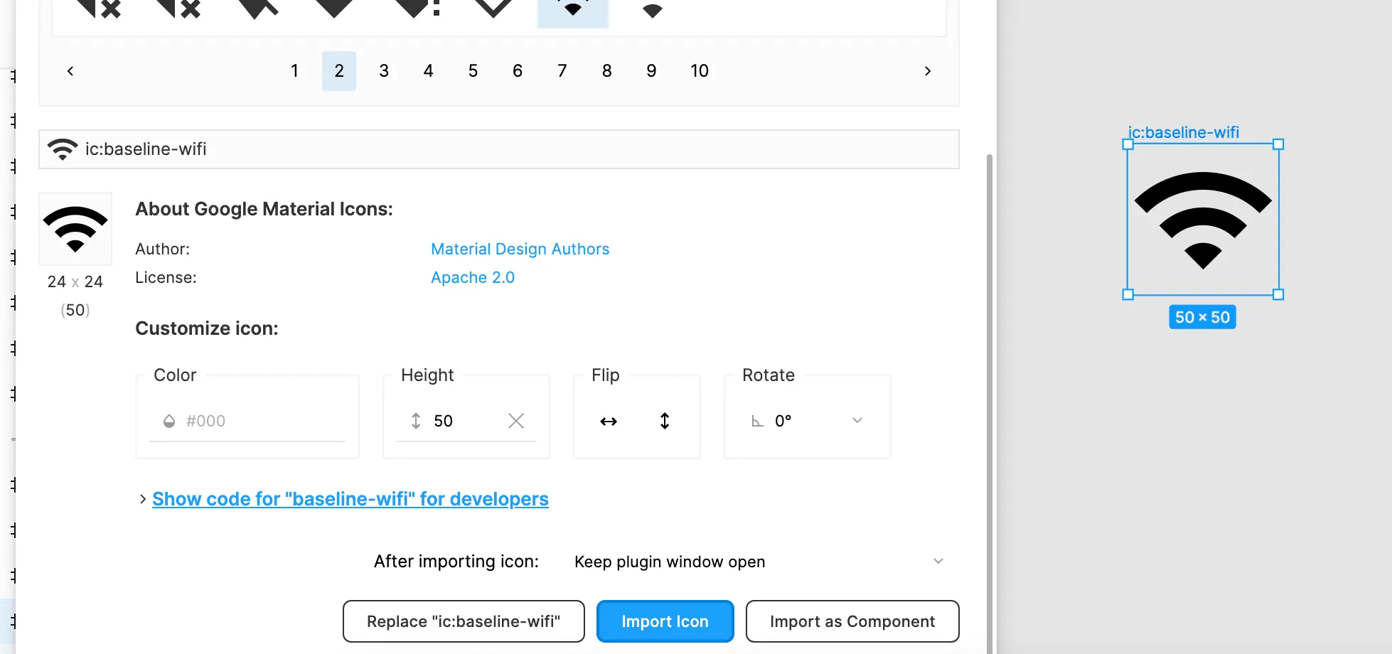
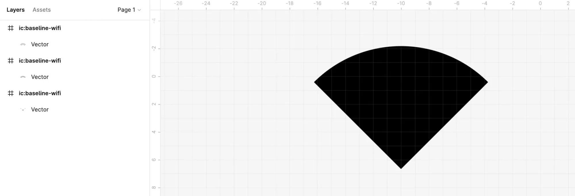
Now that we have the icon picked out, let’s examine it by clicking on it.
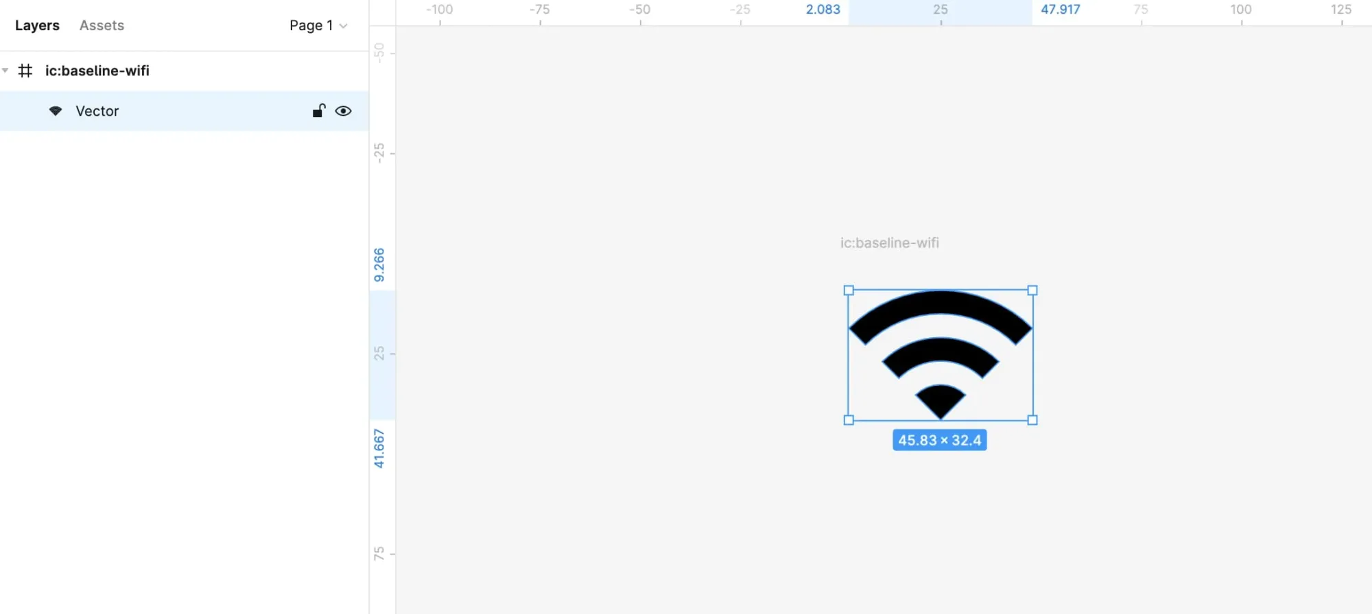
You can see that it’s a solid shape, and each “piece” of the icon does not have its own path. Exporting the icon in its current state gives us something like the following:
<svg width="46" height="33" ...>
	<path d="..." fill="black"/>
</svg>
While this is fine for regular non-animated icons, it does not give us multiple paths to target with CSS which is exactly what we want to do.
The way around this is to copy the icon, and manually piece it back together. This sounds like more work than it actually is, but it will vary depending on the complexity of the icon.
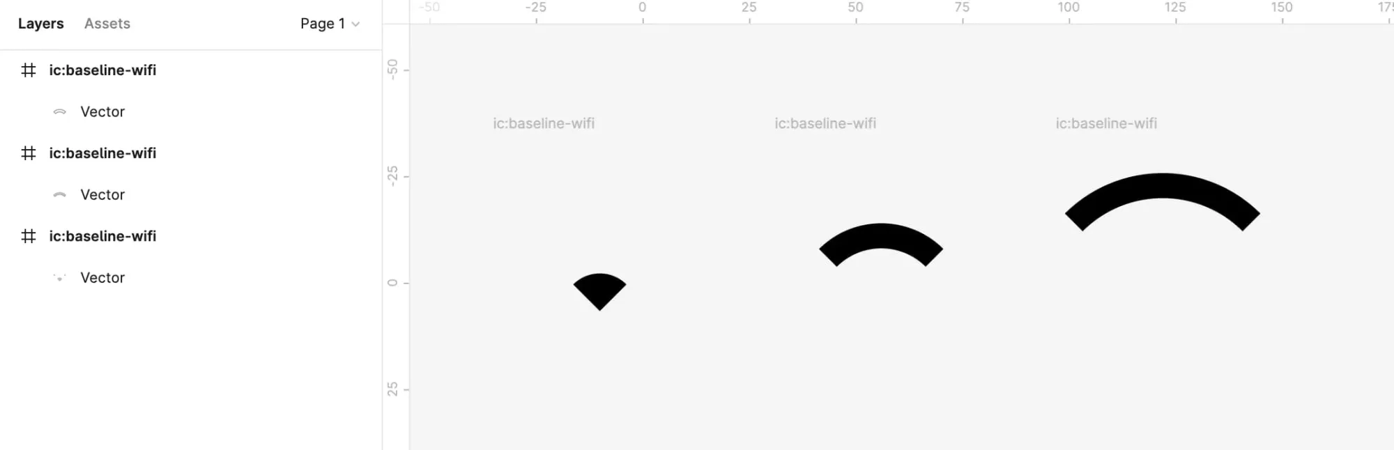
Because this particular icon has three pieces, we need three copies of it.
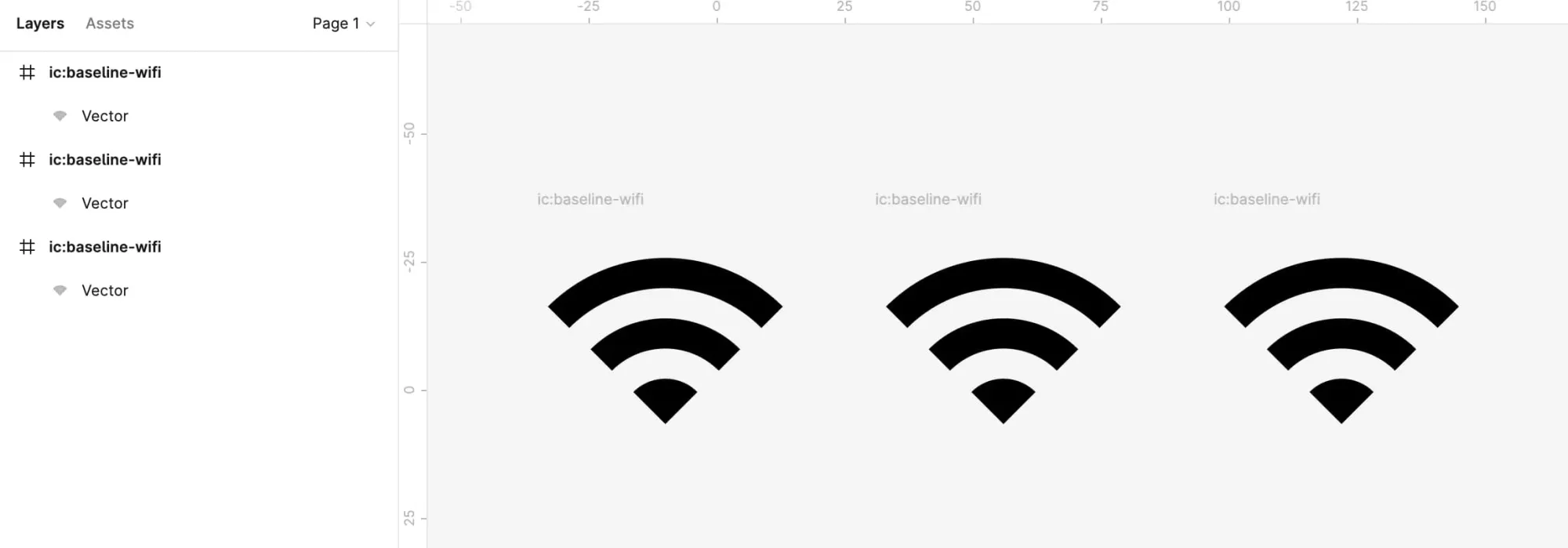
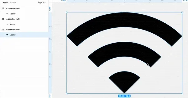
For each copy, we need to remove the pieces we don’t need so that we can combine what’s left back into the original shape.
Double click on the first icon. What we want to do is select the top two “wave” shapes, and delete them by pressing the delete key.
You’ll know if it’s selected if you see the blue draggable guides appear over the shape.
This part requires some trial and error, as well as precise clicking to select the very edge of the shape. Zooming in and aiming for the blue outline of the shape helps.
Sometimes an outline of the shape will be left over once you press delete. You need to select the pieces of the outline and delete them too.
After removing the bottom wave, repeat the same action for the top one.
We should now be left with just the bottom piece.
Repeat this same process for the other copies of the icon, keeping only the piece needed to form the original.
You should end up with something like the screenshot below.
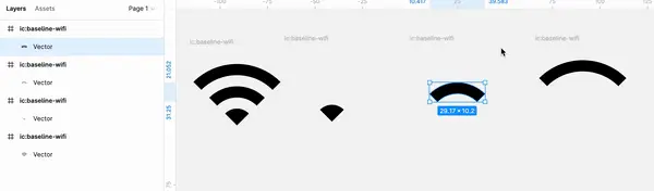
Now we need to combine the shapes so that they resemble the original structure of the icon. It can be helpful to use the original as a guide.
All that’s left before we can start using the icon in our code is to export it from Figma. There are a few ways to do this, but the quickest way is to choose “Copy as SVG” when right-clicking the outermost frame that the shapes are contained in.
You will want to make sure that all the shapes you created are within the same frame or group so that they all appear in the SVG that’s exported.
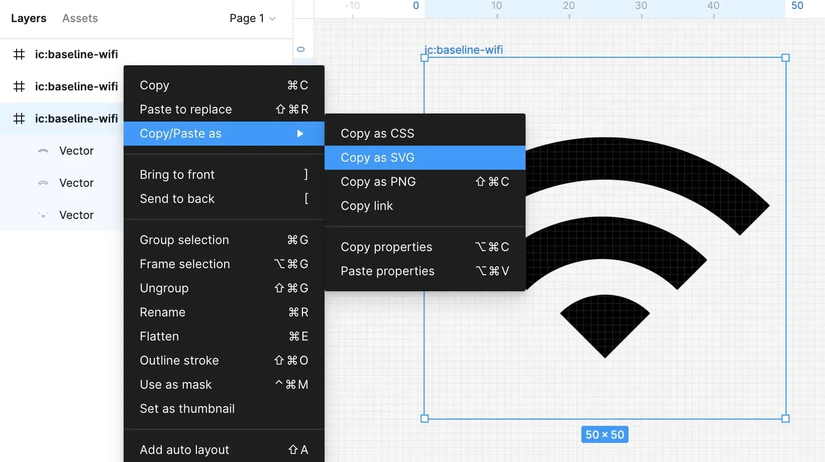
The SVG that you copied or exported from Figma should look like below. Now we have three distinct paths we can target with CSS.
<svg width="50" height="50" ...>
	<path d="..." fill="black" />
	<path d="..." fill="black" />
	<path d="..." fill="black" />
</svg>
This same process should be done for the chain and gear icons. You can also just copy and paste them from the demo if you’d prefer.
This approach has worked just fine for me for a lot of different icons, but there are likely other ways to accomplish the same thing.
Animating the WiFi Icon
Now that we know how to modify icons in Figma, let’s add animations to them!
Let’s start with the WiFi icon from the previous section.
The animation for it will be blinking the two “waves” at the top of the icon.
To do this, we need to add classes onto the path elements.
<path class="piece w-top" d="..." />
<path class="piece w-mid" d="..." />
<path class="piece w-bottom" d="..." />
Now for the CSS.
In the demo for this article, the CSS is all inside a single stylesheet. Where you add the styles for your icons depends entirely on your project setup and personal preference. For example, if you're using React, you may opt to make an icon component with the CSS as part of it.
First we’ll define some animations for the w-mid and w-top (the middle and top “waves”). The top one should have a slight delay before it begins.
.w-mid {
  animation: 2s ease blink infinite;
}

.w-top {
  animation: 2s ease blink infinite;
  animation-delay: 0.4s;
}
Notice how we’re using
infinitein the animation definition. This allows the animation to play through infinitely. You may or may not want that, depending on the effect you’re trying to achieve. For example, you might only want the animations to play once when the page loads, when on a timer, or when a user hovers over the an element. You can substituteinfinitewithforwardsand see what works for you!
Now for the keyframe itself. All it does is change the opacity from 0 to 1.
@keyframes blink {
  from {
    opacity: 0;
  }

  to {
    opacity: 1;
  }
}
The animation for this icon is done!
Animating the Chain Icon
Next up we have a chain icon. The animation for this icon will pretty subtle: all we are going to do is move the two chain link paths towards each other.
First define some classes on each path.
<path class="chain chain-bottom" d="..." ... />
<path class="chain chain-top" d="..." ... />
Starting from the bottom part of the chain link, the animation for this will be moving the path slightly up and to the right. This can be done using transform: translate().
.chain-bottom {
  animation: 2s ease chainBottom infinite alternate;
}

@keyframes chainBottom {
  from {
    transform: translate(-3px, 3px);
  }

  to {
    transform: translate(0, 0);
  }
}
The top chain path is the opposite: moving the path down and to the left.
.chain-top {
  animation: 2s ease chainTop infinite alternate;
}

@keyframes chainTop {
  from {
    transform: translate(3px, -3px);
  }

  to {
    transform: translate(0, 0);
  }
}

Animating the Gears Icon
The last icon will be of some spinning gears. This one is similar to the two we’ve already done.
First, add some classes to each of the paths.
<path class="gear gear-large" d="..." fill="black"/>
<path class="gear gear-medium" d="..." fill="black"/>
<path class="gear gear-small" d="..." fill="black"/>
Each gear will be rotated via transform: rotate(), so we need to define what origin to rotate on using transform-origin and how the rotation happens via transform-box. You can read more about this property here.
.gear {
  transform-origin: 50% 50%;
  transform-box: fill-box; /* Important, otherwise animation is not centered */
}
The large gear path (gear-large) should rotate clockwise to the right. To handle this, let’s add a selector and a keyframe to define the animation.
.gear-large {
  animation: 5s linear rotateR infinite;
}

@keyframes rotateR {
  to {
    transform: rotate(360deg);
  }
}
The medium and small gear paths should rotate counter-clockwise to the left.
.gear-medium {
  animation: 5s linear rotateL infinite;
}

.gear-small {
  animation: 5s linear rotateL infinite;
}

@keyframes rotateL {
  to {
    transform: rotate(-360deg);
  }
}

Icon Animation Accessibility
The animations we added are pretty subtle, but we should still allow for them to be disabled if users prefer it.
Fortunately, we can do this easily with the prefers-reduced-motion media query. It will “unset” the animations if a user has their OS configured to do so.
All that’s needed is to add this media query beneath the styles we’ve already written for each icon.
For more info about this media query, check out this article.
// Wifi icon
@media (prefers-reduced-motion) {
  .w-mid,
  .w-top {
    animation: none;
  }
}

// Chain icon
@media (prefers-reduced-motion) {
  .chain-bottom,
  .chain-top {
    animation: none;
  }
}

// Gears icon
@media (prefers-reduced-motion) {
  .gear {
    animation: none;
  }
}
Summary
In this article, you learned how to use CSS animation to bring life to SVG icons. This technique may not work for every project, but it's a good trick to be aware of and have at your disposal to bring some joy to an otherwise static page!