
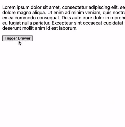
Building a Drawer Component With React Portals
Learn how to build a flexible Drawer component.
You have definitely seen "drawers" (or "trays") before, both on the web and in native apps. They are used to display anything from menus to forms, usually animating into view from any side of the screen and dimming the page background in the process. You can think of them as being very similar to modals.
In this article, we'll be building our own drawer component with React Hooks. We will also leverage React Portals to ensure the drawer renders correctly, no matter where it's implemented.
Defining the Drawer Component
First, let's define how the component will work. Since drawers are in many ways like modals, we will use some modal best practices to help guide us.
- The drawer is displayed after a user interaction, like a button click.
- The drawer will be animated in when it becomes visible.
- When the drawer is open, the page should not be scrollable.
- The user's focus is directed to the drawer content, and "trapped" there until the drawer is closed.
- We will pass the component a prop to control whether the drawer persists in the DOM, or is only appended when open.
- The drawer positioning can be controlled by a prop: left, top, right or bottom.
- The drawer can be dismissed either when clicking on the backdrop or when the escape key is pressed.
To learn more about some best practices, see these articles.
Component Markup and Styles
We'll add the base functionality for our drawer first. Begin by creating a new file named Drawer.jsx.
Import the useRef and useEffect hooks from React and also cn from the classnames package. We are using classnames to help manage the addition and removal of CSS classes from our component. You can learn more about it here.
import { useRef, useEffect } from 'react';
import cn from 'classnames';

const Drawer = ({
  isOpen,
  children,
  className,
  onClose,
	position = 'left',
}) => {
	return ( ... );
}

export default Drawer;
Our component has five props to begin with:
isOpen- A boolean that determines whether or not the drawer should be visible.children- The drawer content.className- An optional CSS class.onClose- A function to handle closing the drawer.position- The position of the drawer:left,top,right, orbottom.
const Drawer = ({
  isOpen,
  children,
  className,
  onClose,
  position = 'left',
}) => {
	return (
    <div
      aria-hidden={isOpen ? "false" : "true"}
      className={cn("drawer-container", {
        open: isOpen,
        className
      })}
    >
	    ...
    </div>
  );
}
We will return a drawer-container div with a few CSS classes. The div also has an aria-hidden attribute to indicate its visibility to accessibility APIs.
Inside the drawer-container, we have the actual drawer div and a backdrop.
return (
  <div
    aria-hidden={isOpen ? "false" : "true"}
    className={cn("drawer-container", {
      open: isOpen,
      className
    })}
  >
    <div
      className={cn("drawer", position)}
      role="dialog"
    >
      {children}
    </div>
    <div className="backdrop" onClick={onClose} />
  </div>
);
Now let's add some functionality to prevent the page from scrolling when the drawer is open.
First, we need a reference to the page body. This allows us to target the body element and toggle styles on it when the drawer is visible.
Inside a new useEffect function, add another new function named updatePageScroll. This will be run whenever the isOpen prop value changes. If isOpen is true, we access the style property of the bodyRef and toggle overflow:hidden.
const Drawer = (...) => {
	const bodyRef = useRef(document.querySelector('body'));

	useEffect(() => {
    const updatePageScroll = () => {
      if (isOpen) {
        bodyRef.current.style.overflow = 'hidden';
      } else {
        bodyRef.current.style.overflow = '';
      }
    };

    updatePageScroll();
  }, [isOpen]);

	return ( ... );
}
Now for the drawer CSS.
.drawer-container {
  --transition-speed: 0.3s;
}

.drawer {
  background: #fff;
  width: 30%;
  height: 100%;
	overflow: auto;
  position: fixed;
  box-shadow: 0 0 15px rgba(0, 0, 0, 0.5);
  transition: transform var(--transition-speed) ease;
  z-index: 1000;
}

.drawer.left {
  top: 0;
  left: 0;
  transform: translateX(-100%);
}

.drawer-container.open .left {
  transform: translateX(0);
}

.backdrop {
  visibility: hidden;
  opacity: 0;
  background: rgba(0, 0, 0, 0.5);
  transition: opacity var(--transition-speed) ease,
    visibility var(--transition-speed) ease;
  width: 100%;
  height: 100%;
  top: 0;
  left: 0;
  position: fixed;
  pointer-events: none;
	z-index: 0;
}

/*
	Only apply the box-shadow when open to prevent the shadow
  from appearing on the edge of the screen when inactive
 */
.drawer-container.open .drawer {
  box-shadow: 0 0 15px rgba(0, 0, 0, 0.5);
}

.drawer-container.open .backdrop {
  visibility: visible;
  opacity: 1;
  pointer-events: auto;
	z-index: 999;
}
Initially, we use a translateX transform of -100% to position the element off the left edge of the page. When the drawer-container receives the open class, we set the transform value to 0.
Since the positioning of the drawer defaults to
left, we'll start with those styles and add in the other positioning classes later.
With the styles in place, we should test it out to see the progress we've made so far.
import { useState } from "react";
import Drawer from "./Drawer";

export default function App() {
  const [isOpen, setIsOpen] = useState(false);

  return (
    <div className="app">
      <button type="button" onClick={() => setIsOpen(!isOpen)}>
        Trigger Drawer
      </button>
      <Drawer isOpen={isOpen} onClose={() => setIsOpen(false)}>
        <button type="button" onClick={() => setIsOpen(false)}>
          Close
        </button>
        <p>The drawer content!</p>
        <input type="text" />
      </Drawer>
    </div>
  );
}
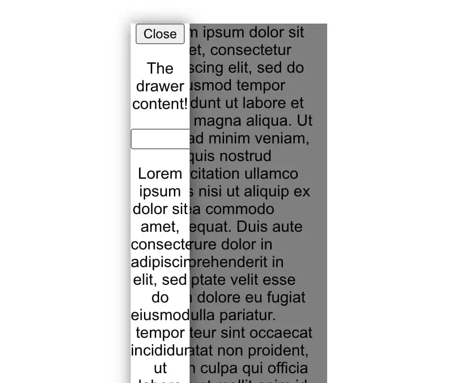
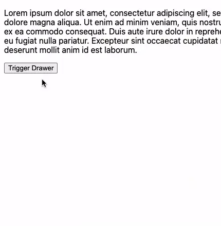
When adding the component, give it any content you want. You can also pass a close button within the drawer content. This gives the user two ways to dismiss it.
Our drawer is functional!
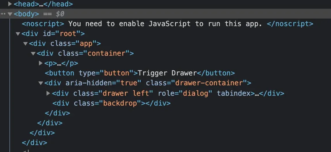
Adding a React Portal
So far, there is one drawback with our component. Depending on where you implement the drawer in a real-world app, it could be very far down in the DOM tree. It's possible that styles set on a parent element could impact our component, causing it to render incorrectly.
For example, try adding the styles below to the drawers parent.
transform: translateX(10px);
width: 200px;
It may be a trivial example, but it shows that you shouldn't need to depend on the styles of other elements for the drawer to be usable.
This sounds like a great use case for React Portals!
Portals provide a first-class way to render children into a DOM node that exists outside the DOM hierarchy of the parent component. - React docs.
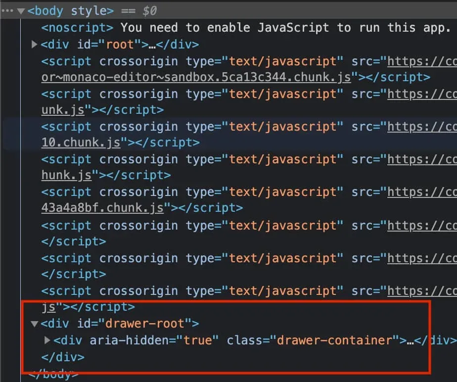
With a portal, now we can ensure the drawer renders at the very top of the DOM tree instead, and we don't have to worry about other elements affecting it.
To implement this, we need to make a few changes.
Start by importing createPortal from react-dom.
Next we need to add a function named createPortalRoot. This returns a div that will be the target element to render our drawer into.
import { useRef, useEffect } from "react";
import { createPortal } from 'react-dom';

function createPortalRoot() {
  const drawerRoot = document.createElement('div');
  drawerRoot.setAttribute('id', 'drawer-root');

  return drawerRoot;
}
The element that createPortalRoot returns is then passed into a useRef hook.
const Drawer = (...) => {
  const portalRootRef = useRef(document.getElementById('drawer-root') || createPortalRoot());
}
Since we don't want to create the
drawer-rootelement more than once, we will try to find it viagetElementByIdand only create it if it's not found.
Next we need a useEffect hook to append this new ref into the DOM when the component first mounts.
const Drawer = (...) => {
  const portalRootRef =
    useRef(document.getElementById('drawer-root') || createPortalRoot());

	// Append portal root on mount
  useEffect(() => {
    bodyRef.current.appendChild(portalRootRef.current);
    const portal = portalRootRef.current;
    const bodyEl = bodyRef.current;

    return () => {
      // Clean up the portal when drawer component unmounts
      portal.remove();
      // Ensure scroll overflow is removed
      bodyEl.style.overflow = '';
    }
  }, []);
}
We should be sure to return a function from the useEffect to handle cleanup when the drawer component unmounts. It will remove the portal contents from the DOM, and unset the overflow styles from the body element.
Finally, let's update the return statement slightly to incorporate the createportal function we imported.
The first parameter of createPortal is the child element to render, and the second is the container in which to render it. Since portalRootRef is a direct child of the body element, the drawer component should now render much higher up in the DOM tree.
return createPortal(
  <div
    aria-hidden={isOpen ? 'false' : 'true'}
    className={cn('drawer-container', {
      open: isOpen,
      className,
    })}
  >
    <div
      className={cn('drawer', position)}
      role="dialog"
    >
      {children}
    </div>
    <div className="backdrop" onClick={onClose} />
  </div>,
  portalRootRef.current,
);
Below you can see a before and after of where the component is located in the DOM.
DOM Persistence
Next, let's add some control over appending the drawer into the DOM only when necessary. Say for example that the drawer content contains a lot of heavy sub-components, or has content that isn't important for SEO. In cases like these, it makes sense not to clutter the DOM with elements until they are required.
This DOM persistence logic may or may not be important to you, depending on how you plan to use this component, but it helps make the drawer as flexible and reusable as possible.
All we need to do is add a prop and one conditional check to our component to toggle this feature.
const Drawer = ({
  isOpen,
  children,
  className,
  onClose,
  position = 'left',
  removeWhenClosed = true,
}) => {
	...

	if (removeWhenClosed && !isOpen) {
    return null;
  }

	return createPortal( ... );
}
If the removeWhenClosed prop is true and the drawer is not open, return null.
Transitioning on Mount
Changing the drawer to conditionally render in the DOM has introduced an issue.
You may have noticed that the CSS transitions are no longer working.
Unfortunately, unless you're using a library like Framer Motion or Transition Group, transitioning a mounting or unmounting component is not something that React is going to handle for you.
But, there's a workaround: How to Animate Mounting Content in React.
Using a React hook, we can add some logic to allow transitioning a component when it enters or leaves the DOM.
We won't cover the specifics here, but please check out the article above for more information.
import { useEffect, useState } from "react";

const useMountTransition = (isMounted, unmountDelay) => {
  const [isTransitioning, setIsTransitioning] = useState(false);

  useEffect(() => {
    let timeoutId;

    if (isMounted && !isTransitioning) {
      setIsTransitioning(true);
    } else if (!isMounted && isTransitioning) {
      timeoutId = setTimeout(() => setIsTransitioning(false), unmountDelay);
    }
    return () => {
      clearTimeout(timeoutId);
    };
  }, [unmountDelay, isMounted, isTransitioning]);

  return isTransitioning;
};

export default useMountTransition;
First, save this code in a file named useMountTransition.js, then import to use it inside the drawer.
import useMountTransition from './useMountTransition';

const Drawer = (...) => {
  const isTransitioning = useMountTransition(isOpen, 300);

	if (!isTransitioning && removeWhenClosed && !isOpen) {
    return null;
  }

	return createPortal(
    <div
      aria-hidden={isOpen ? 'false' : 'true'}
      className={cn('drawer-container', {
        open: isOpen,
        in: isTransitioning,
        className,
      })}
    >
      ...
      <div className="backdrop" onClick={onClose} />
    </div>,
    portalRootRef.current,
  );
}
We need to update the drawer-container div to add a class of in depending on the value that useMountTransition returns.
We also need to update the condition we added in the last section to include the isTransitioning value.
if (!isTransitioning && removeWhenClosed && !isOpen) {
  return null;
}
Finally, in our CSS, a few selector changes are needed to accommodate the in class.
.drawer-container.in.open .left {
  ...
}

.drawer-container.in.open .backdrop {
  ...
}
With these changes in place, the mount and unmount transitions should be working again when the drawer is added and removed from the DOM.
Adding Drawer Positioning
Our drawer currently animates in from the left side of the screen. Let's add some styles to support top, right and bottom positioning.
.drawer.right {
  top: 0;
  right: 0;
  transform: translateX(100%);
}

.drawer.top {
  top: 0;
  left: 0;
  right: 0;
  width: 100%;
  transform: translateY(-100%);
  height: 40%;
}

.drawer.bottom {
  bottom: 0;
  left: 0;
  right: 0;
  width: 100%;
  transform: translateY(100%);
  height: 40%;
}

.drawer-container.in.open .left,
.drawer-container.in.open .right {
  transform: translateX(0);
}

.drawer-container.in.open .top,
.drawer-container.in.open .bottom {
  transform: translateY(0);
}
Accessibility Improvements
We are almost done! In this section, there are two things we should add to make the drawer component more accessible.
Closing via Escape Key
First, the drawer should be closable by pressing the escape key.
Within the Drawer.jsx file, let's add another useEffect to handle this logic. This useEffect will run when the value of isOpen changes, and will also call onClose.
useEffect(() => {
  const onKeyPress = (e) => {
    if (e.key === 'Escape') {
      onClose();
    }
  }

  if (isOpen) {
    window.addEventListener('keyup', onKeyPress);
  }

  return () => {
    window.removeEventListener('keyup', onKeyPress);
  }
}, [isOpen, onClose]);
If the drawer is open, we want to add an event listener for the keyup event. Then, within a function named onKeyPress, we can check the key that was pressed. If it was the Escape key, we call the onClose function to close the drawer.
Managing Focus
Next, we should control how the focus works when the drawer is open.
What we want to do is set the focus inside the drawer and "trap" the focus within it until it's been closed.
We'll be using the focus-trap-react library to implement this.
Once you've installed it, wrap the drawer markup with the <FocusTrap /> component, and pass it an active prop depending on if the drawer is open.
import FocusTrap from 'focus-trap-react';

const Drawer = (...) => {
	...

	return createPortal(
    <FocusTrap active={isOpen}>
      <div
        aria-hidden={isOpen ? 'false' : 'true'}
        className={cn('drawer-container', {
          open: isOpen,
          in: isTransitioning,
          className,
        })}
      >
       ...
      </div>
    </FocusTrap>,
    portalRootRef.current,
  );
}
Summary
This sure was a journey, so thanks for making it all the way through! In this article, you learned how to make a flexible, reusable React drawer component. You also learned about a good scenario to utilize React Portals.
The props and functionality could also be expanded further to support different types of CSS transitions, different drawer dimensions, and more!