
Animated Social Share Links
Learn how to build an animation for displaying social links using CSS
In this article, we’ll be using CSS to animate a list of social sharing links. After clicking on a trigger button, the links expand out into a semi-circle with a slightly staggered animation effect.
The animation interaction was inspired by this Dribbble shot and all icons are from Font Awesome.
We’ll be using React for demonstration purposes, but this article can be applied to vanilla JS or any other library.
Getting Started
The component we’re building contains both the “trigger” button, as well as the social links themselves. The idea is that we toggle a few classes when the trigger is clicked, and the power of CSS handles everything else.
First, create a new React component named SocialShare.
There are two state values. isActive determines when the share link component has been clicked, and isComplete, as the name implies, is added shortly after to denote that the animation is complete. Both of these state values determine when CSS classes are added or removed.
const SocialShare = () => {
  const [ isActive, setIsActive ] = useState(false);
  const [ isComplete, setIsComplete ] = useState(false);

  const transitioningClass = isActive ? 'active' : 'inactive';

  return (...);
}
We also add a transitioningClass constant for the CSS class we’ll be toggling on and off.
Now we have some HTML to add.
The component returns a button to be used as the trigger for opening and closing the list of links. This button has an onClick event handler to toggle the isActive state we added above, and receives the transitioningClass we defined.
const SocialShare = () => {
  ...
  ...

  return (
    <div className="share">
      <button
        className={`trigger ${transitioningClass}`}
        type="button"
        onClick={() => setIsActive(!isActive)}
      >
        <Share />
      </button>
    </div>
  );
}
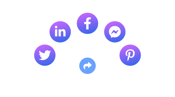
Next, we need to add the social links and icons. There’s one for Twitter, LinkedIn, Facebook, Messenger, and Pinterest. Each anchor should have a corresponding CSS class.
const SocialShare = () => {
  ...
  ...

  return (
    <div className="share">
      <button
        className={`trigger ${transitioningClass}`}
        type="button"
        onClick={() => setIsActive(!isActive)}
      >
        <Share />
      </button>
	    <div className={`share-options ${transitioningClass} ${isComplete && 'complete'}`}>
        <a href="#" className="twitter"><Twitter /></a>
        <a href="#" className="linkedin"><LinkedIn /></a>
        <a href="#" className="facebook"><Facebook /></a>
        <a href="#" className="messenger"><Messenger /></a>
        <a href="#" className="pinterest"><Pinterest /></a>
      </div>
    </div>
  );
}
Keep in mind, if you want a different number of links than above, you’ll need to do some manual CSS adjustments to update the positioning of each link.
Some projects have different ways of importing and using SVG icons. Here we assume the icons are imported and used as React components. Please reference the demo to see the full code.
Finally, let’s add a useEffect into the component. This updates the isComplete state value we defined to add a CSS class when the animation is starting. We’ll come back to the reasoning behind this soon.
const SocialShare = () => {
  ...
  ...

  useEffect(() => {
    if (isActive) {
      setIsComplete(true);
    } else {
      setIsComplete(false);
    }
  }, [isActive]);

  return ( ... );
}
Our React component is done, but so far all you’ll see are some icons on the page. Let’s add some styles!
CSS Styling and Layout
We’ll be using CSS nesting below. This is native in CSS now and should work just fine so long as you’re using a modern browser. To learn more about nested CSS, please check out Nesting in CSS.
First, we have the styles for buttons and the share div.
button {
  cursor: pointer;
  border: none;
  line-height: 1;
}

.share {
  margin: 260px auto;
  max-width: 400px;
  position: relative;
}
Next let’s define the .trigger styling and its hover effect.
.trigger {
  background: #2863DB;
  padding: 15px;
  border-radius: 50%;
  height: 60px;
  width: 60px;
  display: block;
  margin: auto;
  transition: transform 0.3s ease, box-shadow 0.3s ease, background 0.3s ease;
  transform-origin: 50% 50%;
  position: relative;
  z-index: 2;

  & svg {
    height: 30px;
    width: 30px;
    fill: #fff;
  }

  &:hover {
    transform: translateY(-5px);
    box-shadow: 0px 6px 10px 0px rgba(0, 0, 0, 0.2);
  }
}
If you noticed in the demo, the trigger should spin 360 degrees and get slightly smaller after being clicked.
We can do this by adding a CSS animation property when the active class is applied.
.trigger {
  ...
  ...

  &.active {
    animation: rotateClockwise 0.6s ease forwards;
    background: #6aa2ff;
    box-shadow: none;
  }
}

@keyframes rotateClockwise {
  0% {
    transform: rotate(0) scale(1);
  }

  100% {
    transform: rotate(360deg) scale(0.9);
  }
}
Let’s take a break and check the progress so far.

Now that the trigger is done, lets style and position the social links.
Each link is contained in a .share-options div. This div is absolutely positioned over the trigger and initially has a visibility of hidden and opacity of 0 in order to hide it when not active. We use flexbox to help with alignment.
.share-options {
  display: flex;
  justify-content: center;
  align-items: center;
  position: absolute;
  top: 50%;
  left: 0%;
  right: 0%;
  opacity: 0;
  height: 100%;
  width: 100%;
  visibility: hidden;
}
Each link should have a gradient background and be absolutely positioned.
.share-options {
  ...

  & a {
	  background: linear-gradient(165deg, hsla(283, 100%, 70%, 1) 0%, hsla(221, 81%, 54%, 1) 100%);
	  padding: 15px;
	  margin: 10px;
	  height: 70px;
	  width: 70px;
	  border-radius: 50%;
	  vertical-align: middle;
	  display: flex;
	  align-items: center;
	  position: absolute;

	  &:hover {
	    box-shadow: 0px 6px 10px 0px rgba(0, 0, 0, 0.2);
	  }
	}

  & svg {
    fill: white;
    height: 40px;
    width: 40px;
  }
}
Next, we have the layout for the links, as well as the hover state.
Each link is positioned in a semi-circle outwards from the trigger. We can accomplish this positioning by applying a CSS transform to each link when the share-options div receives the active class.
.share-options {
  ...

  &.active {
    opacity: 1;
    visibility: visible;
    top: 0;

    .twitter {
      transform: translate(-200%, -50%);

      &:hover {
        transform: translate(-200%, -50%) scale(1.2);
      }
    }

    .linkedin {
      transform: translate(-128%, -160%);

      &:hover {
        transform: translate(-128%, -160%) scale(1.2);
      }
    }

    .facebook {
      transform: translate(0%, -200%);

      &:hover {
        transform: translate(0%, -200%) scale(1.2);
      }
    }

    .messenger {
      transform: translate(128%, -160%);

      &:hover {
        transform: translate(128%, -160%) scale(1.2);
      }
    }

    .pinterest {
      transform: translate(200%, -50%);

      &:hover {
        transform: translate(200%, -50%) scale(1.2);
      }
    }
  }
}
Notice how the hover effect has some repetition of the translate positioning when defining the
scaleproperty. This is to hold the link in place when hovering. Without it, the link moves back to its original position.
Animating the Links
Clicking the trigger button places each link into the correct position, so now let’s add the animation.
First, add the transition and transform properties to the share-options div. The cubic-bezier transition timing we’re using gives the links a slight “bounce” effect.
.share-options {
  ...

  & a {
    ...
    transition: transform 0.3s cubic-bezier(.47,1.64,.41,.8), box-shadow 0.3s ease;
    transform: scale(0.2);
  }
}
Since we already applied the positioning for each item, all we need to do is provide a slightly incrementing transition-delay. This allows for the staggered animation.
.share-options {
  &.active {
    ...

    .twitter {
      ...
      transition-delay: 0.1s;
    }

    .linkedin {
      ...
      transition-delay: 0.15s;
    }

    .facebook {
      ...
      transition-delay: 0.2s;
    }

    .messenger {
      ...
      transition-delay: 0.25s;
    }

    .pinterest {
      ...
      transition-delay: 0.3s;
    }
  }
}
The last thing to add is the scale transition for each anchor on hover.
The useEffect we added earlier was to apply the complete CSS class. Because we’ve already defined a transition-delay on each link, a separate class is needed to remove the delay when the animation is done. Without this, the scale transition for each link is delayed by whatever value was defined previously.
.share-options {
  ...

  &.active {
    ...

    &.complete {
      & a {
        transition-delay: 0s;
      }
    }
  }
}
Summary
This article demonstrated how to use CSS to create an animation that expands social sharing links into a semi-circle after clicking a trigger button. The article includes React code for the component and CSS styling for the trigger button and links, including positioning and animation effects.