
Resizable Tables with React and CSS Grid
Learn how to add resizing to your HTML tables.
HTML tables can be a nightmare to get right. They're rigid, there are several edge cases to consider, and displaying them on mobile devices requires extra effort or a different solution altogether. The columns of a table aren't resizable by default either, even though in many cases a user would benefit by having this ability.
I've seen tables with resizable columns a lot more recently, which made me curious how it could be done. After trying a few things that didn't work, I found a great tutorial by Adam Lynch that was exactly what I was looking for.
This article will explore how to resize table columns with React and CSS Grid.
React is not specifically needed for this task, and what we'll be building can be accomplished just as well in vanilla JS (see the article I linked above).
Also note that this is not quite a production ready solution. It's enough to illustrate how table columns can be resized, and provides a React-specific head start to a final solution.
Why CSS Grid?
While doing some research on how other sites build adjustable tables, I wouldn't have thought of using CSS grid. It seemed like it would over-complicate something that tables already do: lay out data in columns and rows.
After applying some grid styles to a basic table, I did notice that it allows some flexibility that regular tables don't have. For example, it was more or less responsive without any extra effort. You can also experiment with the minmax() values we'll add to make adjustments to the sizing based on your requirements.
Building a Table Component
All the logic we add will be contained in one React component. Start by creating a new file named Table.jsx.
The Table component will require three props. The first, headers, is an array of the table headers to display. You can think of these as the driving force behind the resizing functionality. The second is minCellWidth, and this defines the minimum width a table cell can be resized to. The last prop is tableContent, which provides the table with data.
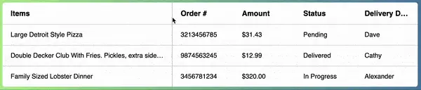
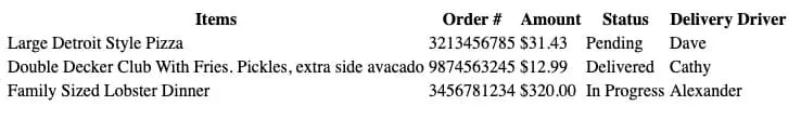
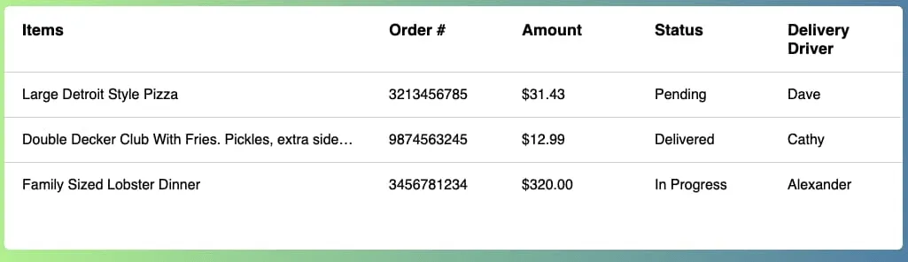
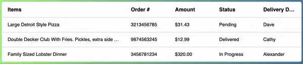
This article focuses on the table headings and not the table data itself, since that will vary completely on your implementation. Please check the demo for an example of one way to pass in table content.
There are two states to track using the useState hook. We need tableHeight for the overall height of the table. We will use this later to determine how tall the resize handles will be for the columns. The other state value is activeIndex, which stores the index of the column currently being resized.
Lastly, we need a reference to the table itself using the useRef hook. This will help us get the tableHeight mentioned above and apply the correct widths to the table header cells later on.
import { useState, useCallback, useEffect, useRef } from 'react';

const Table = ({
  headers,
  minCellWidth,
	tableContent,
}) => {
  const [tableHeight, setTableHeight] = useState('auto');
  const [activeIndex, setActiveIndex] = useState(null);
  const tableElement = useRef(null);

  return ...
}

export default Table;
Now for the table HTML. We'll rework the table headers more in the next section but for now a simple map to output them is what we want.
return (
  <div className="table-wrapper">
    <table className="resizeable-table" ref={tableElement}>
      <thead>
        <tr>
          {headers.map((heading) => (
	          <th key={heading}>{heading}</th>
	        ))}
	        </tr>
      </thead>
      {tableContent}
    </table>
  </div>
);
With this in place, you will have a basic unstyled table. A little boring, but let's improve it with some styling.
Table Styling
Start with some general styles for the table.
.table-wrapper {
  margin-bottom: 25px;
  border-radius: 6px;
  background: #fff;
  overflow: hidden; /* Clips any scrollbars that appear */
}

table {
  width: 100%;
  overflow: auto; /* Allow scrolling within the table */
}

table th {
  position: relative;
  font-size: 18px;
}

table th,
table td {
  text-align: left;
  padding: 16px 20px;
}

table th span,
table td span {
  white-space: nowrap;
  text-overflow: ellipsis;
  overflow: hidden;
  display: block;
}

table tr td {
  border-top: 1px solid #ccc;
}
Inside of all <th> and <td> table cells, we want to wrap the content with a span. This serves as a way to clip any content that exceeds the width of the cell and display an ellipsis for anything that is cut off.
You may already be familiar with the
text-overflow: ellipsistechnique in things like search bars or form fields. It works well here too!
Next we'll define the default CSS grid styles for the table.
table {
  ...
  display: grid;
  grid-template-columns:
    minmax(150px, 3fr)
    minmax(150px, 1fr)
    minmax(150px, 1fr)
    minmax(150px, 1fr)
    minmax(150px, 1fr);
}

table thead,
table tbody,
table tr {
  display: contents;
}
The key parts here are the grid-template-columns and display: contents. We set a default of minmax(150px, 3fr) for the column with the largest content and minmax(150px, 1fr) for all other columns. This gives us an initial grid before any columns are resized.
Using display: contents gives us a way to have the grid properties bypass the table head, body and rows and extend to the <th> and <td> elements where they can become part of the grid. Check out this article for more information.
Now we should have a table layout that looks better.
Resizing the Table Columns
Now for the reason you're probably here! This section discusses how to add the table column resizing functionality. We'll start by assigning some refs to each table header and then add some draggable resize handle elements, ending with the events that will do the resizing magic.
First, we need a reference to each table header so that we can update its width while resizing and to maintain it if another column is dragged. To do this, create a new function named createHeaders adjacent to the Table component.
const createHeaders = (headers) => {
  return headers.map((item) => ({
    text: item,
    ref: useRef(),
  }));
}

const Table = ({
	headings,
	minCellWidth,
	tableContent,
}) => {
	const [tableHeight, setTableHeight] = useState("auto");
  const [activeIndex, setActiveIndex] = useState(null);
  const tableElement = useRef(null);
	const columns = createHeaders(headings);
	...
}
This function iterates over the headers array prop and calls useRef to create a ref for each header. It will return us a new array with a ref and header text.
With this in place, update the <thead> to iterate over the columns array instead of the headers prop we were using before.
<thead>
  <tr>
    {columns.map(({ ref, text }, i) => (
      <th ref={ref} key={text}>
        <span>{text}</span>
      </th>
    ))}
  </tr>
</thead>
Now we can add the resize handles that serve as a way for the user to drag a column to resize. If the handle is being dragged, we want to make sure it's clear to the user by adding a class of active that changes the color. We also want each handle to span the height of the table so that it's accessible from either the <th> and <td> cells.
To make the handles take up the full height of the table, we need to get its height. Since we already have a ref for the table DOM element, a useEffect hook can retrieve it and set it to state via setTableHeight.
useEffect(() => {
  setTableHeight(tableElement.current.offsetHeight);
}, []);
This
useEffectwill run only on mount, but could easily be updated to run if new table rows or columns are added dynamically.
Next, within the <thead> we just modified, add a div for the handle.
{columns.map(({ ref, text }, i) => (
  <th ref={ref} key={text}>
    <span>{text}</span>
    <div
      style={{ height: tableHeight }}
      onMouseDown={() => mouseDown(i)}
      className={`resize-handle ${activeIndex === i ? 'active' : 'idle'}`}
    />
  </th>
))}
Last, add a mouseDown event to update the activeIndex state value. As mentioned earlier, this will set the state value of activeIndex so that we know which header we are dealing with.
const mouseDown = (index) => {
  setActiveIndex(index);
}
To finish what we just did, add one final bit of CSS.
.resize-handle {
  display: block;
  position: absolute;
  cursor: col-resize;
  width: 7px;
  right: 0;
  top: 0;
  z-index: 1;
  border-right: 2px solid transparent;
}

.resize-handle:hover {
  border-color: #ccc;
}

.resize-handle.active {
  border-color: #517ea5;
}
Now if you hover or click the right edge of any column in the table, you should see a border appear. This is our resize handler.
Resize Handle Events
Next we need some additional events. After the mouseDown event occurs, we need a way to determine what to do when the resize handle is being dragged. Then we need another event for when the mouse drag is released.
We can add these events with a useEffect hook that runs when the activeIndex value changes.
If the activeIndex value isn't null, add two new listeners: mouseMove and mouseUp.
useEffect(() => {
  if (activeIndex !== null) {
    window.addEventListener('mousemove', mouseMove);
    window.addEventListener('mouseup', mouseUp);
  }

  return () => {
    removeListeners();
  }
}, [activeIndex, mouseMove, mouseUp, removeListeners]);
You'll see that the
useEffectdependency array also containsmouseMove,mouseUp, andremoveListeners. This is partially due toeslintrules (thereact-hooks/exhaustive-depsrule, specifically), but is generally good practice to re-run theuseEffectif any of those dependencies were to change.
Note that we're using
useCallbackto wrap the events below. This is a performance safeguard that is recommended because we havemouseMove,mouseUpandremoveListenerslisted in the useEffect dependency array. To learn more aboutuseCallback,check out the React docs.
Let's first focus on the mouseMove function. We ultimately want to return a string of pixel values that will be applied to our table. To do that, map over the columns and check if each index matches the activeIndex state value.
const mouseMove = useCallback((e) => {
	// Return an array of px values
  const gridColumns = columns.map((col, i) => {
    if (i === activeIndex) {

    }
  });
}, [activeIndex, columns, minCellWidth]);
If there is a match, get the column width. As long as this width is greater than or equal to the minCellWidth prop, return the new width. Otherwise, return the previous width.
const mouseMove = useCallback((e) => {
	const gridColumns = columns.map((col, i) => {
	  if (i === activeIndex) {
	    // Calculate the column width
	    const width = e.clientX - col.ref.current.offsetLeft;

	    if (width >= minCellWidth) {
	      return `${width}px`;
	    }
	  }

		// Otherwise return the previous width (no changes)
	  return `${col.ref.current.offsetWidth}px`;
	});
}, [activeIndex, columns, minCellWidth]);
The above gets us an array of pixel values. Now we assign it to the table by using .join() and accessing the table refs style property.
const mouseMove = useCallback((e) => {
	const gridColumns = columns.map((col, i) => {
	  if (i === activeIndex) {
	    // Calculate the column width
	    const width = e.clientX - col.ref.current.offsetLeft;

	    if (width >= minCellWidth) {
	      return `${width}px`;
	    }
	  }

		// Otherwise return the previous width (no changes)
	  return `${col.ref.current.offsetWidth}px`;
	});

	// Assign the px values to the table
	tableElement.current.style.gridTemplateColumns =
    `${gridColumns.join(' ')}`;
}, [activeIndex, columns, minCellWidth]);
The output of the above looks something like this.
grid-template-columns: 230px 150px 150px 150px 150px;
Where the pixel value of the column being resized is updated and the previous values of all other columns remain the same.
Next we need to define a mouseUp function otherwise the columns will never stop resizing.
The mouseUp function will unset the activeIndex state value and call a function to remove the event listeners.
const mouseUp = useCallback(() => {
  setActiveIndex(null);
  removeListeners();
}, [setActiveIndex, removeListeners]);
Finally, add the removeListeners function.
const removeListeners = useCallback(() => {
  window.removeEventListener('mousemove', mouseMove);
  window.removeEventListener('mouseup', removeListeners);
}, [mouseMove]);
If you click and drag now, you'll see that the table is resizable!
Summary
In this article, you learned how to make a table with resizable columns. You can theoretically take this idea and add resize handlers to other UI elements like modals or cards. You could expand on it by using localStorage to persist the size of the element even once the page has been reloaded.
Writing and researching this article reminded me just how effective a few lines of CSS and event listeners can be!