
Recreating the Medium Applause Button
Learn how to create the Medium applause button in React.
If you've ever read an article on Medium, you've likely seen their applause button. After using this button so many times for the great content I read, I was curious about how it worked and wanted to try to recreate it from scratch. With some subtle interactions and a surprising amount of complexity, there was a lot to unpack.
This post will share my variation of it.
I did not look at the source code for this on Medium's site, aside from borrowing the hand SVGs as a starting point. The rest is just my interpretation from approximating and also applauding a LOT of posts!
Functionality
First off, let's describe the functionality we want to achieve.
- The button should initially display with a counter showing any previous "claps". Clicking the button should increment the counter by one.
- Each time the button is clicked, there should be a short animation and subtle transition.
- When the counter is incremented, a bubble should appear that shows the total of how many times you've clicked it.
- This bubble should remain in place until a certain amount of time passes without any subsequent clicks.
- Once a user applauds 50 times, the button should become disabled.
Base Counter and Styles
Let's start by creating a component named ApplauseButton.
We'll be writing this example in React, but you can use whatever is most familiar to you.
import React, { useState, useEffect, useRef } from 'react';
import { ReactComponent as HandsOutline } from './assets/hands-outline.svg';
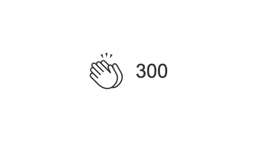
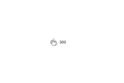
const INITIAL_COUNT = 300;
const APPLAUSE_MAX = 50;
const ApplauseButton = () => {
const [applause, setTotalApplause] = useState(0);
const handleClick = () => {
setTotalApplause((prevState) => prevState + 1);
};
return (
<div className="outer-container">
<button
type="button"
className="applause-button"
onClick={handleClick}
disabled={applause >= APPLAUSE_MAX}
>
<HandsOutline className="hands" />
<span className="counter">{applause + INITIAL_COUNT}</span>
</button>
</div>
);
};
export default ApplauseButton;
To create our base applause counter functionality, we add a button with a click handler to increment the applause state by one whenever the button is clicked. The button itself contains an "empty" SVG icon that will display until a user interacts with it for the first time. We will start with an arbitrary initial count of 300.
We also want to disable the button if the applause state value reaches our APPLAUSE_MAX of 50. This accomplishes #1 and #5 from the list above.
Next let's add some base styles.
:root {
  --black: #333;
}

.applause-button {
  border: none;
  background: none;
  display: flex;
  align-items: center;
  cursor: pointer;
  padding: 10px;
  position: relative;
  outline: none;
  color: var(--black);
}

.applause-button:disabled {
  cursor: not-allowed;
}

.applause-button .hands {
  fill: var(--black);
  margin-right: 7px;
  transition: transform 0.2s ease;
}
So far, you should have a basic counter that increments up to 350.
Button Click Interactions
Next let's add the interactions around clicking the button. There are three things that occur when the button is clicked.
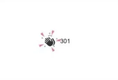
- If the button is being clicked for the first time, we swap the "outline" variation of the icon with a filled-in variation.
- We display a "spark" effect.
- We scale the button up to appear slightly larger.
In order to help manage our CSS classes and make them more readable, we'll use a really helpful NPM package:
classnames. If you aren't familiar with it, please check the docs to see how it works.
First we want to add a new state value named clicked. This will be used for adding a CSS class to control the spark effect, button scale, as well as some additional things that are covered later. We'll set this state to true each time the button is clicked and back to false after a short timeout duration,
const INITIAL_COUNT = 300;
const APPLAUSE_MAX = 50;
const CLICK_THRESHOLD = 250;

const ApplauseButton = () => {
  let clickTimer = useRef(null);
  const [clicked, setIsClicked] = useState(false);

  const handleClick = () => {
    setIsClicked(true);
		setTotalApplause(prevState => prevState + 1);
  };

  useEffect(() => {
    if (clicked) {
      clickTimer.current = setTimeout(() => setIsClicked(false), CLICK_THRESHOLD);
    }

    return () => {
      clearTimeout(clickTimer.current);
    };
  }, [applause, clicked]);

	return (
		...
		<button
      ...
      className={cn("applause-button", {
        clicked,
      })}
      ...
    >
	)
}
Button Interacted State
Next we want to display a different icon depending on if the button has been clicked before. For this, we can add a hasInteracted state value and use that to determine the icon. We set this state only once within the handleClick function when the button is clicked.
const ApplauseButton = () => {
  ...
  ...
  const [hasInteracted, setHasInteracted] = useState(false);

  const handleClick = () => {
    ...
    setHasInteracted(true);
    ...
  };

	return (
		...
		<button
      ...
      className={cn("applause-button", {
        clicked,
				interacted: hasInteracted,
      })}
      ...
    >
		{hasInteracted ? (
      <Hands className="hands" />
    ) : (
      <HandsOutline className="hands" />
    )}
		...
	)
Spark Effect
When it comes to creating the "spark" effect, there are plenty of ways to accomplish it.
I chose to use an SVG that randomly rotates left or right and scales upwards on animation.
const sparkTilt = Math.random() < 0.5 ? 'left' : 'right';
For the randomization, we use Math.random() to generate a number between 0 and 1. If it's less than 0.5, we get a left CSS class that rotates the spark SVG to the left, otherwise we get a right class.
import React, { useState, useEffect, useRef } from "react";
import cn from "classnames";
import { ReactComponent as HandsOutline } from "./assets/hands-outline.svg";
import { ReactComponent as Hands } from "./assets/hands.svg";
import { ReactComponent as Spark } from "./assets/spark.svg";

const CLICK_THRESHOLD = 250;
const APPLAUSE_MAX = 50;
const INITIAL_COUNT = 300;

const ApplauseButton = () => {
  let clickTimer = useRef(null);
  const sparkTilt = Math.random() < 0.5 ? 'left' : 'right';

  const [applause, setTotalApplause] = useState(0);
  const [clicked, setIsClicked] = useState(false);
  const [hasInteracted, setHasInteracted] = useState(false);

  const handleClick = () => {
    setIsClicked(true);
    setHasInteracted(true);
    setTotalApplause(prevState => prevState + 1);
  };

  useEffect(() => {
    if (clicked) {
      clickTimer.current = setTimeout(() => setIsClicked(false), CLICK_THRESHOLD);
    }

    return () => {
      clearTimeout(clickTimer.current);
    };
  }, [applause, clicked]);

  return (
    <div className="container">
      <div className="outer-container">
        <button
          type="button"
          className={cn("applause-button", {
            clicked,
            interacted: hasInteracted,
          })}
          onClick={handleClick}
          disabled={applause >= APPLAUSE_MAX}
        >
          {hasInteracted ? (
            <Hands className="hands" />
          ) : (
            <HandsOutline className="hands" />
          )}
          <div className={cn('spark-container', sparkTilt)}>
            <Spark className="spark" />
          </div>
          <span className="counter">{applause + INITIAL_COUNT}</span>
        </button>
      </div>
    </div>
  );
};

export default ApplauseButton;
The CSS for the effect is as follows:
.applause-button.clicked .spark {
  animation: spark 0.25s ease forwards;
}

.spark-container {
  position: absolute;
  left: 0;
  top: 0;
  z-index: 1;
}

.spark-container.left {
  transform: rotate(-20deg);
}

.spark-container.right {
  transform: rotate(20deg);
}

.spark-container .spark {
  opacity: 0;
  visibility: hidden;
  transform: scale(0.4);
}

@keyframes spark {
  20% {
    opacity: 1;
    visibility: visible;
  }

  70% {
    opacity: 1;
  }

  100% {
    opacity: 0;
    transform: scale(1.4);
  }
}
We absolutely position the spark container over the hands icon, and then rotate it to the left or right by 20 degrees depending on what CSS class (right or left) it is assigned.
For the animation keyframe, we want the SVG to start scaled down to 0.4 and then increased to 1.4 by the end of the transition.
Icon Scale
Finally, we just need to add a slight scale up effect for the icon at the same time the spark animation is occurring.
This is done using the .clicked class we added above.
.applause-button.clicked .hands {
  transform: scale(1.1);
  fill: #777;
}
With all of this in place, we should now be seeing some fun animation effects on click!
Adding the Applause Counter Bubble
The last piece of this button is adding the bubble effect that displays your total amount of applause and animates upwards after a certain amount of time if no clicks have occurred. To do this, we'll add another state value named active as well as another timer named bubbleTimer.
...
const BUBBLE_THRESHOLD = 1000;

const ApplauseButton = () => {
  let bubbleTimer = useRef(null);

  const [active, setIsActive] = useState(false);

  const handleClick = () => {
		...
    setIsActive(true);
  };

	useEffect(() => {
    if (active) { // change from clicked state value to active state value
      ...
      bubbleTimer.current = setTimeout(() => setIsActive(false), BUBBLE_THRESHOLD);
    }

    return () => {
      ...
      clearTimeout(bubbleTimer.current);
    }
  }, [applause, active]);
Now that we have our active state added, we want to replace the clicked value we were using in our if statement inside the useEffect hook.
Next we want to make sure we have an active class available to use on the button, as well as an inactive class to know when to start hiding the bubble.
<button
  className={cn('applause-button', {
    active,
    inactive: !active,
    ...
  })}
></button>
Finally, we add an applause bubble <span /> inside of the button.
<button
  type="button"
  className={cn('applause-button', {
    active,
    inactive: !active,
    clicked,
    interacted: hasInteracted,
  })}
  onClick={handleClick}
  disabled={applause >= APPLAUSE_MAX}
>
  ...
  <span className="bubble">{`+${applause}`}</span>
  ...
</button>
Here are our remaining styles for the counter bubble:
/* Visually hide the counter span while the button is active */
.applause-button.active .counter {
  visibility: hidden;
}

/* When the button becomes inactive, we want to start the upwards transition */
.applause-button.interacted.inactive .bubble {
  animation: bubble 0.55s ease forwards;
}

.applause-button.active .bubble,
.applause-button.clicked .bubble {
  opacity: 1;
  visibility: visible;
}

.applause-button.active .bubble {
  transform: translateY(-40px);
}

/* The bubble has a very slight scale transition when clicked */
.applause-button.clicked .bubble {
  transform: translateY(-40px) scale(1.05);
}

.bubble {
  opacity: 0;
  visibility: hidden;
  position: absolute;
  left: 3px;
  height: 42px;
  width: 42px;
  display: flex;
  justify-content: center;
  align-items: center;
  background: var(--black);
  color: #ffffff;
  padding: 10px;
  border-radius: 30px;
  transform: translateY(-30px);
  transition: transform 0.1s ease;
}

@keyframes bubble {
  0% {
    opacity: 1;
    visibility: visible;
    transform: translateY(-40px);
  }

  60% {
    opacity: 1;
  }

  100% {
    opacity: 0;
    transform: translateY(-100px);
  }
}
When the button is active, it becomes visible, but does not yet begin its transition out until the 1000ms threshold elapses without any additional clicks. Once that happens, the button will get the inactive class and that's the trigger to begin the upwards transition.
Our applause button is now complete!
One missing piece that wasn't covered is the ability to hold a click down over the button to rapidly increment the applause counter. See if you can solve for this yourself!
Summary
And there you have it: my take on the Medium applause button! It's not identical, but it covers most of the interactions.
As you can see, small UI interactions like these can actually be pretty complex just to show a short animation or transition. If used correctly, however, they add a bit of delight for your users and can even help encourage them to perform a certain action, like applauding posts.