
Making Progress With Progress Indicators: Part 2
Part two on building progress indicators. This time, using SVG animation.
This post is a continuation of Making Progress with Progress Indicators: Part 1 and will leverage the same type of "stepped" progress indicator, except this time we will be putting a different spin on the layout and progress animation. Please read Part 1 first, as we'll be reusing a lot of the same code.
The design for this post was inspired by this Dribbble shot by Tyler Wain.
Getting Started
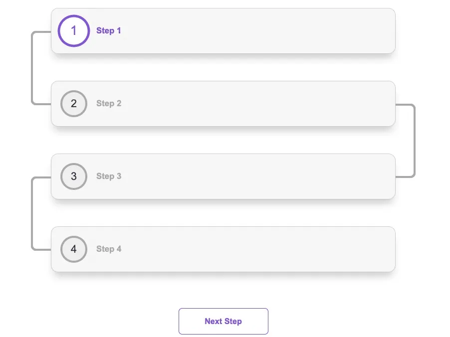
Our markup is going to be largely the same as Part 1, but with a few differences. In this example, the progress steps will have a card treatment, while the progress bar will have a curved appearance. When transitioning between steps, we want the progress bar to fill with our active color when moving forward and reverse when moving backwards.
Instead of using CSS pseudo elements to create the progress bars, we're going to be using SVG elements and animating properties to get our desired effect.
Progress Bar Markup
First let's take a look at the SVGs themselves. ProgressBarRight.svg is just a horizontally flipped version of ProgressBarLeft.svg.

// ProgressBarLeft.svg
<svg width="47" height="166" viewBox="0 0 47 166" fill="none" xmlns="http://www.w3.org/2000/svg">
  <path className="empty" d="M47 2H12C6.47715 2 2 6.47715 2 12V154C2 159.523 6.47715 164 12 164H47" stroke-width="5"/>
  <path className="fill" d="M57 2H12C6.47715 2 2 6.47715 2 12V154C2 159.523 6.47715 164 12 164H47" stroke-width="5"/>
</svg>

// ProgressBarRight.svg
<svg width="47" height="166" viewBox="0 0 47 166" fill="none" xmlns="http://www.w3.org/2000/svg">
  <path className="empty" d="M-1.3411e-06 2H35C40.5228 2 45 6.47715 45 12V154C45 159.523 40.5228 164 35 164H-1.3411e-06" stroke-width="5"/>
  <path className="fill" d="M-1.3411e-06 2H35C40.5228 2 45 6.47715 45 12V154C45 159.523 40.5228 164 35 164H-1.3411e-06" stroke-width="5"/>
</svg>
The important thing here is that we have two SVG paths: one for our "empty" state and one for our "fill" state. We'll use these specific classes to target with CSS properties in the next section.
Next let's render these SVGs.
Note that with the exception of adding the SVGs, and the logic around them, all of the other JSX here is an exact copy from the previous post.
...
import { ReactComponent as ProgressBarLeft } from './progressBarLeft.svg';
import { ReactComponent as ProgressBarRight } from './progressBarRight.svg';

const ProgressIndicatorPartTwo = () => {
  ...
  return (
    <div className="container">
      <ul className="progress-indicator">
        {steps.map((step) => (
          <li
            key={step.index}
            className={`
              progress-step
              ${activeIndex === step.index ? 'active' : 'inactive'}
              ${activeIndex > step.index ? 'complete' : 'incomplete'}
              step-${step.index + 1}
            `}
          >
            {step.index < (steps.length - 1) && (
              step.index % 2 === 0 ? (
                <ProgressBarLeft className="progress-bar left" />
              ) : (
                <ProgressBarRight className="progress-bar right" />
              )
            )}
            <span className="step-number">{step.index + 1}</span>
            <h3>{step.label}</h3>
          </li>
        ))}
      </ul>
      ...
    </div>
  );
};
Within the progress-step list item, we'll want to add some conditional logic. We should only render a progress bar on steps that are not the last step, so our logic should check for that: step.index < (steps.length - 1).
We also want to render the ProgressBarRight on step indexes that are odd numbers and ProgressBarLeft on even. To do that, add a modulus operator and check if the index is divisible by 2: step.index % 2 === 0. If it is, render the left. Otherwise, render the right.
This should give us our progress bar SVGs. Next let's add some styles.
Base Styles
We'll be using the same CSS variables for colors as we did in part one. We'll also be using almost the same actions, progress-button, and step-number styles, with a few minor changes, so feel free to copy all of the code below, as we won't be going through it.
:root {
  --black: #333333;
  --white: #ffffff;
  --purple: #8057d7;
  --gray: #aaaaaa;
}

.actions {
  display: flex;
  justify-content: center;
}

.progress-button {
  background: none;
  cursor: pointer;
  border: 1px solid var(--purple);
  font-size: 18px;
  padding: 18px;
  color: var(--purple);
  font-weight: 700;
  margin: 0 10px;
  min-width: 200px;
  border-radius: 8px;
}

.progress-step .step-number {
  display: flex;
  justify-content: center;
  align-items: center;
  border: 4px solid transparent;
  background: transparent;
  border-radius: 50%;
  padding: 20px;
  height: 60px; /* Height 60px vs 80px from part one */
  width: 60px; /* Height 60px vs 80px from part one */
  font-size: 24px;
  z-index: 1;
  color: var(--purple);
	/* 1s delay vs. 0.5s from part one */
  transition: transform 0.5s ease 1s, background 0.5s ease, border-color 0.5s ease;
}

.progress-step.incomplete .step-number {
  background: #eeeeee;
  border-color: var(--gray);
  color: var(--black);
}

.progress-step.active .step-number {
  background: var(--white);
  border-color: var(--purple);
  color: var(--purple);
  transform: scale(1.2);
}

.progress-step.complete .step-number {
  background: var(--purple);
  color: var(--white);
}

.progress-step h3 {
  margin-left: 20px; /* vs. margin: 20px 0 0; from part one */
  color: var(--gray);
}

.progress-step.active h3 {
  color: var(--purple);
}

.progress-step.complete h3 {
  color: var(--black);
}
Let's start with the main progress-indicator container.
.progress-indicator {
  display: flex;
  flex-direction: column;
  align-items: center;
  margin: 50px 0;
  list-style: none;
  padding: 0 50px;
}
We want to use flexbox to align all of the steps into a column and align-items to center align all of the items. We also want some padding on the left and the right so that this layout won't be cut off when viewed on smaller devices.
Now for the progress-step and progress-bar.
.progress-step {
  display: flex;
  align-items: center;
  background: #f7f7f7;
  list-style: none;
  border-radius: 16px;
  border: 1px solid #cccccc;
  box-shadow: 0px 15px 16px -7px rgba(0, 0, 0, 0.2);
  padding: 20px;
  width: 100%;
  max-width: 768px;
  margin: 30px 0;
  position: relative;
}

.progress-bar {
  position: absolute;
  top: 50%;
  z-index: -1; /* Hide any bar overlap under the progress-step */
}

.progress-bar .empty {
  stroke: var(--gray);
}

.progress-bar.left {
  left: -6%;
}

.progress-bar.right {
  right: -6%;
}
We use flexbox here too for the alignment of the progress-step number and label. The rest of the styles are to set the background color, box shadow and position properties.
For the progress-bar, we want to absolutely position it 50% from the top of each progress-step, and -6% to the left or the right, depending on its left or right class.
Lastly, we set the stroke color of the empty path in our SVG to be gray.
With all of the above, you should be seeing this so far.
Animating the Progress Bar
Now for the fun part! Let's animate the SVGs we're using for the completed "fill" state of the progress indicator bars. Fortunately, we can do all of this in CSS, and it's where the second path in our SVGs come into play.
For a great explanation of how this works, please see this article from Chris Coyier.
.progress-step .fill {
  stroke-dasharray: 255;
  stroke-dashoffset: 255;
}
The key attributes here are stroke-dasharray and stroke-dashoffset.
The stroke-dasharray attribute is a presentation attribute defining the pattern of dashes and gaps used to paint the outline of the shape. - MDN Docs
You can basically think of dasharray (with the value we used) as a single long dash with the same position of the underlying path. The 255 value we set is somewhat arbitrary and works for the size of these particular SVGs to "cover" the whole path.
The stroke-dashoffset attribute is a presentation attribute defining an offset on the rendering of the associated dash array. - MDN Docs
The dashoffset attribute, on the other hand, is a way to move the dasharray we defined above. And that's exactly what we want to do when the complete class is added to the progress-step. The purple stroke value provides a "fill" color, and the animation keyframe will handle adjusting the dash-offset.
Similar to what we did in the previous post, it's important to add the forwards animation-fill-mode shorthand value, so that the animation maintains its end position.
.progress-step.complete .fill {
  animation: progress 1.5s ease forwards;
  stroke: var(--purple);
}

@keyframes progress {
  to {
    stroke-dashoffset: 0; /* Animate down to no stroke value (ie full) */
  }
}
In our keyframe, we want to "move" the purple fill value we defined to a value of zero over 1.5 seconds. Clicking the Next Step button should now give us the effect we're looking for!
You might be wondering why we didn't set the animation property on the .progress-step .fill selector. This is because we need to create another keyframe to handle the empty state animation when a user moves backwards via the Previous Step button. This is done using the .incomplete selector.
.progress-step.incomplete .fill {
  animation: progressReverse 1.5s ease forwards;
}

.progress-step.active.incomplete .fill {
  stroke: var(--purple);
  stroke-dashoffset: 0;
}

@keyframes progressReverse {
  to {
    stroke-dashoffset: 255;
  }
}
Now we can reverse the animation back to the initial empty value by setting the stroke-dashoffset back to its initial value.
Preventing Animation on Initial Load
We should make one final change. If you refresh the page, you'll see that the progressReverse animation runs right away on page load. This is happening because the first step is both active and incomplete: the same selectors we're using to determine when to run our "reverse" fill animation.
We don't want that to happen, so one way we can prevent this is to add a class onto the progress steps after our initial mount and update the CSS selector with that specific class.
import React, { useState, useEffect } from 'react';
...
const ProgressIndicatorPartTwo = () => {
	...
  const [isReady, setIsReady] = useState(false);

  // Prevents the inactive animation on first page load
  useEffect(() => {
    setTimeout(() => {
      setIsReady(true);
    }, 2000);
  }, []);

  return (
    {steps.map((step) => (
      <li
	      key={step.index}
        className={`
          progress-step
          ${activeIndex === step.index ? 'active' : 'inactive'}
          ${activeIndex > step.index ? 'complete' : 'incomplete'}
          ${isReady ? 'ready' : 'not-ready'}
          step-${step.index + 1}
        `}
      >
      ...
      </li>
    }
  )
}
We do this by adding a useEffect hook that only runs only once, which sets a timeout to update our isReady state that adds a ready class after two seconds. This way we prevent the animation from running until it's ready, active and incomplete.
The updated CSS selector looks like this:
.progress-step.ready.active.incomplete .fill {
  stroke: var(--purple);
  stroke-dashoffset: 0;
}
Now we have a fully functioning and animated progress indicator!