
Making Progress With Progress Indicators: Part 1
The first of a two part series exploring stepped progress indicators.
Today we're going to be building a stepped progress indicator. This type of UI element is typically used when gathering multiple pieces of user information, such as creating an account, doing your taxes or really any action that contains multiple steps. You want to make it obvious to the user how far along they are, and a progress indicator does exactly that.
This example will be in React, but the concept and styles are the same regardless of what framework you're using.
The design for this post was inspired by this Dribbble shot from Tyler Wain.
The Progress Indicator
We'll begin by creating a new component named ProgressIndicator.jsx. It will contain the indicator, the previous/next actions and the state that manages the index of the active step.
import React, { useState } from 'react';

const ProgressIndicator = () => {
  const [activeIndex, setActiveIndex] = useState(0);
  return ();
}
We also want to create an array that serves as the data source for our steps. In a more real world scenario, these steps would contain additional properties like content, forms or other React components. But, for the purposes of this demo, we only need a step index and a label.
const steps = [
  {
    index: 0,
    label: 'Step 1',
  },
  {
    index: 1,
    label: 'Step 2',
  },
  {
    index: 2,
    label: 'Step 3',
  },
  {
    index: 3,
    label: 'Step 4',
  }
];

const ProgressIndicator = () => { ... }
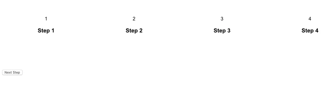
Now for the markup. Let's start with a container div and an unordered list. Then, we want to map over our steps and output a list item that has conditionally added classes, a span that will display our step number and an h3 that will display the step label.
return (
  <div className="progress-container">
    <ul className="progress-indicator">
      {steps.map((step) => (
        <li
          key={step.index}
          className={`
            progress-step
            ${activeIndex === step.index ? 'active' : 'inactive'}
            ${activeIndex > step.index ? 'complete' : 'incomplete'}
          `}
        >
          <span className="step-number">{step.index + 1}</span>
          <h3>{step.label}</h3>
        </li>
      ))}
    </ul>
  </div>
);
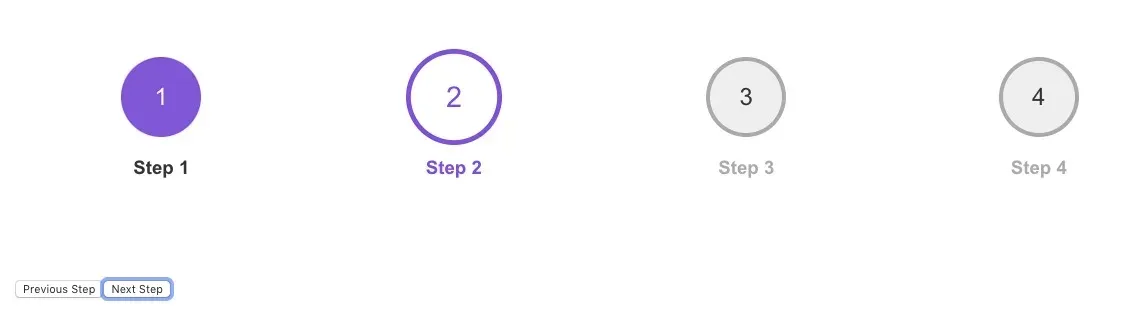
Each list item element should have a class of progress-step. Additionally, we want the step that is currently active to have an active class, and for all others, an inactive class. We determine this by adding a ternary operator that compares the activeIndex value against the steps index. If they're equal, then that step must be currently active. In that case, we apply an active class. Otherwise, it's inactive.
We do something similar for the complete or incomplete classes, except here we check if the activeIndex is greater than the step index. If it is, then the user must have already completed it.
For the step-number, since the step.index value is zero based, we need to add 1 to it.
Previous and Next Actions
Now we'll add buttons to update the state in order to progress to the next or previous step.
Note that in a lot of use cases, there may not be actions as concise as "next" or "previous" guiding the user. Moving to the next step may involve submitting a form or performing some other type of action.
First, each button should have an onClick event handler that will tell our setActiveIndex function which index to update the state to.
return (
  <div className="progress-container">
    <ul className="progress-indicator">...</ul>
    <div className="actions">
      {activeIndex > 0 && (
        <button
          onClick={() => setActiveIndex(activeIndex - 1)}
          className="progress-button prev"
        >Previous Step</button>
      )}
     {activeIndex < (steps.length - 1) && (
       <button
         onClick={() => setActiveIndex(activeIndex + 1)}
         className="progress-button next"
       >Next Step</button>
     )}
    </div>
  </div>
);
In order to go back a step, take the active index and subtract one. To move forward, add one.
Finally, we only render these buttons when necessary. Starting with the previous step button, render it if the user is past the first step. To do this, we add a conditional check activeIndex > 0. Now the previous button will only display if the user is on step 2 or greater.
For the next step button, we want to render it on every step except the last. To do this, we use the activeIndex state value and compare that against the amount of steps there are: steps.length - 1.
Now onto the styling!
Progress Indicator Layout
Let's first apply the general layout styles. On our main progress-indicator list, want to use flexbox here with a flex-direction of row to position the elements. Because this is an unordered list, there are a few additional properties to remove padding and list style.
.progress-indicator {
  display: flex;
  flex-direction: row;
  padding: 0;
  list-style: none;
}

.progress-step {
  display: flex;
  justify-content: center;
  flex-direction: column;
  align-items: center;
  flex: auto;
  position: relative;
}
For the individual progress-step items, we'll use flexbox to position their content, in this case as a column, with the step number first and the label right after it. We do this by setting the flex-direction to column. We also want to set the flex shorthand value to auto, so that each element takes up an equal amount of space in the row.
The layout is already starting to come together!
Next, let's add styles for the steps. We won't go through every property here – just the ones around the transitions. Note that CSS variables are being used to prevent repeating color values.
:root {
  --black: #333333;
  --white: #ffffff;
  --purple: #8057d7;
  --gray: #aaaaaa;
}

.progress-step .step-number {
  display: flex;
  justify-content: center;
  align-items: center;
  border: 4px solid transparent;
  background: transparent;
  border-radius: 50%;
  padding: 20px;
  height: 80px;
  width: 80px;
  font-size: 24px;
  z-index: 1;
  color: var(--purple);
  transition: transform 0.5s ease 0.5s, background 0.5s ease, border-color 0.5s ease;
}

.progress-step.incomplete .step-number {
  background: #eeeeee;
  border-color: var(--gray);
  color: var(--black);
}

.progress-step.active .step-number {
  background: var(--white);
  border-color: var(--purple);
  color: var(--purple);
  transform: scale(1.2);
}

.progress-step.complete .step-number {
  background: var(--purple);
  color: var(--white);
}

.progress-step h3 {
  margin: 20px 0 0;
  color: var(--gray);
}

.progress-step.active h3 {
  color: var(--purple);
}

.progress-step.complete h3 {
  color: var(--black);
}
When a step is active, we want to transition the step-number so it appears slightly larger, so we can use the transform property to scale the value to 1.2.
Notice how we didn't use transition: all 0.5s ease to transition all of the properties, and instead listed the three individually. This gives us more control, specifically over timing, so that we're able to add a short delay before the transform occurs. This is done by adding a shorthand transition-delay value of 0.5s only to the transform property. The other transitions should happen without a delay.
transition: transform 0.5s ease 0.5s, background 0.5s ease, border-color 0.5s ease;
Now our steps are looking better and clicking through the next and previous buttons should be applying the correct styles. Let's move on to the progress bar and its animation.
Progress Bar
The progress bar is the line that connects all of the steps and is the trickiest part of our styles. I chose to use before and after pseudo elements for this, but there are likely other ways to accomplish this visual treatment as well.
The before element serves as the main gray background of the bar. The after element will be the purple animating background. It's visible when progressing to the next step and on completed steps. They are both positioned on top of each other.
We only need to apply these pseudo elements to the first three steps. To do this, we can use a combination of the the :not() and :last-child selectors.
.progress-step:not(:last-child):before,
.progress-step:not(:last-child):after {
  content: '';
  position: absolute;
  height: 4px;
  left: 50%;
  top: 35px;
}

.progress-step:before {
  width: 100%;
  background: var(--gray);
}
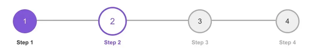
Next, if progress-step has a complete or incomplete class, we want to animate the width property of the after pseudo element. We'll use some animation keyframes to do this.
Notice the forwards value at the end of the animation value. This is important so that when the animation is finished, it maintains the ending value. Otherwise it will reset back to the initial value when the animation completes.
.progress-step.complete:after {
  background: var(--purple);
  animation: progressWidth 0.5s ease forwards;
}

.progress-step.incomplete:after {
  background: var(--purple);
  animation: progressWidthReverse 0.5s ease forwards;
}

@keyframes progressWidth {
  0% {
    width: 0%;
  }
  100% {
    width: 100%;
  }
}

@keyframes progressWidthReverse {
  0% {
    width: 100%;
  }
  100% {
    width: 0%;
  }
}
Also note that we have a separate progressWidthReverse keyframe. This is to apply essentially the exact animation, only in reverse, when moving backwards with the previous button.
Previous/Next Buttons
Finally, we need to apply some styles for the next and previous progress buttons.
.actions {
  display: flex;
  justify-content: center;
}

.progress-button {
  background: none;
  cursor: pointer;
  border: 1px solid var(--purple);
  font-size: 18px;
  padding: 18px;
  color: var(--purple);
  font-weight: 700;
  margin: 0 10px;
  min-width: 200px;
  border-radius: 8px;
}
With this last bit of styling in place, you should now have a complete progress indicator!
What About Mobile?
You'll notice that this treatment works great on desktop and tablet, but on smaller devices the horizontal layout may be too wide, depending on how many steps there are. I didn't cover mobile in this post, because in real world use cases, there are several different layout options available. You could display the progress indicator vertically, or hide it altogether and show some other simpler treatment.
Summary
Hopefully this post gives you some ideas for building some stepped UI treatments. Progress indicators are a great way to break up long forms, and can be visually pleasing just by adding some basic CSS transitions.