
How to Build a Story Layout
Create an image story layout like those seen in popular apps.
Over the past several years, apps like Instagram, Facebook, Snapchat, and even services like Coinbase and Spotify have used "stories" to stitch together images or video slides uploaded by a user. No matter where you've seen them, they will feel familiar.
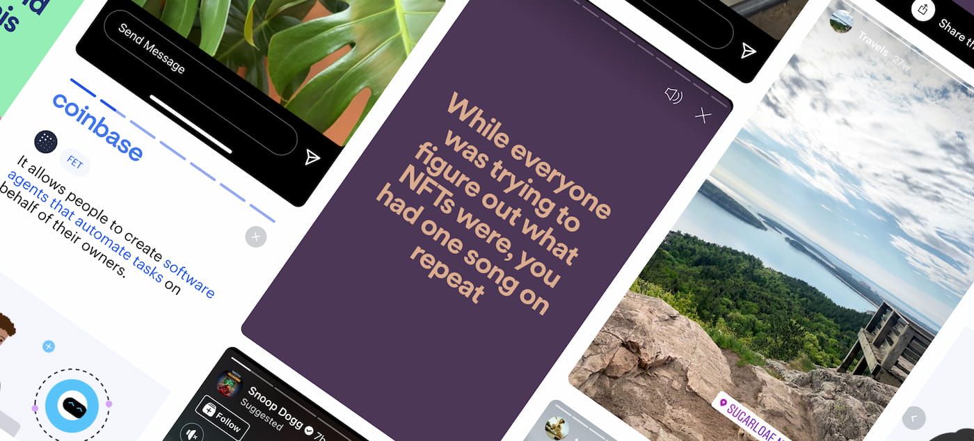
Since this style of layout has become more and more popular, I used Instagram Stories as a source of inspiration and built something similar to it using React. In this article, I'll show you how I did it.
By the end, you'll learn how to:
- Use several types of React hooks
- Create a basic timing animation in CSS
- Use
setInterval- Add and remove event listeners
There are certainly many different ways to accomplish what is discussed in this article, and there are parts that could be expanded upon that we won't cover. Those are discussed in the last section.
Configuration and Data
Let's start by determining what kind of data we'll need. Each story will consist of an object with some info about the user and a number of slides. Each object will have some properties:
username- A username string associated to the storythumbnail- An object containingsrcandaltstrings for the user's thumbnailslides- An array of objects, each containingtextandimagestringstimer- An optional number (in milliseconds) that controls how long each slide is visible before switching to the next one
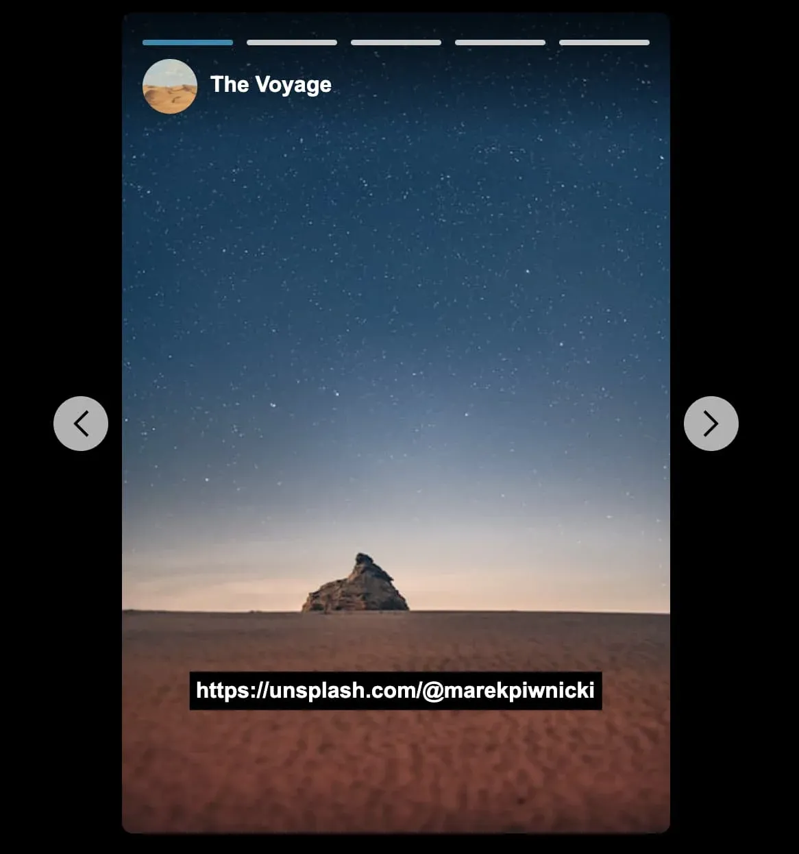
{
  username: 'The Voyage',
  thumbnail: {
    src: thumb1,
    alt: 'thumb 1',
  },
  slides: [
    {
      text: 'Slide text',
      image: '/path/to/image',
    },
    ...
  ],
  timer: 4000,
},
The Main Stories Component
Our layout will consist of three React components: Stories, StoryThumbnail and Story.
First, make a new file named Stories.jsx. This will be our main parent component that renders everything else. And, it will take one prop stories, which is the data structure we decided on in the last section.
import { useRef, useEffect, useCallback, useState } from 'react';

const Stories = ({ stories }) => {
  const [activeStoryIndex, setActiveStoryIndex] = useState(null);

	return (
    <div className="stories">...</div>
  );
}

export default Stories;
Within this component, we'll want to import several of the default React hooks: useRef, useEffect, useCallback, and useState.
We want to keep track of one state value activeStoryIndex, which is used to determine what story to display when the modal opens.
As a way to open the modal to a specific story, add a function named handleModalOpen.
const handleModalOpen = (index) => {
  setActiveStoryIndex(index);
}
We also need a function to "reset" the active index. This will be assigned to the close button, as well as run programmatically later on.
const handleModalClose = () => {
  setActiveStoryIndex(null);
}
Now let's render the thumbnails that display the stories.
Create a component named StoryThumbnail, either in its own file or inside the Stories file we just created.
const StoryThumbnail = ({
  thumbnail,
  index,
  setActiveStory,
  user,
}) => (
  <button className="thumbnail" onClick={() => setActiveStory(index)}>
    <img src={thumbnail.src} alt={thumbnail.alt} />
    <span>{user}</span>
  </button>
);

export default StoryThumbnail;
This component is pretty straightforward. All it does is display the story thumbnail image within a button, and clicking the button updates the activeStoryIndex state.
Back in the Stories component, let's use this new component by iterating over the stories prop and passing the thumbnail, index, setActiveStory, and user props.
import StoryThumbnail from './StoryThumbnail';

const Stories = ({ stories }) => {
	return (
	  <div className="stories">
			{stories.map((story, index) => (
	      <StoryThumbnail
	        key={index}
					thumbnail={story.thumbnail}
					index={index}
	        setActiveStory={handleModalOpen}
	        user={story.username}
	      />
	    ))}
		</div>
	);
}
Now, to finally see something on the page, let's render the main Stories component by passing it some data.
// Some component where you want to render our progress so far
const Page = () => {
  return (
    <div className="container">
      <Stories stories={stories} />
    </div>
  );
};

So far so good! If you add console.log(activeStoryIndex) into the Stories component, you should see the state value logged when each thumbnail is clicked.
Let's finish up the thumbnails with some basic styling while we're at it.
:root {
  --width: 640px;
  --animation-timing: 4s;
  --primary: #118ab2;
  --white: #fff;
  --black: #000;
  --button-size: 40px;
}

img {
  vertical-align: middle;
}

button {
  border: none;
  background: none;
  cursor: pointer;
  padding: 0;
}

.stories {
  display: flex;
  justify-content: center;
  max-width: var(--width);
  margin: 50px auto;
}

.thumbnail {
  display: block;
  margin: 10px;
  border-radius: 60px;
}

.thumbnail img {
  width: 100px;
  height: 100px;
  border: 3px solid var(--primary);
  padding: 2px;
  border-radius: 50%;
}

.thumbnail span {
  display: block;
  margin-top: 10px;
  font-weight: 700;
}
Some of the CSS variables above will be used later, but you can add them now.

Determining the Active Story
Next we should determine which story is "active" when a thumbnail is clicked.
To do this, we select a story at a specific index from the stories array using the activeStoryIndex state value.
const Stories = ({ stories }) => {
	const [activeStoryIndex, setActiveStoryIndex] = useState(null);
	const activeStory = stories[activeStoryIndex];

	return ( ... );
}
With the activeStory const, we have the data we should display now, so let's update the return statement to show either the thumbnails or the story. We'll add a Story component in the next section.
const Stories = ({ stories }) => {
	...
	return (
	  <div className="stories">
	    {!activeStory ? (
	      stories.map((story, index) => (
	        <StoryThumbnail
	          key={index}
	          setActiveStory={handleModalOpen}
	          index={index}
	          thumbnail={story.thumbnail}
	          user={story.username}
	        />
	      ))
	    ) : (
	      <Story
          story={activeStory}
          goToPrevStory={() => setActiveStoryIndex(activeStoryIndex - 1)}
          goToNextStory={() => setActiveStoryIndex(activeStoryIndex + 1)}
          handleCloseClick={handleModalClose}
        />
	    )}
	  </div>
	);
}
Story Component
Next, create a new file named Story.jsx. This is the last component we'll need, and it displays most of the UI like the slides for each story, the modal background, and the close button.
import React, { useState, useEffect } from 'react';
import cn from 'classnames';

const Story = ({
  story,
  goToPrevStory,
  goToNextStory,
  handleCloseClick,
}) => {
  const [currentSlideIndex, setCurrentSlideIndex] = useState(0);

	// Destructure some of the data from our story data
  const { slides, timer = 4000, thumbnail, username } = story;

	// Determine the current slide to show
  const currentSlide = slides[currentSlideIndex];
  const slideCount = slides.length;

	return (...);
}

export default Story;
Note that we're using the
classnameslibrary. This is optional, but it's a helpful tool to manage CSS classes.
Just like the main Stories component, this one will also use an index value to determine which slide to display.
We will need two functions to control the previous and next button navigation. Each of them will update the slide index of the Stories parent component.
const handlePrevClick = () => {
  setCurrentSlideIndex(currentSlideIndex - 1);
}

const handleNextClick = () => {
  setCurrentSlideIndex(currentSlideIndex + 1);
}
Now for the markup.
The CSS for the elements is included as part of each section. We won't cover each property, just the important parts.
First we need a backdrop div, which serves as the dark modal background. We also need a close button.
return (
  <>
    <div className="backdrop" />
    <button className="close" onClick={handleCloseClick}>
      <Close />
    </button>
  </>
);
Note that we're using a shorthand React fragment here because the backdrop and close button should be adjacent to the story div.
The Close icon above is an SVG imported as a React component
.backdrop {
  background: var(--black);
  position: fixed;
  left: 0;
  top: 0;
  right: 0;
  bottom: 0;
  z-index: 100;
}

.close {
  position: fixed;
  top: 10px;
  right: 10px;
  z-index: 101;
}

.close svg {
  fill: var(--white);
  height: 40px;
  width: 40px;
}
Next we have the story div that contains all of the other content.
return (
  <>
    <div className="backdrop" />
    <button className="close" onClick={handleCloseClick}>
      <Close />
    </button>
    <div
      className="story"
      style={{ backgroundImage: `url(${currentSlide.image})` }}
    >
      ...
    </div>
  </>
);
.story {
  background: var(--black);
  background-repeat: no-repeat;
  background-size: cover;
  max-width: 400px;
  border-radius: 8px;
  width: 100%;
  margin: auto;
  padding: 15px;
  position: relative;
  z-index: 100;
}

.story::before {
  content: '';
  width: 100%;
  height: 130px;
  left: 0;
  top: 0;
  background: linear-gradient(180deg, rgba(0, 0, 0, 0.7) 0%, rgba(255, 255, 255, 0) 70%);
  position: absolute;
}
We've included a before pseudo element positioned at the top of the story. This provides a subtle gradient background to make the username and thumbnail a bit more visible when a light-colored image is used.
You'll notice we're using a background image for the story slide itself. This decision was mostly just to get the image into place, without taking too much consideration for things like device type, loading display, etc. You'd ideally want to implement some sort of image lazyloading pattern where the next image is loaded while the current one is playing, but that's beyond the scope of this article.
Inside of the story div, we'll add some indicators that display the progress of each slide, as well as mark the current slide being viewed.
<div className="story" style={{ backgroundImage: `url(${currentSlide.image})` }}>
  <div className="indicators">
    {slides.map((slide, index) => (
      <span
        key={`${slide.text}-${index}`}
        className={cn('indicator', {
          complete: currentSlideIndex > index,
          active: currentSlideIndex === index,
        })}
      />
    ))}
  </div>
</div>
.indicators {
  display: flex;
  grid-gap: 10px;
  justify-content: space-between;
  margin: 5px 0 10px;
}

.indicator {
  display: block;
  width: 100%;
  height: 4px;
  border-radius: 12px;
  background: #ccc;
  position: relative;
  overflow: hidden;
}

.indicator.active {
  transition: transform 1s ease;
}

.indicator.complete {
  background: var(--primary);
}

.indicator.active::before {
  content: '';
  width: 100%;
  height: 100%;
  position: absolute;
  background: var(--primary);
}
Next we need a div for the slide itself. This displays the user thumbnail and name, as well as the slide text label.
<div className="story">
	<div className="indicators">...</div>
	<div className="slide">
	  <div className="user-info">
	    <img className="slide-thumb" src={thumbnail.src} alt={thumbnail.alt} />
	    <span>{username}</span>
	  </div>
	  <h3 className="label">{currentSlide.text}</h3>
	</div>
</div>
.slide {
  min-height: 550px;
  position: relative
}

.user-info img {
  height: 40px;
  width: 40px;
  border-radius: 50%;
  margin-right: 10px;
}

.user-info span {
  color: var(--white);
  font-weight: 700;
}

.label {
  color: var(--white);
  text-align: center;
  font-size: 16px;
  background: var(--black);
  padding: 5px;
  position: absolute;
  bottom: 45px;
  left: 50%;
  transform: translate(-50%, -50%);
}
Finally, the previous/next buttons.
<div className="story">
	<div className="indicators">...</div>
	<div className="slide">...</div>
	<div className="prev-next">
	  <button onClick={handlePrevClick}><Prev /></button>
	  <button onClick={handleNextClick}><Next /></button>
	</div>
</div>
.prev-next {
  position: absolute;
  top: calc(50% - var(--button-size) / 2);
  left: 5px;
  right: 5px;
}

.prev-next button {
  position: absolute;
  background: var(--white);
  height: var(--button-size);
  width: var(--button-size);
  border-radius: 50%;
  display: flex;
  justify-content: center;
  align-items: center;
  opacity: 0.7;
}

.prev-next button:first-child {
  left: 0;
}

.prev-next button:last-child {
  right: 0;
}

/* Slight repositioning of the elements on mobile */
@media screen and (min-width: 520px) {
  .prev-next {
    left: -50px;
    right: -50px;
  }
}
Note the usage of
calc()above. This is to get the button positioning to be 50% from the top of the slide, while also taking into account the button size, which we've saved as a variable.
All of the markup is now complete! So far, clicking on a story should open the modal with the content styled correctly. You can also click through the slides in a single story. But, moving to the next or previous story doesn't work yet so let's add that next.
Moving Between Stories
Back in the Story component, we need to make a couple of changes to the handlePrevClick and handleNextClick functions.
What we want to do is check the currentSlideIndex value and either update it, or reset it and move to the next or previous story.
const handlePrevClick = () => {
  const newIndex = currentSlideIndex - 1;

  if (newIndex < 0) {
    setCurrentSlideIndex(0);
    goToPrevStory();
  } else {
    setCurrentSlideIndex(newIndex);
  }
}
The changes for handleNextClick are similar. But here, we check to see if the currentSlideIndex with 1 added to it will equal the amount of slides we currently have. If that's the case, we're at the end of that stories slides, and we should run the goToNextStory() function.
const handleNextClick = () => {
  const newIndex = currentSlideIndex + 1;

  if (newIndex === slideCount) {
    setCurrentSlideIndex(0);
    goToNextStory();
  } else {
    setCurrentSlideIndex(newIndex);
  }
}
One other addition we need to make is in the Stories component. We need a way to close the modal once we've hit either the beginning of the stories list by clicking the previous button, or the end of the list by clicking next.
Inside of a useEffect hook, call the handleModalClose function if the activeStoryIndex value is less than 0, or if it's greater or equal to the total number of stories.
useEffect(() => {
  // Close the modal when reaching the beginning or end of the list
  if ((activeStoryIndex < 0) || (activeStoryIndex >= stories.length)) {
    handleModalClose();
  }
}, [activeStoryIndex, stories.length]);
Changing Slides Using setInterval
As is the case for Instagram stories, we should auto-play through each slide over a certain number of seconds. Fortunately, this is fairly easy to do.
In the Story component add a new useEffect hook.
We use let to store a reference to setInterval so that it can be cleared later on.
useEffect(() => {
  let interval;

	interval = setInterval(() => {}, timer);

	return () => {
    clearInterval(interval);
  }
}, []);
Inside setInterval, some logic is needed to check the slide index value and, depending on what it is, either continue moving through the slides, or reset the index and move to the next story.
useEffect(() => {
  let interval;

  interval = setInterval(() => {
    if (currentSlideIndex < slideCount - 1) {
      setCurrentSlideIndex(currentSlideIndex + 1);
    } else if (currentSlideIndex === slideCount - 1) {
      setCurrentSlideIndex(0);
      goToNextStory();
    }
  }, timer);

  return () => {
    clearInterval(interval);
  }
}, [goToNextStory, currentSlideIndex, slideCount, timer]);
Lastly, make sure the dependency array contains the values we're making use of.
Indicator Animation
The slide indicators are functioning now, but we can make them look a little nicer with some animation!
First, add a useEffect into the Story component.
// Set the CSS animation timing equal to the value in the story configuration
useEffect(() => {
  document.documentElement.style.setProperty('--animation-timing', `${timer}ms`);
}, [timer]);
The useEffect updates the --animation-timing CSS variable to match the timer value. This makes it dynamic. For example, one story could have its slides change every 4 seconds, and the next story could be every 8 seconds. The CSS animation will work with no changes needed.
Next there's some CSS to add.
.indicator.active::before {
  ...
  animation: fill var(--animation-timing) ease;
}

@keyframes fill {
  from {
    transform: translateX(-100%)
  }

  to {
    transform: translateX(0%)
  }
}
In the animation keyframe, the position of the background color should start from the left side (-100%) and go all the way to the right (0%).

Basic Keyboard Support
One last change we should make is when the escape key is pressed, it should close the modal. Fortunately, all we really need to do is add an event, check to make sure a specific key was pressed and close the modal if it was, and then determine when to remove the event.
This functionality could certainly be expanded upon. For example, enabling the arrow keys to navigate through the stories.
First let's revisit our Stories component.
We'll add a useRef value that will help us track when the modal is open.
const Stories = ({ stories }) => {
  ...
  const isModalOpenRef = useRef(false);
}
In the handleModalOpen function we wrote earlier, we want to set the value of the ref to true, and add a new event listener.
const handleModalOpen = (index) => {
  isModalOpenRef.current = true;
  setActiveStoryIndex(index);
  window.addEventListener('keyup', handleKeyPress);
}
Next add a new function, handleKeyPress to check if the escape key is pressed. If so, close the modal.
const handleKeyPress = useCallback((e) => {
  if (e.key === 'Escape') {
    handleModalClose();
  }
}, []);
Note the
useCallbackhook. We want this becausehandleKeyPressis referenced in two different useEffect locations as a dependency. This is recommended by thereact-hooks/exhaustive-depseslint rule to prevent the useEffect dependencies from changing on every render.
Next we need a useEffect hook that will remove the keyup event and reset the ref value when the modal is closed. In that scenario, activeStory will be false and the isModalRef value will still be true.
useEffect(() => {
  if (!activeStory && isModalOpenRef.current) {
    isModalOpenRef.current = false;
    window.removeEventListener('keyup', handleKeyPress);
  }
}, [activeStory, handleKeyPress]);
Last, we need to remove the event when the Stories component unmounts. This can be done by adding yet another useEffect hook to remove the event in the return function.
useEffect(() => {
  // Remove event on unmount
  return () => {
    window.removeEventListener('keyup', handleKeyPress);
  }
}, [handleKeyPress]);
Other Improvements
And we're done! If you wanted to take what we built here even further, below are some more improvements you could make. Maybe you've already identified a few of them.
Data Source
We hardcoded the data needed to display the UI, but to make it more scalable, you could store the data in a CMS like Sanity or Contentful.
Preserving the State
You may have noticed that if you view a story, then click the close button, re-opening that story will start from the first slide. Preserving the state of which slides have been viewed already would make the user experience better! You could take it a step further and persist this state in localStorage or in a database.
Image Srcset
As a proof of concept, we are using a simple background image for the stories in this article. With a bit of refactoring, you could replace it to use a regular image tag and provide a srcset attribute. You'd also probably want to show a loading state while subsequent images are loading.