
How to Build a Color Palette Component
Animating with flexbox, using the Javascript Clipboard API and more.
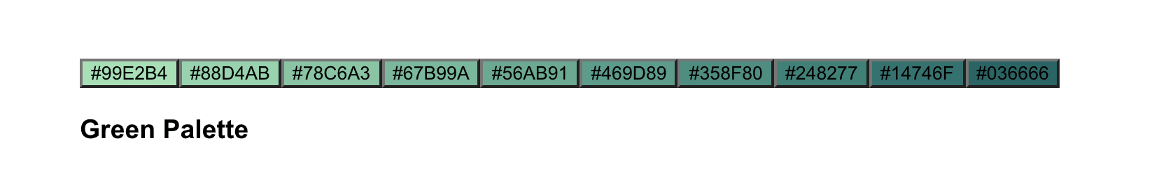
While browsing for color palettes recently, I came across Cooolors, which is a great tool for generating color palettes. I thought the hover interaction on their trending palettes page was really interesting, so I wanted to try and create a similar effect.
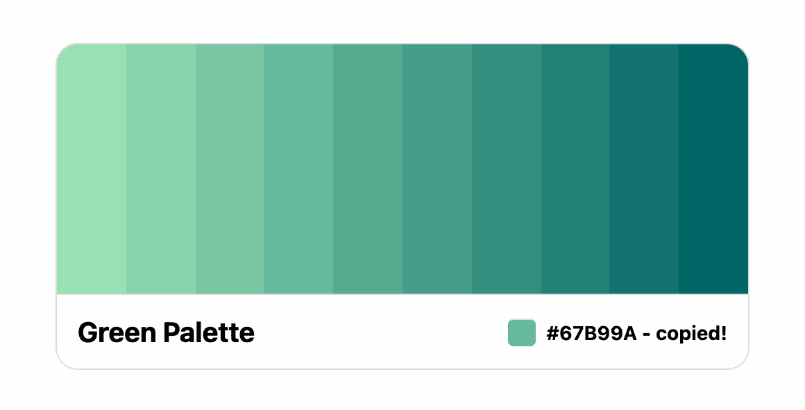
When you hover over a color, it expands to show the hex value and can be clicked to copy the value to your clipboard.
This article will show you how to build a color palette component using React. Through building this component, you will learn how to:
- Use the Clipboard API to copy a text value
- Create an equal column layout in flexbox
- Animate the
flex-basisflexbox property
This article is not sponsored by Cooolors, but the tools they have built are really useful. Check them out!
Props and Markup
Our component will have just two props that can be passed to it.
The first should be a title, which is a string to describe the colors in the palette.
The second, colors, will be an array of objects. Each object should contain a color hex value, and an optional lightLabel boolean. We'll use this lightLabel property to change the color of the label to white in order to have better contrast with a dark color.
It should look like below.
colors={[
	{
    value: '#222222',
    lightLabel: true,
  },
  {
    value: '#5C0601',
  },
]}
Now that the props are defined, let's start adding the component markup.
Begin by creating a new file named ColorPalette.jsx.
First we should create a state value, activeColor. This state will hold the value of the currently selected color.
import React, { useState } from 'react';

const ColorPalette = ({ title, colors }) => {
  const [activeColor, setActiveColor] = useState(null);

  return (
    <div className="palette-container">
			<div className="tiles"></div>
      <div className="palette-info"></div>
    </div>
  );
};
Then add some divs with classNames of palette-container, tiles and palette-info.
To render the palette colors, map over the colors array and return a color tile for each of them. We are using buttons as the actual tiles because they will be clickable, and this also provides keyboard support by default.
<div className="palette-container">
	<div className="tiles">
	  {colors.map(({ value, lightLabel }) => (
	    <button
	      key={value}
	      className={`tile ${value === activeColor ? 'active' : 'inactive'}`}
	      style={{ background: value}}
	    >
	      <span className={`label ${lightLabel ? 'light' : 'dark'}`}>
					{value.toUpperCase()}
				</span>
	    </button>
	  ))}
	</div>
	<div className="palette-info">...</div>
</div>
The label we output for each color will have either a light or dark class, depending on the lightLabel property.
Next, inside palette-info, we display the title and the activeColor value that was copied.
<div className="tiles">...</div>
<div className="palette-info">
  <h3>{title}</h3>
  {activeColor && (
    <div>
      <span className="tile-sm" style={{ background: activeColor }} />
      <span>{activeColor} - copied!</span>
    </div>
  )}
</div>
Finally, add a click handler onto the button. This will update the activeColor state.
const ColorPalette = ({ title, colors }) => {
  const [activeColor, setActiveColor] = useState(null);

  const onTileClick = (color) => {
		setActiveColor(color);
	};

  return (
    <div className="palette-container">
      <div className="tiles">
        {colors.map(({ value, lightLabel }) => (
          <button
            onClick={() => onTileClick(value)}
            key={value}
            className={`tile ${value === activeColor ? 'active' : 'inactive'}`}
            style={{ background: value}}
          >
            <span>...</span>
          </button>
        ))}
      </div>
      ...
    </div>
  );
};
Copying to the Clipboard
Now let's add some logic that copies the color value to the user's clipboard on button click.
To do this, we'll use the Clipboard API writeText method. writeText returns a Promise so the onTileClick function we wrote previously should be updated slightly to utilize async/await.
const onTileClick = async (color) => {
  setActiveColor(color);

  try {
    await navigator.clipboard.writeText(color);
  } catch (e) {
    console.log(`${e} - this action is not supported`);
  }
}
Note that the
writeTextmethod is not supported in Internet Explorer.By now you should have a series of buttons that will copy the hex value to the clipboard when clicked.
Styling
With the markup finished, let's move onto styling the component.
First there are some basic styles for the button treatment, the palette-container and palette-info elements.
:root {
  --gray: #ddd;
}

button {
  background: none;
  border: none;
  cursor: pointer;
  padding: 0;
  margin: 0;
  outline: none;
}

.palette-container {
  max-width: 500px;
  margin: 50px auto;
  border: 1px solid var(--gray);
  border-radius: 16px;
  overflow: hidden;
}

.palette-info {
  border-top: 1px solid var(--gray);
  padding: 15px;
  display: flex;
  justify-content: space-between;
  align-items: center;
}

.palette-info h3 {
  margin: 0;
  font-size: 20px;
}

.palette-info span {
  vertical-align: middle;
  font-weight: 700;
  font-size: 14px;
}
Next, add the styles for the small color tile showing the activeColor value.
.tile-sm {
  border-top: 1px solid var(--gray);
  display: inline-block;
  height: 20px;
  width: 20px;
  border-radius: 4px;
  margin-right: 8px;
  vertical-align: middle;
}
Now we have the styling for the color tiles and here's where things get a bit more interesting! We will rely on flexbox to manage the spacing and position of each tile.
The flex-grow property here is key – it keeps the component layout flexible so no matter how many colors we have, each is aligned and spaced evenly.
.tiles {
  display: flex;
  flex-direction: row;
}

.tile {
  display: flex;
  align-items: center;
  justify-content: center;
  height: 180px;
  flex-grow: 1;
  flex-shrink: 1;
  flex-basis: 1%;
  position: relative;
}
Next we have some styles for the color labels.
.label {
  font-size: 16px;
  font-weight: 700;
  visibility: hidden;
  opacity: 0;
  position: absolute;
}

.label.dark {
  color: #000;
}

.label.light {
  color: #fff;
}
Animating the Color Tiles on Hover
Our color palette component is coming along great! Now how do we go about adding the animation when each color is hovered or focused?
Recall the flex-basis property that we added in the previous section. As it turns out, this property can be transitioned, so that's what we'll do!
First we need to add a transition property onto the .tile class, specifically targeting the flex-basis property. We'll also add a slight transition-delay as well.
.tile {
  ...
  transition: flex-basis 0.15s ease;
  transition-delay: 0.1s;
}

.tile:hover,
.tile:focus {
  flex-basis: 25%;
}
When hovered or focused, set the flex-basis value to 25%. Since we added an initial value of 1% for this property, updating it will transition the difference. We'll update the value to take up 25% of the available space. As this occurs, the other elements will shrink.
We've achieved our expand effect!
Next we need to display the color labels when the tile is hovered or focused. We'll do it with a bit of an opacity transition and also a slight delay.
.tile:hover .label,
.tile:focus .label {
  visibility: visible;
  opacity: 1;
  transition: opacity 0.3s ease, visibility 0.3s ease;
  transition-delay: 0.15s;
}
Finally, let's add a subtle scale animation when a color is selected. This will make it a bit more obvious that an action occurred, in addition to the activeColor value updating.
.tile.active .label {
  animation: labelScale 0.3s ease forwards;
}

@keyframes labelScale {
  0% {
    transform: scale(1);
  }

  50% {
    transform: scale(1.2);
  }

  100% {
    transform: scale(1);
  }
}
Optional - Removing Focus
This optional step could be an improvement if you prefer having only one color expanded at a time. For example, if a color is clicked, then hovering over another color should collapse the one that was clicked.
This change is pretty straightforward, and there are probably a few different ways to accomplish it.
Start by adding a new onMouseOver event onto the button.
<button
  onClick={() => onTileClick(value)}
  onMouseOver={() => onHover(value)}
  key={value}
  ...
>
  <span>...</span>
</button>
Next, add a new function named onHover. This function receives a color value when a tile is hovered and compares it against activeColor. If they aren't equal, then another tile must have been hovered. In that case, remove the focus by calling blur() on document.activeElement.
const onHover = (color) => {
  if (color !== activeColor) {
    document.activeElement.blur();
  }
}
Summary
In this article, we built a color palette component with React. We used flexbox for the layout to have the colors spaced out evenly, no matter how many are displayed.
We learned that the flex-basis property can be animated for expanding/collapsing transitions, and we also learned that copying text to the clipboard is super easy using the Javascript Clipboard API.
One way this component could be improved is to replace the lightLabel property with a way to dynamically change the label color based on the hex value passed. There are ways to do this, but it's a bit beyond the scope of this article. Feel free to experiment!