Customize and share radiant code screenshots.

How to Build a Card Flip Animation
Learn how to apply CSS transforms and animations to playing cards
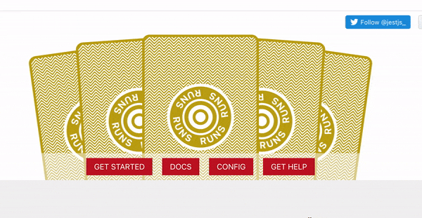
In this article, we’ll be building a card flipping animation, loosely inspired by the Jest homepage.
The overall effect is a challenge that can be solved using mostly CSS transforms and animations. We’ll be using React to help manage some local state values, but you could substitute that with anything you’d like.
Let’s get started!
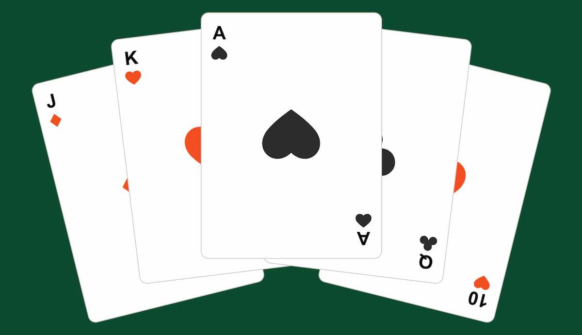
Shoutout to Emil for the Figma playing card icons.
Getting Started
The component we’re building takes just a single cards prop.
This prop is an array of specific values and suit icons for each card.
const CARDS = [
  {
    value: 'J',
    suit: <Diamonds />
  },
  {
    value: 'K',
    suit: <Hearts />
  },
  {
    value: 'A',
    suit: <Spades />
  },
  {
    value: 'Q',
    suit: <Clubs />
  },
  {
    value: '10',
    suit: <Hearts />
  }
]
Next create a new component named CardFlip.
We’re using the classnames package below help manage CSS classes, but this is not required.
import React, { useState, useEffect, useRef } from 'react';
import cn from 'classnames';
import { ReactComponent as CardBack } from './assets/back.svg';

export const CardFlip = ({ cards }) => {
  const [flipIndex, setFlipIndex] = useState(-1);
  const [isReady, setIsReady] = useState(false);
  const intervalRef = useRef();

  const handleClick = () => {}

  return ();
}
The component has two state values for now.
The first, flipIndex, is the index of the card currently being flipped. This will be incremented in milliseconds.
The nice thing about using an index to track which card is being flipped is that you have direct control. For example, you could pause the cards being flipped, or flip a specific card using this approach.
The second state value, isReady, determines when to start flipping the cards.
We also have a ref value, intervalRef, that stores a reference to a setInterval value so that we can clear it (more on that in the next section).
Markup
Now let’s write the component HTML.
Begin by adding an outer card-container div that wraps an unordered list of cards, as well as an actions div.
return (
  <div className="card-container">
    <ul className="cards"></ul>
    <div className="actions"></div>
  </div>
);
Inside the cards list, we map over the cards prop to output a list item.
Each item has a unique key and receives a class of flipped if isReady is true, and the index is less than or greater than the flipIndex.
{cards.map((card, index) => (
  <li key={`${card.value}-index`} className={cn('card-outer', {
    flipped: isReady && index <= flipIndex
  })}>
  ...
  </li>
))}
Inside each list item there is the actual card div containing the front and back content.
<div className="card">
  <div className="card-back">
    <CardBack />
  </div>
  <div className="card-front">
    <span className="top">
      {card.value}
      {card.suit}
    </span>
    <div className="suit">
      {card.suit}
    </div>
    <span className="bottom">
      {card.value}
      {card.suit}
    </span>
  </div>
</div>
Finally, we define the actions. For now there’s just a “flip” button, but we’ll add another later.
<div className="actions">
  <button type="button" onClick={handleClick} className="flip-btn">
    <span>{flipIndex > 0 ? 'Reset' : 'Flip!'}</span>
  </button>
</div>
Basic Styling and Positioning
Now that we’ve set up the component HTML, let’s add some styles for the basic layout.
Start by creating a new file named styles.css.
First we’ll define some basic reset styles, and some variables to be used throughout.
:root {
  --chip-background: red;
  --white: #fff;
}

* {
  box-sizing: border-box;
}

body {
  background: #0b4b30;
  color: var(--white);
}

button {
  cursor: pointer;
  background: none;
  border: none;
}

ul {
  list-style: none;
  padding: 0;
}
Next we have the card-container and cards.
.card-container {
  width: 100%;
  display: flex;
  flex-direction: column;
  height: 100vh;
  justify-content: center;
}

.cards {
  display: flex;
  justify-content: center;
  align-items: center;
  gap: 20px;
  width: 100%;
  height: 50%;
  margin: 0 auto;
  transform: translateY(40%);
}
The cards unordered list uses translateY to move it downwards slightly for positioning purposes.
Next we have the card-outer list item styles.
These styles help with the animation we’ll be doing, and serve as a container that the actual card element can move upwards and downwards within for easier movement on the Y axis.
.card-outer {
  height: 400px;
  position: absolute;
}

.card-outer:hover .card:not(.flipped) {
  transform: translateY(-10%);
}
We’ll also move the card upward slightly when hovered and not yet flipped.
Now we have the card itself.
.card {
  width: 235px;
  cursor: pointer;
  height: 320px;
  border: 1px solid #ccc;
  background: var(--white);
  border-radius: 10px;
  display: flex;
  align-items: center;
  justify-content: center;
  transition: transform 0.4s ease;
  position: relative;
  backface-visibility: hidden;
}
Each card has styles specific to both the front and the back.
The front and the back of the card are both positioned absolutely, and the card-back has some padding around the edges of the pattern.
.card-back,
.card-front {
  position: absolute;
}

.card-back svg {
  padding: 12px 0;
}
Next we have some styles for the card-front and the positioning of each card suit.
We won’t cover everything below but the
rotateY(180deg)andbackface-visibilityfor thecard-frontare necessary to keep the front of the card hidden until flipped.
.card-front {
  color: #222;
  transform: rotateY(180deg);
  backface-visibility: hidden;
  height: 100%;
  width: 100%;
  display: flex;
  justify-content: center;
  align-items: center;
  font-weight: bold;
}

.card-front .top,
.card-front .bottom {
  position: absolute;
  font-size: 24px;
  display: flex;
  flex-direction: column;
  justify-content: center;
  align-items: center;
}

.card-front .top {
  top: 12px;
  left: 12px;
}

.card-front .bottom {
  bottom: 12px;
  right: 12px;
  transform: rotate(180deg);
}

.card-front .top svg {
  margin-top: 3px;
}

.card-front .suit svg {
  height: 80px;
  width: 80px;
}
Next we need to position each of the cards.
This is done with specific translateX, translateY and rotate values.
.card-outer:first-child {
  transform: translateX(-75%) translateY(0) rotate(-14deg);
  z-index: 1;
}

.card-outer:nth-child(2) {
  transform: translateX(-40%) translateY(-10%) rotate(-7deg);
  z-index: 2;
}

.card-outer:nth-child(3) {
  z-index: 3;
  transform: translateY(-15%);
}

.card-outer:nth-child(4) {
  transform: translateX(40%) translateY(-10%) rotate(7deg);
  z-index: 2;
}

.card-outer:last-child {
  transform: translateX(75%) rotate(14deg);
  z-index: 1;
}
Now the cards should be in a fanned position.
Finally, we have some basic styles for the positioning of the actions.
.actions {
  display: flex;
  justify-content: center;
  align-items: center;
  flex-direction: row;
  justify-content: space-between;
  position: relative;
  z-index: 1;
  padding: 50px 0 0;
  margin: auto;
  bottom: 0;
  width: 40%;
  max-width: 300px;
}

The Flipping Technique
Now for the fun part!
Let’s revisit the handleClick function we added earlier.
This function will first toggle the isReady state value.
const handleClick = () => {
  setIsReady(!isReady);

  if (isReady) {
    setFlipIndex(-1);
    clearInterval(intervalRef.current);
  }
}
If the state value is already true, it means we need to reset the cards back to their unflipped state. In this case, we set the flipIndex state value back to -1 and clear any intervals that may be running.
The first useEffect checks the isReady state value, and starts an interval to begin incrementing the flipIndex value. The output of setInterval is stored in the intervalRef so that we can access it.
useEffect(() => {
  if (isReady) {
    intervalRef.current = setInterval(() => {
      setFlipIndex((prevIndex) => prevIndex + 1);
    }, 300);
  }

  return () => {
    clearInterval(intervalRef.current);
  }
}, [isReady]);
Be sure to return a function that clears the interval when the component is unmounted. Otherwise it will run indefinitely.
The second useEffect tracks when all of the cards have been flipped and will also clear the interval at that time.
useEffect(() => {
  if (flipIndex === cards.length) {
    clearInterval(intervalRef.current);
  }
}, [flipIndex]);
Now when the class of flipped is applied to the card-outer element, the inner card div receives some additional style properties.
First, apply backface-visibility: visible to each flipped card, as well as transform-style: preserve-3d. These properties assist in being able to see only the front of the card after being flipped.
.flipped .card {
  backface-visibility: visible;
  transform-style: preserve-3d;
}
Then we have some animation properties
The animation name will be cardFlip and it’ll use just a regular ease for the animation timing.
.flipped .card {
  ...
  animation: cardFlip ease;
  animation-fill-mode: forwards;
  animation-duration: 0.4s;
}
animation-fill-mode: forwards; will hold the animation in its end state when the animation finishes and the animation will play over 0.4s.
Let’s define the keyframe.
We start the animation at 0deg and 0%. At the halfway point, the card should be rotated 180deg and be at a position of -14% on the Y axis. This moves each card upwards slightly. The animation ends back at 0% on the Y axis, while still remaining rotated.
@keyframes cardFlip {
  0% {
    transform: rotateY(0deg) translateY(0%);
  }

  50% {
    transform: rotateY(180deg) translateY(-14%);
  }

  100% {
    transform: rotateY(180deg) translateY(0%);
  }
}
Lastly, apply a backface-visibility of hidden to the card-back div. This will hide the side of the card that’s been flipped. Without this property, the back of the card will still be visible even though it’s been rotated.
.flipped .card-back {
  backface-visibility: hidden;
}
You should now be able to flip the cards when clicking the button!
Adjusting the Speed
So far, the cards only flip at a specific speed. What if we wanted the speed to be adjustable? Doing this is pretty straightforward!
First, add a new state value to the CardFlip component.
const CardFlip = ({ cards }) => {
  const [flipIndex, setFlipIndex] = useState(-1);
  const [isReady, setIsReady] = useState(false);
  const [flipSpeed, setFlipSpeed] = useState(0.4);

  return ( ... );
}
Next, we’ll adjust the speed using a range input slider. Minimum and maximum values can be set, with a step increment of 0.1. We update the flipSpeed state each time the input slider value is changed.
<div className="actions">
  ...
  <div className="field-wrapper">
    <label>
      <span>Flip Speed ({flipSpeed} seconds)</span>
      <input
        type="range"
        min="0.3"
        max="3"
        step="0.1"
        defaultValue={flipSpeed}
        onChange={(e) => setFlipSpeed(e.target.value)}
      />
    </label>
  </div>
</div>
Finally, a dynamic animation duration is added directly to the card element and we can remove the one previously set on .flipped .card.
<div
  className="card"
  style={{
    animationDuration: `${flipSpeed}s`,
  }}
>...</div>
.flipped .card {
  ...
  animation-duration: 0.4s; /* REMOVE */
}
Bonus - Poker Chip Button
Keeping with the theme of playing cards, let’s add a bit of flair to the flip button and style it to look like a poker chip.
.flip-btn {
  border-radius: 50%;
  transition: transform 0.4s ease;
  will-change: transform;
}
The inner span styles.
.flip-btn span {
  background: var(--chip-background);
  padding: 0px;
  border: 4px solid var(--white);
  border-radius: 50%;
  font-size: 20px;
  font-weight: bold;
  color: white;
  display: flex;
  justify-content: center;
  align-items: center;
  height: 100px;
  width: 100px;
  position: relative;
  margin: 7px;
}
We’ll also use an after psuedo element for the outer dashed border.
.flip-btn span::after {
  content: '';
  display: block;
  border: 15px dashed var(--white);
  height: 100%;
  width: 100%;
  background: var(--chip-background);
  position: absolute;
  z-index: -1;
  border-radius: 50%;
  padding: 8px;
}
Lastly, add a slight rotation when the button is hovered.
.flip-btn:hover {
  transform: rotate(10deg);
}
Taking It Further
This article mostly focused on the card flipping technique, but a few things that could be expanded on might be:
- Flipping the cards in a random order
- Using a full deck of cards and choosing them randomly when the cards are flipped
- Flip a specific card when it’s been clicked
Summary
This article covered the basic setup, styling, and animation techniques for flipping cards using CSS animations.
While this type of layout is not likely something you’d build in the real world, using CSS to position and animate elements certainly is!