
Getting Started With Framer Motion
An intro to the animation library from Framer.
Framer Motion is an open source React animation library brought to you by Framer. You can make complex, vibrant animations relatively easily with its declarative, prop-driven API and components.
This article will cover how to use Framer Motion by walking through some basic examples. Then we'll kick it up a notch by using what we learned to build a drag and drop component UI.
Please note that this tutorial was written using Framer Motion V2. The API has changed dramatically so look for an updated version of this article soon!
Basic Concepts
Framer Motion is essentially split up into two different parts: a handful of base components, and an API to interface with those components via props, like configuring transitions, adding gestures and applying animation styles.
The Motion Component
<motion.div
  animate={{ x: 100 }}
  transition={{ duration: 2 }}
/>
The main component you'll use is motion. It's used in place of any regular HTML elements you want to animate, and it surfaces several new props.
"Motion components are DOM primitives optimised for 60fps animation and gestures. There's a motion component for every HTML and SVG element" - Framer Motion Docs
To see a motion component in action, let's rotate a div when it's clicked:
import React from 'react';
import { motion } from 'framer-motion';

const Rotate = () => {
  const [isActive, setIsActive] = React.useState(false);

  return (
    <motion.div
      onClick={() => setIsActive(!isActive)}
      animate={{
        rotate: isActive ? 90 : 0,
      }}
    >
      DIV
    </motion.div>
  );
};
We used the motion component animate prop to add the rotation we want when the isActive state value changes. We also added an onClick handler to the div element that toggles the state. The rest is handled by Framer Motion. There's no CSS animations or transitions we needed to write!
Variants
In our previous example, we used a ternary operator to choose between two rotation values. Since we were only transitioning one property, it worked fine. But what if we want to transition several different properties? We could keep using the ternary for every property, but that could be messy.
<motion.div
  animate={{
    rotate: isActive ? 90 : 0,
    scale: isActive ? 1.5 : 1,
    opacity: isActive ? 1 : 0.75,
  }}
/>
Instead, we can use what are called "variants".
Variants are just objects that hold different states that properties can be in. They're passed to a motion component using the variants prop, then referenced by their label in the animate prop.
Using variants, the above example would become this:
const variant = {
  active: {
    rotate: 90,
    scale: 1.5,
    opacity: 1,
  },
  inactive: {
    rotate: 0,
    scale: 1,
    opacity: 0.75,
  },
}

<motion.div
  variants={variant}
  animate={isActive ? 'active' : 'inactive'}
/>
Another benefit of using variants is that if another component needed the same animation effect, you could just export the variant as you would any other constant. You could even build your own mini-library of common generic variants if you wanted to!
Transitioning on Mount and Unmount
Something that can be tricky in React is transitioning elements into or out of view when they're added or removed from the DOM. Framer Motion makes these types of transitions easy.
To demonstrate, let's add a button that mounts or unmounts a div when clicked. On mount, it should fade in, scale slightly in size, and apply a box shadow. On unmount, the reverse should happen.
import React from 'react';
import {
  AnimatePresence,
  motion,
} from 'framer-motion';

const FramerMotion = () => {
  const [isMounted, setIsMounted] = React.useState(false);

	const defaultState = {
    opacity: 0,
    scale: 0.6,
  };

  return (
    <div className="container">
      <button
				onClick={() => setIsMounted(!isMounted)}
			>
				{`${isMounted ? 'Unmount' : 'Mount'} Element`}
			</button>
      <AnimatePresence>
        {isMounted && (
          <motion.div
            initial={defaultState}
            exit={defaultState}
            animate={{
              opacity: 1,
              boxShadow: '1px 1px 10px rgba(0, 0, 0, 0.3)',
              scale: 1,
            }}
          />
        )}
      </AnimatePresence>
    </div>
  );
};
"When a component mounts, it'll automatically animate to the values in animate if they're different from those defined in style or initial." - Framer Motion Docs
In our case, defining the initial prop with our defaultState object is enough to accomplish the mount transition.
For the unmount transition, we'll use the AnimatePresence component that Framer Motion exports. It exists specifically for transitioning components when they're being removed from the component tree.
We pass the defaultState object to the exit prop to tell it what properties to use when unmounting ("exiting") and that's it.
Gestures
Another feature of Framer Motion is gestures. This means support for hovering, tapping, panning and dragging elements.
Two common gestures you'll see are whileHover and whileTap. To scale an element slightly when it's hovered or tapped via a touch device, you would add the following:
<motion.div
  whileHover={{ scale: 1.2 }}
  whileTap={{ scale: 1.2 }}
/>
The ability to drag elements is another common gesture. This is controlled via the drag prop.
In its most basic form, you can pass true (or just the drag prop by itself) to enable dragging an element in any direction, or you can pass x or y to enable dragging only on a specific axis.
There are a lot of other props as well, like constraining dragging to a certain area, transition configuration and callback events. You can view them all here.
<motion.div
  drag="x"
  dragConstraints={{ left: 0, right: 200 }}
/>
Building a Drag and Drop UI
Now that we've covered some of the basic concepts of Framer Motion, let's use those to build something more interesting! We're going to be creating a drag and drop component interface where a div can be dragged and dropped into a cell container.
DragDrop Component
Start by creating a new file named DragDrop.jsx. Within this file, we will create two components.
Feel free to arrange these components however you'd like! If you would prefer to separate them in different files, please do so.
The first component, DragDrop, is our main component and will render the cells, as well as control the state and callback functions.
The second component named Cell will output all of the visuals.
The first thing we need to do is create a ref for each cell. These refs will be used for accessing DOM properties on each of the four cells that we render.
We'll number the refs 0 through 3, and store them in an array named cells.
In the DragDrop component, we want to keep track of two pieces of state. The first is activeIndex, which will store the current active index. We'll use indexes to determine which cell should render the draggable item. More on this in a minute.
The other state value we need is isDragging, which we'll set if the user is currently dragging and add some stylistic effects if they are.
So far you should have what looks like below:
import React, { useRef, useState, forwardRef } from "react";
import { motion } from 'framer-motion'
import "./styles.css";

const DragDrop = () => {
  const ref0 = useRef(null);
  const ref1 = useRef(null);
  const ref2 = useRef(null);
  const ref3 = useRef(null);

  const cells = [ref0, ref1, ref2, ref3];

  const [activeIndex, setActiveIndex] = useState(0);
  const [isDragging, setIsDragging] = useState(false);

  return ...
}

const Cell = () => {

}

export default DragDrop;
Next we need a few functions for updating the state.
The params in the dragEnd function will be used in the next section.
const dragStart = () => {
  setIsDragging(true);
};

const dragEnd = (_, info) => {
  setIsDragging(false);
};

return ...
Now let's add some markup. We'll add a grid div that wraps all of our output which is solely responsible for the grid layout. Note that it's not a <motion.div> because we don't need to animate it.
Next we iterate over our array of cells to output a Cell component for each, while passing down the dragStart and dragEnd callbacks, and our activeIndex and isDragging state. We also need to pass down the cell value itself, which is a ref.
return (
	<div className="grid">
    {cells.map((cell, i) => (
      <Cell
        index={i}
        key={`cell-${i}`}
        activeIndex={activeIndex}
        onDragStart={dragStart}
        onDragEnd={dragEnd}
        isDragging={isDragging}
        ref={cell}
      />
    ))}
  </div>
);
We'll revisit DragDrop shortly, but now let's write the Cell component.
Cell Component
The cell component will output all visual pieces of our UI.
We'll start by using the React forwardRef function to ensure the ref prop we passed can be applied to the cell. This is important because if the DragDrop component does not have access to the Cell DOM properties, we can't determine which cell we've dropped the element onto.
export const Cell = forwardRef(({
	index,
	activeIndex,
	onDragStart,
	onDragEnd,
	isDragging
}, ref) => {
  return ...
}
Next we want to return a motion.div component which is the visual cell.
return (
	<motion.div
	  className="cell center"
	  ref={ref}
	  id={index}
	  variants={cellVariant}
	  animate={isDragging ? "dragging" : "inactive"}
	>
  ...
  </motion.div>
);
You'll notice that we are using variants here. The cellVariant is not too complex, but as we learned, it helps to remove the styles from being used directly in the animate prop.
const cellVariant = {
  dragging: {
    border: "2px dashed #008E95"
  },
  inactive: {
    border: "2px solid #fff"
  }
};
Now we want to add our draggable item. This element is actually output within the cell we just wrote, when the activeIndex prop value matches the cell index.
With some positioning styles, this is how we'll get it to appear visually on top of the cell background. We'll add those styles in the next section.
We learned earlier that adding a drag prop makes a motion component draggable, so let's add that. We don't need an x or y value for this, and we also don't need to add a dragConstraints prop, because we want this div to be draggable anywhere on the screen.
The way we'll actually determine when and if the element can be dropped is by using the coordinates the onDragEnd callback provides, and measuring those against the ref values for each cell. We'll write this logic soon.
return (
<motion.div
className="cell center"
ref={ref}
id={index}
variants={cellVariant}
animate={isDragging ? "dragging" : "inactive"}
>
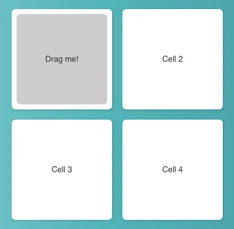
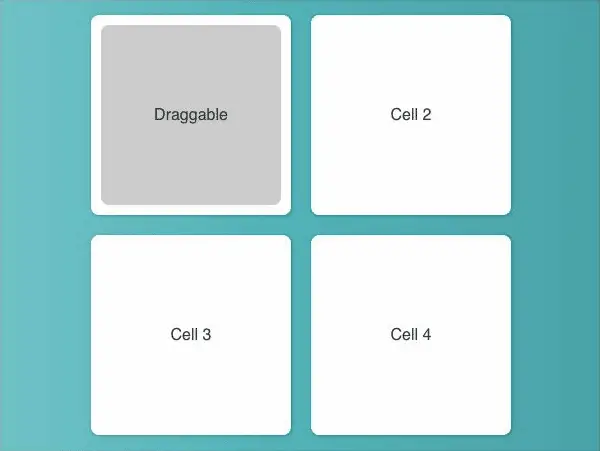
{`Cell ${index + 1}`}
{activeIndex === index && (
<motion.div
drag
className="draggable center"
variants={draggableVariant}
animate={isDragging ? "dragging" : "inactive"}
dragElastic={1}
onDragStart={onDragStart}
onDragEnd={onDragEnd}
>
Drag me!
</motion.div>
)}
</motion.div>
);
Finally, let's add the draggableVariant styles that will apply when this div is being dragged.
const draggableVariant = {
  dragging: {
    scale: 0.5
  },
  inactive: {
    scale: 1
  }
};
Layout Styles
The styles we'll need are minimal. Since we want a 2x2 grid layout for the display of our cells, we'll use CSS grid for that.
Let's first get some high level styles out of the way for a gradient background, font-family and box-sizing. We'll also add a .center utility class to help with centering text.
* {
  box-sizing: border-box;
}

body {
  background: linear-gradient(
    90deg,
    hsla(183, 46%, 74%, 1) 0%,
    hsla(183, 100%, 29%, 1) 100%
  );
  font-family: sans-serif;
}

.center {
  display: flex;
  justify-content: center;
  align-items: center;
}
Next we'll set up the grid and cell styles. The 2x2 grid layout can be achieved using grid-template-colums and a gap of 20px between each item.
.grid {
  display: grid;
  grid-template-columns: repeat(2, auto);
  grid-gap: 20px;
  justify-content: center;
  align-content: center;
  position: relative;
}

.cell {
  background: #fff;
  border-radius: 8px;
  height: 200px;
  width: 200px;
  color: #333;
  box-shadow: 1px 1px 4px rgba(0, 0, 0, 0.2);
  position: relative;
}
Lastly, we'll need the styles for the draggable element itself.
.draggable {
  background: #ccc;
  height: 180px;
  width: 180px;
  border-radius: 8px;
  position: absolute;
  cursor: grab;
  z-index: 1;
  transition: background 0.3s ease;
}

.draggable:hover {
  background: #ddd;
}
Drag and Drop Logic
The last part we need to write is the logic that determines what to do when the draggable element is dropped. We'll use the dragEnd callback we wrote earlier to help with this. dragEnd has an info parameter object that contains, among other things, the X and Y coordinates of where the drag event ended, relative to the window.
Add a function named getActiveCellIndex with one destructured param, point. This function will return an index that's passed to setActiveIndex to update the state.
const DragDrop = () => {
  ...

  const getActiveCellIndex = ({ point }) => {

  }

  const dragEnd = (_, info) => {
    setIsDragging(false);
    setActiveIndex(getActiveCellIndex(info));
  };
}
Inside getActiveCellIndex , we want to iterate over each cell and get some measurements. We'll specifically need the offsetLeft, offsetTop, offsetWidth, offsetHeight and parentElement properties.
const getActiveCellIndex = ({ point }) => {
	const cellIndex = cells.findIndex((cell) => {
    const {
      offsetLeft,
      offsetTop,
      offsetWidth,
      offsetHeight,
      parentElement,
     } = cell.current;
	}
}
We are using the
findIndexarray method above to return an index or -1, but you could also use aforloop.
Once we have these, let's add a few constants.
Because the X and Y coordinates we get from the dragEnd callback are relative to the window, and not the immediate parent of the cells, we need to do some calculation to determine what the left, right, top and bottom values are for each cell. We can get those by combining the offset values, heights and widths.
const cellIndex = cells.findIndex((cell) => {
	...
	...
	const leftEdge = parentElement.offsetLeft + offsetLeft;
	const rightEdge = parentElement.offsetLeft + offsetLeft + offsetWidth;
	const topEdge = parentElement.offsetTop + offsetTop;
	const bottomEdge = parentElement.offsetTop + offsetTop + offsetHeight;
}
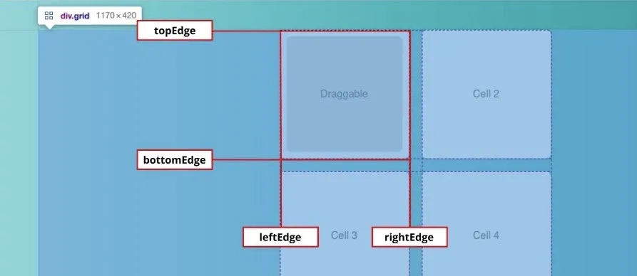
Here's our logic: if the x coordinate is greater than or equal to the leftEdge, and less than or equal to the rightEdge, and the y coordinate is greater than or equal to the topEdge and less than or equal to the bottomEdge, then return the current index to set this cell as the active cell.
const getActiveCellIndex = ({ point }) => {
	const cellIndex = cells.findIndex((cell) => {
		...
		...
		...
		return (
	    point.x >= leftEdge &&
	    point.x <= rightEdge &&
	    point.y >= topEdge &&
	    point.y <= bottomEdge
		);
	}

	if (cellIndex < 0) return activeIndex;

  return cellIndex;
}
Since we are using findIndex, then we'll return the corresponding index if the above criteria is true. If none of the cells match these criteria, findIndex will return with -1. If that's the case, our function should return the current activeIndex state value.
This was a lot, and we're finally done! Well, almost...
You'll notice that when you drop the element into a cell, it "snaps" into position with no transition. The reason for this is because the element that was being dragged was actually unmounted when it was dropped. There is a newly mounted motion component in its place. Wouldn't it be nice to continue the transition through these two states?
Framer Motion Position Transition
We can continue the transition using the AnimateSharedLayout component.
AnimateSharedLayout- Animate layout changes across, and between, multiple components.The AnimateSharedLayout component enables you to perform layout animationsacross a set of components that don't otherwise share state and between different components that share alayoutIdas they're added/removed. - Framer Motion docs
This component will create a complete transition from when our div is dropped and re-rendered in its new cell. For it to work, the AnimateSharedLayout needs to wrap all of our other markup:
import { AnimateSharedLayout } from "framer-motion";

// DragDrop component
return (
	<AnimateSharedLayout>
	  <div className="area">
	    {cells.map((cell, i) => (
	      <Cell
	        ...
	      />
	    ))}
	  </div>
	</AnimateSharedLayout>
);
The only other addition we need is a layoutId prop on the draggable element.
This prop allows a transition handoff from the previous component to any newly mounted component with the same layoutId value.
<motion.div
	drag
  className="draggable center"
	...
	layoutId="drag"
>
  Drag me!
</motion.div>
Conclusion
Hopefully you are now comfortable enough with the basics of Framer Motion to go on to build some amazing animations! There are a lot of other features that this article didn't cover, so be sure to check out their docs.
If you liked this article and want more examples of building UIs with Framer Motion, be sure to check out Animated Tabs With Framer Motion.