
Flexbox Bottom Aligned Elements
We'll cover two ways of bottom aligning an anchor within a flexbox item.
In this short post, we'll cover some ways to handle flexbox bottom alignment. If you've ever needed aligned elements, like buttons or links at the bottom of another element, then you know it can be difficult. Let's check out some ways to handle this.
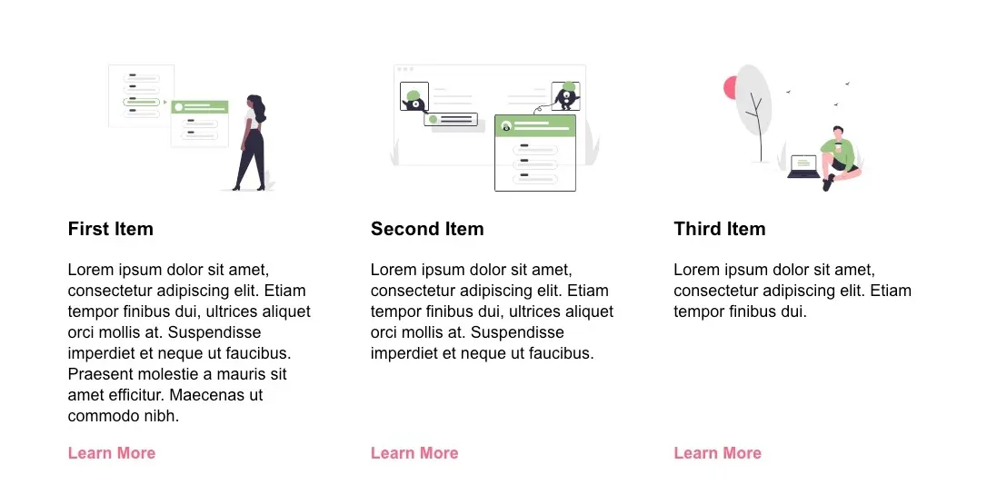
Imagine we have a layout like the screenshot above. There are a few items with slightly varying lengths of content, and we want to make sure that for each item, the Learn More link is always aligned at the bottom, no matter how much space is above it. We also want the title and description for each item to be aligned at the top.
Like many things in CSS, there are a few different ways to do this. In the past we might have reached for absolute positioning. This solution works, but you'd need to watch out for content possibly overlapping the link at different screen sizes.
We'll look at two ways to do this using flexbox.
Auto Margin Approach
The first way this could be done is by using an auto margin value.
<div class="item">
  <FirstIcon />
  <h3>First Item</h3>
  <p>
    Lorem ipsum dolor sit amet, consectetur adipiscing elit. Etiam
    tempor finibus dui, ultrices aliquet orci mollis at. Suspendisse
    imperdiet et neque ut faucibus. Praesent molestie a mauris sit amet
    efficitur. Maecenas ut commodo nibh.
  </p>
  <a href="/link">Learn More</a>
</div>
Our markup consists of an icon, a title, a description and a learn more link, all adjacent to each other. Next add the following styles.
.item {
  display: flex;
  flex: 1;
  flex-direction: column;
}

.item a {
  margin-top: auto;
}
We set item as a flexbox item, set the flex-direction to column, and the anchor to have a top margin of auto.
With these additions, the link should now be bottom aligned in each child item.
Align-Self Approach
Another way to do this is to structure the markup so that we have an inner div containing all of the item elements **except** the call to action link.
<div class="item">
  <div>
    <FirstIcon />
    <h3>First Item</h3>
    <p>
      Lorem ipsum dolor sit amet, consectetur adipiscing elit. Etiam
      tempor finibus dui, ultrices aliquet orci mollis at. Suspendisse
      imperdiet et neque ut faucibus. Praesent molestie a mauris sit amet
      efficitur. Maecenas ut commodo nibh.
    </p>
  </div>
  <a href="/link">Learn More</a>
</div>
Then we can add the following styles.
.item {
  display: flex;
  flex: 1;
  flex-wrap: wrap;
}

.item a {
  align-self: flex-end;
}
We set each item to display: flex, have the content wrap with flex-wrap: wrap and then align the anchor at the end of the item div with align-self: flex-end.
The main difference between these alignment options is whether you want to add the inner container div or not.