Sharpen your frontend skills with a fresh HTML, CSS, or JavaScript question every day.

CSS Text Effects - Five Minimal Examples
Exploring lightweight CSS text clipping and masking effects.
With the addition of some new CSS properties in the last few years, frontend developers can now create interesting text visuals much easier. "Knockout" or "cutout" text, where words clip a background image, gradient or video, are possible with very little code.
In this article, we'll explore five CSS text masking and clipping techniques using the background-clip and clip-path properties.
CSS Gradient Text
Let's start by creating a CSS gradient text effect. The overall idea is to set a background gradient behind some text and then "clip" the background to the edges of the text.
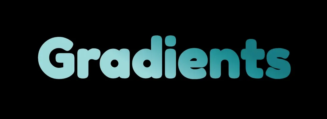
This actually only requires four lines of CSS to accomplish.
Let's assume we have an h1.
<h1>Gradients</h1>
In CSS, let's add a gradient background.
h1 {
	background: linear-gradient(30deg, #9ED8DB 40%, #007B82 70%);
}
If you're like me and can never remember the exact syntax for CSS gradients, check out the awesome gradient generator tool at coolors.co.
Now let's add the property that does the clipping: background-clip.
The background-clip CSS property sets whether an element's background extends underneath its border box, padding box, or content box. - MDN Docs
h1 {
  ...
  background-clip: text;
  -webkit-background-clip: text;
}
Using the text value with this property allows the background gradient to bleed through and clip the edges of the background within the text.
The last property we need is a text color. It should be set to transparent so that the background is completely visible. Without this, you'll probably only see a thin outline of the gradient.
h1 {
  ...
  color: transparent;
}
The
-webkitprefix is actually required for Chrome and Safari at the time of this writing because thetextvalue only has partial support. Adding both the prefixed and un-prefixed properties should support most browsers aside from Internet Explorer. If you need to support IE, you can add a non-transparent text color as a fallback and include it before transparent color.>>Check thebackground-clipdocs for complete browser support info.
CSS Animated Gradient Text
For the next effect, let's stick with gradients and use an animated gradient as the text background.
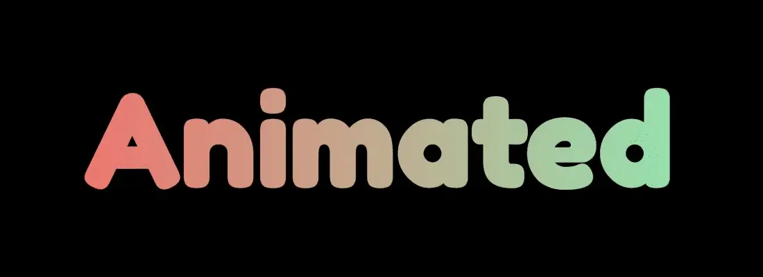
<h1>Animated</h1>
And for the CSS.
h1 {
	background: radial-gradient(circle, #80ffc1 0%, #ff6161 100%);
  background-clip: text;
  -webkit-background-clip: text;
  color: transparent;
}
We continue using the background-clip properties, and set the text color to transparent just like in the previous example.
Since we're working with animation, we need to define that next. The animation should run infinitely and alternate from left to right, and back again.
h1 {
	...
	animation: animatedGradient 2s infinite ease;
  animation-direction: alternate;
}
Last we define the animation keyframe, which increases the background-size value to get the actual animation movement.
@keyframes animatedGradient {
  from {
    background-size: 100%;
  }

  to {
    background-size: 250%;
  }
}
CSS Image Background Text
This next example will again be similar to the ones we just covered. The only difference is that we'll use an actual image instead of a gradient as the background.
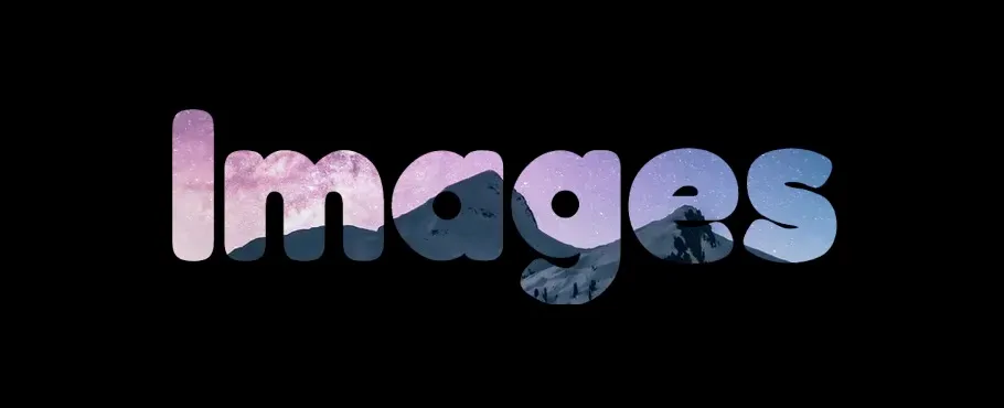
<h1>Images</h1>
h1 {
	background: url('./image.jpg') no-repeat center center;
  background-clip: text;
  -webkit-background-clip: text;
  color: transparent;
}
In our case, we want to make sure the background image isn't repeating and is vertically and horizontally centered.
CSS Video Background Text
Alright, next we'll use video as the background of our text. This effect is different in that it uses an SVG instead of an h1.
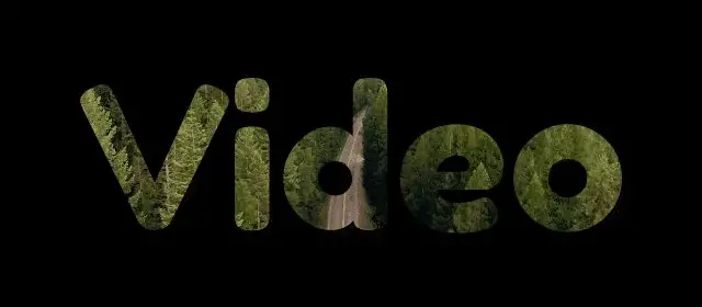
First, we need a div that contains a video tag.
<div class="video-container">
  <video loop autoPlay muted playsInline>
    <source src="./video.mp4" type="video/mp4" />
		... Other <source /> tags here if necessary
  </video>
</div>
On the video tag, we add some properties: loop autoPlay muted playsInline. So far, this should get you a video looping on the page that plays automatically with no sound.
Now the styles.
.video-container {
  position: relative;
}

.video-container video {
	margin: auto;
  display: block;
  clip-path: url(#videoText);
  width: 640px;
}

.video-container svg {
  width: 0;
  height: 0;
  position: absolute;
}
The most important property here is clip-path.
The
clip-pathCSS property creates a clipping region that sets what part of an element should be shown. Parts that are inside the region are shown, while those outside are hidden. - MDN Docs
This will make a little more sense after we add the SVG, but we basically want to use the SVG path as the region to clip our video to, as is referenced by the url(#videoText) value.
Now we need an SVG. There are tons of different ways to create and export them but I usually use Figma or Sketch. All you really need to do is add some text in your program of choice and export it as an SVG.
The SVG I use below is a simplified example. Yours will have the usual
xmlns,viewBox, andpathproperties.
Once you have an SVG exported, there are a few additions to make. First, we need to add a clipPath element around the path.
The
<clipPath>SVG element defines a clipping path to be used by theclip-pathproperty.A clipping path restricts the region to which paint can be applied. Conceptually, parts of the drawing that lie outside of the region bounded by the clipping path are not drawn. - MDN Docs
At a high level, it's not too different from the background-clip property we used in the previous examples.
<svg>
  <clipPath id="videoText" clipPathUnits="objectBoundingBox">
		<path d="M196.62 ..." />
  </clipPath>
</svg>
The clipPath element should have an ID that matches the one we added in our CSS: videoText. It also needs a clipPathUnits="objectBoundingBox" property and value.
The last thing to add are some transform values. We need these because the SVG itself is intentionally set to a height and width of 0 with the CSS we added. Because of that, we need to scale the path back up so that it's visible.
To derive the scale values, divide 1 by the height and width. Since the text in my example has a width of 640px and height of 360px.
  1 / 640 = 0.0015625

  1 / 360 = 0.002777777777778

  scale(0.0015625, 0.002777777777778)
You might need to experiment with this a bit depending on the width and height you want.
Finally, add the finished SVG into the .video-container div.
<div class="video-container">
	<svg>
	  <clipPath id="videoText" clipPathUnits="objectBoundingBox" transform="scale(0.0015625, 0.002777777777778)">
			<path d="M196.62 ..." />
	  </clipPath>
	</svg>

	<video>...</video>
</div>
CSS Split Color Text
For our last example, we'll create a split color text effect. There are likely a few different ways to do this, but I was able to accomplish it the following way.
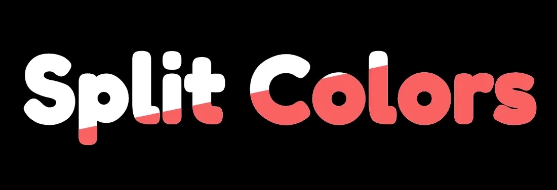
First, we need an h1, except this time we add a data attribute to it. You'll see why in a minute. We also want to make sure there's a div around the h1.
<div class="split-text-container">
  <h1 data-text="Split Colors">Split Colors</h1>
</div>
Now for the styles.
.split-text-container {
  position: relative;
}

h1 {
  color: #fff;
}

h1::before {
  content: attr(data-text);
	clip-path: polygon(0px 105%, 93% 0%, 100% 100%);
	margin: 0;
	color: #ff6161;
	position: absolute;
  top: 0;
  left: 0;
  right: 0;
}
There are two important parts here.
- The use of the
attr()CSS function. The function gets an attribute from the selected element and lets us use that value in CSS. In our case, we want thedata-textattribute we added so that we can use it in thecontentproperty. This gives us two text elements to work with: the original h1 and the psuedo element. - The
clip-pathproperty. In the previous example, we used a separate SVG as the value of this property. We're doing something similar, except using apolygonshape. This is what gives the appearance of the text color being "split". We're using the shape of thispolygonto clip the red pseudo element text so that it's only partially visible, and then positioning it on top of the whiteh1text using absolute positioning.
Finally, one last addition is to make sure the text is still selectable.
h1::before {
  ...
  pointer-events: none; /* Make text selectable */
}
Without the pointer-events property, the pseudo element is actually preventing some of our text from being selected.
Summary
And there you have it: five different CSS clipping and masking effects to try in your next project! The examples we covered really only scratch the surface of the things you can do with these properties. Some other options might involve using textures, more elaborate SVGs, and different types of animation.