
Creating an Animated Counter Button
A short guide to building an animated counter component with React hooks.
If you've ever liked a Tweet or applauded an article on Medium, you may have noticed that subtle animations can make a big difference. When used correctly, they add a bit of joy to any website or application.
This article will guide you through building a simple counter button component using React hooks. The component will increment a counter with a subtle animation interaction when clicked. This component itself isn't very complex, but it demonstrates the power of CSS animation and the importance of introducing joyful user interactions where they make sense.
Let's get started!
Building the Counter Functionality
We'll start by building a basic counter button. Add a new file named CounterButton.jsx.
In our component, there will be two state values to maintain. For that, we'll use the React useState hook.
The first value is isClicked, a boolean that we'll use to add a CSS class for the animation. The second is count which is a number that we'll increment on every other click. It will default to 100.
We set up the component this way so that the animation is essentially reset on every other click for better illustration as a demo. But, it also allows the end state of the animation to persist and the button could be disabled after it's been liked.
We have a button element that gets a class of clicked or idle depending on the state value of isClicked. Within the button we display the count value.
Optionally, you can add
disabled={isClicked}to the button to disable it once it's been clicked.
import React, { useState } from "react";

const CounterButton = () => {
  const [isClicked, setIsClicked] = useState(false);
  const [count, setCount] = useState(100);

  const onClick = () => {};

  return (
	  <button
      onClick={onClick}
      className={`counter-button ${isClicked ? "clicked" : "idle"}`}
    >
      <span className="count">{count}</span>
    </button>
  );
};

export default CounterButton;
Next we have a function named onClick that runs when the button is clicked. Within it, we need to update the state. If the button has already been clicked, set it to false. Otherwise, set the isClicked value to true and increment the count by one.
const onClick = () => {
  if (isClicked) {
    setIsClicked(false);
  } else {
    setIsClicked(true);
    setCount((prev) => prev + 1);
  }
};
With that, we have a button that increments and toggles the clicked CSS class every other time.
Adding Icons and Animation
Now that the basic functionality of our button is working, let's add some styling and animation.
We first need to import some SVG icons into our component. How you import these and where you store them is up to you.
Then we want to use them within the button in our component.
import { ReactComponent as StarFill } from "./assets/star-fill.svg";
import { ReactComponent as StarOutline } from "./assets/star-outline.svg";

const CounterButton = () => {
	...

	return (
		<button
      onClick={onClick}
      className={`counter-button ${isClicked ? "clicked" : "idle"}`}
    >
      <div className="icons">
        <div className="icons-sm">
          <StarFill height={8} width={8} className="fill-1" />
          <StarFill height={12} width={12} className="fill-2" />
          <StarOutline height={14} width={14} className="outline-1" />
          <StarOutline height={20} width={20} className="outline-2" />
        </div>
        <StarOutline className="outline" />
        <StarFill className="fill" />
      </div>
      <span className="count">{count}</span>
    </button>
	);
}
The StarOutline is the initial un-clicked icon and StarFill is the "filled" state that's visible after the button is clicked. The icons within the icons-sm div are the small individually colored icons that are visible during the animation.
Now for some CSS. These are general styles for the button, fill colors for the SVGs and also some positioning.
* {
  box-sizing: border-box;
}

button {
  border: none;
  background: none;
  cursor: pointer;
  outline: none;
}

.counter-button {
  display: block;
  margin: auto;
  text-align: center;
  position: relative;
}

.icons {
  display: flex;
  flex-direction: column;
  align-items: center;
  height: 40px;
  width: 40px;
  margin-bottom: 6px;
}

.icons-sm {
  position: absolute;
  height: 40px;
  width: 40px;
  opacity: 0;
  z-index: 1;
}

.icons-sm * {
  position: absolute;
}

.icons-sm .fill-1 {
  left: 6px;
  top: 2px;
  fill: #ef6029;
}

.icons-sm .fill-2 {
  right: -5px;
  bottom: 1px;
  fill: #0485ff;
}

.icons-sm .outline-1 {
  top: -4px;
  right: -4px;
  fill: #ff0087;
}

.icons-sm .outline-2 {
  fill: #fff;
  left: 3px;
  bottom: 3px;
}

.icons svg {
  fill: #008e95;
}

.outline,
.fill {
  height: 40px;
  width: 40px;
  position: absolute;
}

.fill {
  opacity: 0;
  top: 2px;
}

.count {
  text-align: center;
  font-weight: 700;
  font-size: 18px;
}
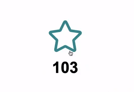
With these in place, you should see the initial outline star icon, but no animation yet.
Let's start with the outline star animation.
.counter-button.clicked .outline {
  animation: outline 1.1s ease forwards;
}

@keyframes outline {
  0% {
    transform: scale(1);
  }
  50% {
    transform: scale(0.6);
    opacity: 1;
  }
  100% {
    transform: scale(2);
    opacity: 0;
  }
}
When the counter button receives the clicked class, we have a CSS animation keyframe that will scale the icon down slightly, then double it in size while fading out.
Notice the use of
forwards. This is what allows us to persist the animation in its "end" state. If we didn't use it, the animation would go back to the beginning when finished.
The fill and icons-sm animations are pretty similar with some scale and opacity changes.
.counter-button.clicked .fill {
  animation: 0.3s fill 0.6s ease forwards;
}

@keyframes fill {
  from {
    transform: scale(0.1);
    opacity: 0;
  }
  to {
    transform: scale(1);
    opacity: 1;
  }
}

.counter-button.clicked .icons-sm {
  animation: 0.7s smIcons 0.6s ease forwards;
}

@keyframes smIcons {
  0% {
    transform: scale(0.1);
  }
  25% {
    opacity: 1;
  }
  100% {
    transform: scale(1.5);
    opacity: 0;
  }
}
For these icons, we are delaying the animation a bit to line it up with the initial outline star animation.
Our component is finished!
Summary
I hope this post has inspired you to take a closer look at the user interactions you work with, and consider if adding a subtle animation might be an improvement. They are easy to overdo though, so using animation sparingly is key. When used correctly and thoughtfully, they are a nice touch that can definitely make a users experience more enjoyable.