Building an Audio Player With React Hooks
Discover how to build an audio player using React and the HTMLAudioElement interface.
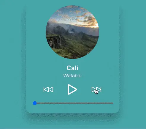
Today we'll be building a basic React audio player component using the HTMLAudioElement interface. The player can play through a list of tracks, pause, scrub and navigate to the next or previous track. As an added bonus, each audio track will have an animated background color.
The design for this audio player was inspired by this Dribbble shot and the audio files in the demo are from Pixabay.
Let's get started!
HTMLAudioElement Overview
There are a few different ways to work with audio on the web. The most common is by using the HTML <audio> tag, or for more lower level control, the Web Audio API. The approach this tutorial will take is somewhere in the middle with the HTMLAudioElement interface.
The HTMLAudioElement interface provides access to the properties of
<audio>elements, as well as methods to manipulate them. - MDN Docs
Using it is pretty straightforward:
const audioElement = new Audio(audio source);
The Audio() constructor above returns an audio element with some methods and data about the source.
audioElement.play();
audioElement.pause();

audioElement.currentTime;
audioElement.ended;
audioElement.duration;
We'll be using all of these shortly. But first, we should define the audio component props.
Defining Props
The only prop our component needs is a list of tracks that it can play through.
We'll provide it an array of objects, each one containing a title, artist, audioSrc, image and color.
const tracks = [
  {
    title: string,
    artist: string,
    audioSrc: string | import,
		image: string,
    color: string,
  },
  ...
  ...
];
The AudioPlayer Component
Start by creating a new file named AudioPlayer.jsx and import the useState, useEffect and useRef hooks.
There are three state values that we should maintain:
trackIndex- The index of the track that's being played.trackProgress- The current progress of the track.isPlaying- Whether or not the track is being played.
import React, { useState, useEffect, useRef } from 'react';

const AudioPlayer = ({ tracks }) => {
	// State
  const [trackIndex, setTrackIndex] = useState(0);
  const [trackProgress, setTrackProgress] = useState(0);
  const [isPlaying, setIsPlaying] = useState(false);

  return ( ... );
}

export default AudioPlayer;
In addition to the state, three refs are needed.
audioRef- The audio element created via theAudioconstructor.intervalRef- A reference to asetIntervaltimer.isReady- A boolean to determine when certain actions are ready to be run.
const AudioPlayer = () => {
	// State
  ...

	// Destructure for conciseness
	const { title, artist, color, image, audioSrc } = tracks[trackIndex];

	// Refs
  const audioRef = useRef(new Audio(audioSrc));
  const intervalRef = useRef();
  const isReady = useRef(false);

	// Destructure for conciseness
	const { duration } = audioRef.current;

	return ( ... );
}
Next we add two functions to serve as placeholders for now. We'll follow up and finish them in a later section.
One function, toPrevTrack, will handle the previous track button click, and the other, toNextTrack, handles the next button click.
const AudioPlayer = () => {
	// State
  ...

	// Refs
  ...

	const toPrevTrack = () => {
    console.log('TODO go to prev');
  }

  const toNextTrack = () => {
    console.log('TODO go to next');
  }

	return ( ... );
}
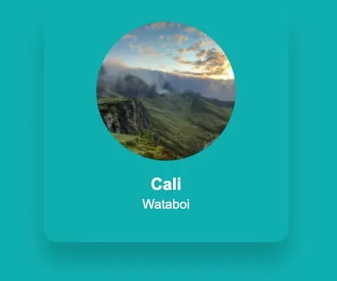
Finally, there's a bit of markup that will complete the main part of the player. It displays the track image, title, and artist, defaulting to the first track in the list.
const AudioPlayer = () => {
	...

	return (
		<div className="audio-player">
			<div className="track-info">
			  <img
			    className="artwork"
			    src={image}
			    alt={`track artwork for ${title} by ${artist}`}
			  />
		    <h2 className="title">{title}</h2>
        <h3 className="artist">{artist}</h3>
			</div>
		</div>
	);
}

It's nothing fancy yet, but so far so good! We have no styling yet, so let's add some.
AudioPlayer Styles
We are going to use a few CSS variables in our styles but they are otherwise not too involved.
Note the
--active-colorvariable. It will be used later to set the active track color as the background.
:root {
  --white: #fff;
  --active-color: #00aeb0;
}

* {
  box-sizing: border-box;
}

html {
	font-family: Arial, Helvetica, sans-serif;
  height: 100%;
  background: var(--active-color);
	transition: background 0.4s ease;
}

button {
  background: none;
  border: none;
  cursor: pointer;
}
Next are some styles specific to the audio player.
.audio-player {
  max-width: 350px;
  border-radius: 20px;
  padding: 24px;
  box-shadow: 0 28px 28px rgba(0, 0, 0, 0.2);
  margin: auto;
  color: var(--white);
}

.artwork {
  border-radius: 120px;
  display: block;
  margin: auto;
  height: 200px;
  width: 200px;
}

.track-info {
  text-align: center;
	z-index: 1;
  position: relative;
}

.title {
  font-weight: 700;
  margin-bottom: 4px;
}

.artist {
  font-weight: 300;
  margin-top: 0;
}
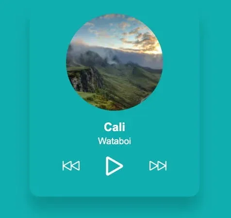
Now we need the player controls.
Controls Component
The audio controls component will store the markup for the play, pause, previous and next track buttons. We'll split it into its own component to help move some of the markup out of the main AudioPlayer.
First make a new file named AudioControls.jsx. There are few props our component will require. We need to know if the audio is playing so we can display either the play or pause button. This is done by passing the isPlaying state value as a prop.
We also need some click handlers for the play, pause, previous and next actions. Those are onPlayPauseClick, onPrevClick and onNextClick.
const AudioControls = ({
  isPlaying,
	onPlayPauseClick,
  onPrevClick,
  onNextClick,
}) => ( ... )

export default AudioControls;
Now for the control markup.
How you use SVGs will depend on your environment setup. With libraries like Create React App, importing and using them should work by default, but in other cases you may need some Webpack tooling in order to get it working.
import React from 'react';
import { ReactComponent as Play } from './assets/play.svg';
import { ReactComponent as Pause } from './assets/pause.svg';
import { ReactComponent as Next } from './assets/next.svg';
import { ReactComponent as Prev } from './assets/prev.svg';

const AudioControls = ({ ... }) => (
	<div className="audio-controls">
    <button
      type="button"
      className="prev"
      aria-label="Previous"
      onClick={onPrevClick}
    >
      <Prev />
    </button>
    {isPlaying ? (
      <button
        type="button"
        className="pause"
        onClick={() => onPlayPauseClick(false)}
        aria-label="Pause"
      >
        <Pause />
      </button>
    ) : (
      <button
        type="button"
        className="play"
        onClick={() => onPlayPauseClick(true)}
        aria-label="Play"
      >
        <Play />
      </button>
    )}
    <button
      type="button"
      className="next"
      aria-label="Next"
      onClick={onNextClick}
    >
      <Next />
    </button>
  </div>
);
Finally, there are a few styles for the control buttons and spacing.
.audio-controls {
  display: flex;
  justify-content: space-between;
  width:  75%;
  margin: 0 auto 15px;
}

.audio-controls .prev svg,
.audio-controls .next svg {
  width: 35px;
  height: 35px;
}

.audio-controls .play svg,
.audio-controls .pause svg {
  height: 40px;
  width: 40px;
}

.audio-controls path {
  fill: var(--white);
}
That's it for the AudioControls. Add the new component into AudioPlayer, passing it the props mentioned above.
import AudioControls from './AudioControls';

const AudioPlayer = () => {
	...
	...
	return (
		<div className="audio-player">
			<div className="track-info">
			  <img
			    className="artwork"
			    src={image}
			    alt={`track artwork for ${title} by ${artist}`}
			  />
		    <h2>{title}</h2>
		    <h3>{artist}</h3>
				<AudioControls
          isPlaying={isPlaying}
          onPrevClick={toPrevTrack}
          onNextClick={toNextTrack}
          onPlayPauseClick={setIsPlaying}
        />
			</div>
		</div>
	);
}
With the audio player controls in place, let's get the player working next!
Audio Player Actions
Back in the AudioPlayer component, we need to finish up the toPrevTrack and toNextTrack functions we added earlier.
Clicking the next button should go to the next track in the list, or back to the first track. For the previous button, the opposite should be true.
We can use the trackIndex state value and the length of the tracks prop to determine this.
const toPrevTrack = () => {
  if (trackIndex - 1 < 0) {
    setTrackIndex(tracks.length - 1);
  } else {
    setTrackIndex(trackIndex - 1);
  }
}

const toNextTrack = () => {
  if (trackIndex < tracks.length - 1) {
    setTrackIndex(trackIndex + 1);
  } else {
    setTrackIndex(0);
  }
}
With these changes, you can now navigate through the list of tracks.
Next there are some useEffect hooks to add.
The first is used to start or stop (pause) audio when the play or pause button is clicked.
useEffect(() => {
  if (isPlaying) {
    audioRef.current.play();
  } else {
    audioRef.current.pause();
  }
}, [isPlaying]);
Whenever the isPlaying state changes, we call the play() or pause() method on the audioRef depending on its value.
If you click the play button you should be hearing some audio now, and clicking pause should pause it.
The next useEffect hook will do some cleanup when the component unmounts. When unmounting, we want to make sure to pause the track and clear any setInterval timers that might be running. More on timers in the next section!
useEffect(() => {
  // Pause and clean up on unmount
  return () => {
    audioRef.current.pause();
    clearInterval(intervalRef.current);
  }
}, []);
The final useEffect hook runs when the trackIndex state changes. It allows us to pause the currently playing track, update the value of the audioRef to a new source, reset the progress state, and set the new track to play.
// Handle setup when changing tracks
useEffect(() => {
  audioRef.current.pause();

  audioRef.current = new Audio(audioSrc);
	setTrackProgress(audioRef.current.currentTime);

  if (isReady.current) {
    audioRef.current.play();
    setIsPlaying(true);
    startTimer();
  } else {
    // Set the isReady ref as true for the next pass
    isReady.current = true;
  }
}, [trackIndex]);
We also set the value of the isReady ref here on the first pass (initial mount). This is to prevent the audio from playing automatically when this useEffect hook first runs, which we don't want. The second and subsequent times this runs (on trackIndex change), only then do we want the play logic to occur.
If you test out the audio player controls, they should now be functional.
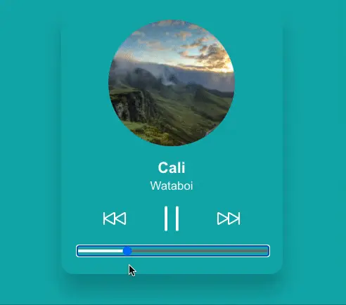
Playback Progress and Scrubbing
Next we need to display the track playback progress and add the ability to scrub to different parts of the audio.
Start by defining a new function named startTimer within the AudioPlayer component. This function is responsible for starting a new setInterval timer when a track begins playing.
const AudioPlayer = () => {
	...
	...

	const startTimer = () => {
	  // Clear any timers already running
	  clearInterval(intervalRef.current);

	  intervalRef.current = setInterval(() => {
	    if (audioRef.current.ended) {
	      toNextTrack();
	    } else {
	      setTrackProgress(audioRef.current.currentTime);
	    }
	  }, [1000]);
	}
}
Every second, we check if the audio has ended/completed. If it has, go to the next track, otherwise update the trackProgress state. The interval ID is stored within intervalRef so that we have access to the timer in other parts of our component in order to clear it.
The startTimer function is called as part of the useEffect hooks we added in the previous section. First, add it when the isPlaying state changes and is true.
useEffect(() => {
  if (isPlaying) {
    audioRef.current.play();
		startTimer();
  } else {
		clearInterval(intervalRef.current);
    audioRef.current.pause();
  }
}, [isPlaying]);
The startTimer function also needs to run when the trackIndex value changes.
useEffect(() => {
  audioRef.current.pause();

  audioRef.current = new Audio(audioSrc);
	setTrackProgress(audioRef.current.currentTime);

  if (isReady.current) {
    audioRef.current.play();
    setIsPlaying(true);
		startTimer();
  }
}, [trackIndex]);
Now we can move onto the progress indicator.
For our UI to be accessible, we will use a native HTML range input as our playback progress indicator. This gives us track scrubbing using a mouse or keyboard for free, and plenty of events to work from.
return (
  <div className="audio-player">
    <div className="track-info">
      ...
      <AudioControls ... />
      <input
        type="range"
        value={trackProgress}
        step="1"
        min="0"
        max={duration ? duration : `${duration}`}
        className="progress"
        onChange={(e) => onScrub(e.target.value)}
        onMouseUp={onScrubEnd}
        onKeyUp={onScrubEnd}
      />
    </div>
  </div>
);
The
durationvalue will initially beNaN. React throws a warning about this: "Received NaN for themaxattribute. If this is expected, cast the value to a string". We are doing what the warning suggests and assigning as a string until the track starts playing and the real duration value replaces it.
We have two more functions to add: onScrubEnd and onScrub. These functions run on these interactions: onkeyup, onChange and onMouseUp.
const onScrub = (value) => {
	// Clear any timers already running
  clearInterval(intervalRef.current);
  audioRef.current.currentTime = value;
  setTrackProgress(audioRef.current.currentTime);
}

const onScrubEnd = () => {
  // If not already playing, start
  if (!isPlaying) {
    setIsPlaying(true);
  }
  startTimer();
}
Now for styling the playback progress indicator itself.
There are likely other approaches, but it doesn't look like there's a good cross-browser standard for styling the elapsed portion of a range input. The solution below uses a
webkit-gradientworkaround, and works in Chrome, Firefox and Safari, but other browsers haven't been tested.
Create a constant that holds the current percentage of the tracks playback. We use this percentage value directly below in the webkit-gradient output to update the background style of the range input.
const currentPercentage = duration ? `${(trackProgress / duration) * 100}%` : '0%';
const trackStyling = `
  -webkit-gradient(linear, 0% 0%, 100% 0%, color-stop(${currentPercentage}, #fff), color-stop(${currentPercentage}, #777))
`;

return ( ... );
This creates a white background that overlays the range input to visually display track progress.

Then apply the trackStyling constant as a style property to the input.
return (
  ...
  ...
	<input
	  type="range"
	  value={trackProgress}
	  step="1"
	  min="0"
	  max={duration ? duration : `${duration}`}
	  className="progress"
	  onChange={(e) => onScrub(e.target.value)}
	  onMouseUp={onScrubEnd}
	  onKeyUp={onScrubEnd}
	  style={{ background: trackStyling }}
	/>
);
Now finally the CSS for the playback progress.
input[type=range] {
	height: 5px;
	-webkit-appearance: none;
	width: 100%;
	margin-bottom: 10px
	border-radius: 8px;
	background: #3b7677;
	transition: background 0.2s ease;
	cursor: pointer;
}
One thing to note. I found that if you try to hide the range input thumb in CSS, using the left and right arrow keys to scrub back and forth breaks in Safari. Because of that, I opted to leave the range input thumb as the browser default.
Changing the Background Color
The last thing to do is dynamically change the page background color. Because every audio track has a color value associated with it, all we need to do is update the --active-color CSS variable. Earlier we set the HTML background to use this variable, and by updating it, we will see a color change when cycling through tracks.
Start by creating a new component named Backdrop.jsx. Within a useEffect hook, the setProperty method will update the CSS variable value when the trackIndex changes.
import React, { useEffect } from 'react';

const Backdrop = ({
  activeColor,
  trackIndex,
  isPlaying,
}) => {
  useEffect(() => {
    document.documentElement.style.setProperty('--active-color', activeColor);
  }, [trackIndex]);

  return (
    <div className={`color-backdrop ${isPlaying ? 'playing' : 'idle'}`} />
  );
};

export default Backdrop;
Back in the AudioPlayer component, add the Backdrop component adjacent to the track-info markup.
const AudioPlayer = () => {
	...
	...
	return (
    <div className="audio-player">
      <div className="track-info">
				...
      </div>
			<Backdrop
        trackIndex={trackIndex}
        activeColor={color}
        isPlaying={isPlaying}
      />
    </div>
	);
}
Now for some animation. Add a linear-gradient background using the same --active-color variable and position it to the full height and width of the screen.
.color-backdrop {
	background: linear-gradient(45deg, var(--active-color) 20%, transparent 100%) no-repeat;
  position: absolute;
  top: 0;
  left: 0;
  right: 0;
  bottom: 0;
  z-index: -1;
}

.color-backdrop.playing {
  animation: colorChange 20s alternate infinite;
}
The animation is applied when the audio is playing and the backdrop has the playing class. It's done using the hue-rotate filter function.
The
hue-rotate()CSS function rotates the hue of an element and its contents. - MDN Docs
Hue-rotate receives an angle degree as an argument. And inside an animation keyframe, all we do is rotate up to 360deg.
@keyframes colorChange {
  from {
    filter: hue-rotate(0deg);
  }
	to {
    filter: hue-rotate(360deg);
  }
}
Note that the
hue-rotateCSS function is not supported in Internet Explorer.
If you were to use this type of animation in a production scenario, you should consider wrapping the animation styles in a
prefers-reduced-motionmedia query. That way, users who want to avoid seeing it are able to. Please see this post I wrote about the topic for more information.
Summary
Thanks for making it all the way to the end: we covered a lot! By now you should have a pretty good idea of how to work with audio, and I hope this has inspired you to build your own cool audio projects.
Since we only covered the basic actions of an audio player, there are certainly more additions you could make. Adding a volume control, playback speed adjustment, and saving playback progress using localStorage are some viable options you could explore. You could also hook the component up to use the Spotify API or some other audio source.