
Building a Vertical Carousel Component in React
Learn how to build an infinite carousel using sentences as slides.
Today we'll be building a unique variation of a carousel using React. The slides are displayed vertically as sentences, and navigating through them will display related content on the right. I discovered this on the homepage of getharvest.com.

Because I hadn't seen this type of carousel before, it looked like an interesting thing to try and build. This article explains how I recreated it!
Requirement Breakdown
Before we dive into the code, let's first determine the requirements we want to achieve.
- There should be a word or two of "leading text" that will visually line up with the rest of a sentence. We should make this a
propfor our component for reusability. - We want some actual content for our carousel. This will be another component
propand will consist of an array of objects, each containing anintroline, anid, and an object for the content that's displayed on the right side, which is an image and some copy. - When clicking on the previous and next buttons, we want to update an index value. We'll need to store this index as state, as well as handle what to do when a user gets to the end of the list of slides, or moves backwards from the first item.
- The carousel slide text should be clickable to go directly to a slide.
- A user can infinitely cycle through these slides, without hitting a stopping point. To do this, we need to "shuffle" items to the bottom or top of the carousel behind the scenes.
Now that we've outlined what to build, keep these requirements in mind throughout each section.
Layout, Props, and Styles
First create a new file named VerticalCarousel.jsx. Within this file, let's make a React component that takes data and leadingText props.
The
classnameslibrary import below will help us manage adding and removing CSS classes. We'll use it later on but be sure to NPM install it in your project if you want to use it.
import React, { useState } from 'react';
import PropTypes from 'prop-types';
import cn from 'classnames';
import { ReactComponent as Next } from './assets/chevronDown.svg';
import { ReactComponent as Prev } from './assets/chevronUp.svg';
import './style.css';

const VerticalCarousel = ({
	data,
	leadingText,
}) => {
	const [activeIndex, setActiveIndex] = useState(0);

	const handleClick = (direction) => {}

	return (
		<section className="outer-container">
	    <div className="carousel-wrapper">
				<button
          type="button"
          className="carousel-button prev"
          onClick={() => handleClick('prev')}
        >
          <Prev />
        </button>

				<button
          type="button"
          className="carousel-button next"
          onClick={() => handleClick('next')}
        >
          <Next />
        </button>
			</div>
			<div className="content">
        <img
					src={data[activeIndex].content.image}
					alt={data[activeIndex].content.introline}
				 />
        <p>{data[activeIndex].content.copy}</p>
      </div>
		</section>
	);
}

VerticalCarousel.propTypes = {
  data: PropTypes.array.isRequired,
  leadingText: PropTypes.string.isRequired,
};

export default VerticalCarousel;
Adding the Next/Previous icons will be different depending on your app setup. In
create-react-app, you can just import them as we did above.
Next let's add some data to be passed as component props to solve for requirements #1 and #2.
{
  "leadingText": "All about",
  "slides": [
    {
      "introline": "dogs",
      "id": "dogs",
      "content": {
        "image": "https://via.placeholder.com/400x200?text=Dogs",
        "copy": "Dog ipsum dolor sit amet, consectetur adipiscing elit. Morbi accumsan est ornare, ultricies erat a, dapibus lectus."
      }
    },
    ... several more items
  ]
}

<VerticalCarousel data={data.slides} leadingText={data.leadingText} />
This carousel treatment starts to break down the fewer carousel slides you have. If there are less than 5, you'll notice some visual bugs. I've found that having a minimum of 9 or 10 is optimal.
Now for some of the vertical carousel CSS.
:root {
  --white: #fff;
  --orange: #f36c00;
}

button {
  cursor: pointer;
}

.outer-container {
  max-width: 800px;
  margin: auto;
  display: flex;
  border: 1px solid #ccc;
  border-radius: 5px;
  box-shadow: 1px 3px 6px rgba(0, 0, 0, 0.3);
  overflow: hidden;
}

.outer-container > div {
  flex: 1;
  padding: 20px;
}

.outer-container .carousel-wrapper {
  background: var(--orange);
  display: flex;
  flex-direction: column;
}

.outer-container .content {
  background: var(--white);
}

.carousel-button {
  display: flex;
  align-self: center;
  padding: 10px;
  max-width: 50px;
  border-radius: 30px;
  background: var(--orange);
  border: 2px solid var(--white);
}

.carousel-button svg {
  height: 26px;
  width: 26px;
}

.carousel-button path {
  fill: var(--white);
}
The basic layout of the carousel uses flexbox for alignment and some CSS variables for storing any color values we might reuse.
With the above code in place, we have the shell of our component, including most of the markup, data, and some styles. So far so good!
Updating the Component State
Now let's fill in the function for managing the component state when the previous or next button is clicked. The empty handleClick function we added earlier is where this logic will live.
const VerticalCarousel = ({
  data,
  leadingText,
}) => {
  const [activeIndex, setActiveIndex] = useState(0);

	const handleClick = (direction) => {
    setActiveIndex((prevIndex) => {
      if (direction === 'next') {
				// If we are at the end of the carousel, set the index to 0
        if (prevIndex + 1 > data.length - 1) {
          return 0;
        }
				// Otherwise increment the index by 1
        return prevIndex + 1;
      }

			// If we are on the first slide and click previous, go to the last slide
      if (prevIndex - 1 < 0) {
        return data.length - 1;
      }
			// We are moving backwards in the carousel, decrement index by 1
      return prevIndex - 1;
    });
  }

	return ...
}
In our function, we want to pass the direction as a string so that we can update the state differently if we are moving forward or backward in the carousel, as well as account for moving from the first slide to the last slide, and vice versa.
Notice that we're passing a function to setActiveIndex so that we're able to get the previous index and add or subtract from it. In React, this is a good way to calculate any new state value that depends on a previous value.
If we add a console.log or a breakpoint in the code now, we can see that the activeIndex value is being correctly updated, and this completes #3 from our list of requirements! The content on the right side should also be updating when clicking the buttons.
Carousel Markup and Styles
Now we'll add the markup and styles for the carousel itself. This markup will go between the previous and next buttons we already added.
const determinePlacement = (itemIndex) => {};

return (
	<PREVIOUS BUTTON>

	<div className="carousel">
    <div className="leading-text">
      <p>{leadingText}</p>
    </div>
    <div className="slides">
      <div className="carousel-inner">
        {data.map((item, i) => (
          <button
            type="button"
            onClick={() => setActiveIndex(i)}
            className={cn('carousel-item', {
              active: activeIndex === i,
            })}
            key={item.id}
            style={{ transform: `translateY(${determinePlacement(i)}px)` }}
          >
            {item.introline}
          </button>
        ))}
      </div>
    </div>
  </div>

	<NEXT BUTTON>
);
We iterate over the data prop array and output a button for each introline text value in our data set. This button has an onClick handler so that clicking it can directly update the state. That solves the #4 requirement in our list at the beginning of this article.
Why are we using buttons for these carousel items? The elements containing the
introlinetext can theoretically be any HTML tag, like a paragraph. For our use case, they should be clickable to navigate to a specific slide. As buttons, they are keyboard focusable by default, and it's also a best practice to use buttons when working withonClickhandlers whenever possible.
We want to add a class of "active" only if the item is currently active. For that, we can compare the activeIndex state value against the index of that item. For our CSS classes, we're using the classnames utility mentioned earlier.
For each carousel slide, we need to transform it by a certain amount depending on its location relative to the currently active slide. To do this, we use an inline style property. We'll add the logic for that in the determinePlacement function soon.
Next we need to add some additional styles for the JSX we just wrote.
.outer-container .carousel-wrapper p,
.carousel-item {
  font-weight: 700;
  font-size: 20px;
  color: var(--white);
  line-height: 1.3;
}

.leading-text {
  display: flex;
  align-items: center;
  height: 100%;
  margin-right: 6px;
}

.carousel {
  height: 100%;
  display: flex;
  flex: 5;
  align-items: center;
  color: var(--white);
}

.slides {
  align-self: flex-start;
  flex: 1;
  width: 100%;
  overflow: hidden;
}

.carousel-inner {
  position: relative;
  max-height: 250px;
  height: 250px;
}

.carousel-inner::before,
.carousel-inner::after {
  content: '';
  z-index: 1;
  position: absolute;
  width: 100%;
  height: 110px;
  pointer-events: none;
}

.carousel-inner::before {
  top: 0;
  background: linear-gradient(0deg, hsla(0, 0%, 100%, 0) 0%, hsla(27, 100%, 48%, 1) 100%);
}

.carousel-inner::after {
  bottom: 0;
  background: linear-gradient(0deg, hsla(27, 100%, 48%, 1) 0%, hsla(0, 0%, 100%, 0) 100%);
}

.carousel-item {
  position: absolute;
  background: none;
  border: none;
  padding: 0;
  margin: 0;
  top: 112px;
  transition: transform 0.4s ease, opacity 0.4s ease;
}
Much of the carousel layout uses flexbox for positioning. In the inner part of the carousel, we use before/after pseudo elements with background linear gradients for a masking effect. You'll also see the use of pointer-events: none. This allows us to click through the gradient that is covering some of the buttons. Without it, you'd be unable to.
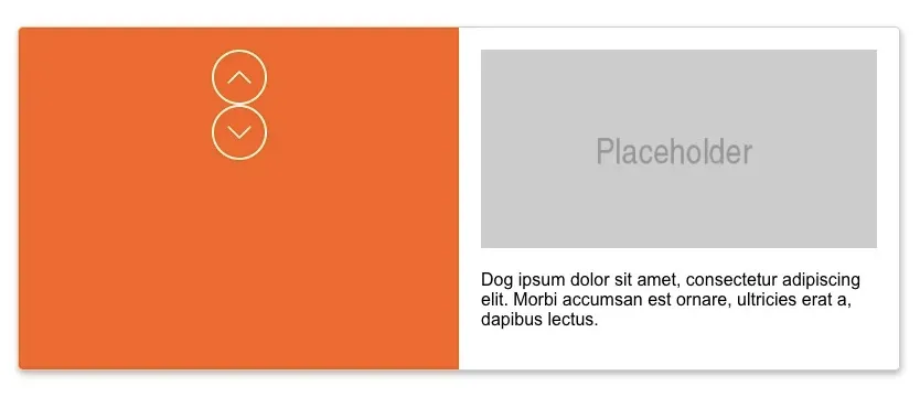
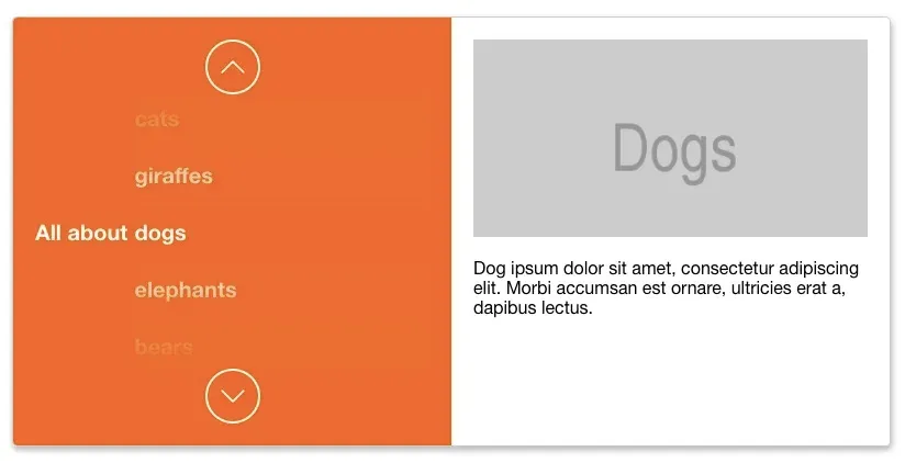
You should now be seeing something like the screenshot above. All of the layout is finished, but now all of the carousel items are stacked on top of each other. The next section will fix that.
Positioning and Shuffling Slides
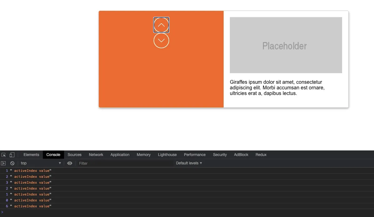
Now for the most complicated part of this component: the positioning and shuffling logic. A user should be able to navigate through the carousel slides smoothly without ever hitting a visible end or beginning. We can accomplish this by shuffling the translateY pixel values for each item when the activeIndex state value updates. Certain items will hit a threshold and are then moved to the bottom of the list, and vice versa. The actual element ordering within the DOM does not change.
For a better visual of what's happening, refer to the demo to see the translateY values being updated in your browser devtools.
There are a few constants we need to create that will help us out.
halfwayIndex. Determines which indexes fall within the second half of the slide array. This lets us know which items we need to initially shuffle to the top of the list.itemHeight. Sets an approximate height on each slide. This will control how far (in pixels) each carousel slide is spaced from the next.shuffleThreshold. This takes the previous constants and multiplies them together to create a number that will let us know when to move an item to the top or bottom of the list.visibleStyleThreshold. We need a way to prevent items from transitioning when they're being shuffled. (More on this in the next section).
const VerticalCarousel = ({
  data,
  leadingText,
}) => {
  const [activeIndex, setActiveIndex] = useState(0);

  // #1 above. Used to determine which items appear above the active item
  const halfwayIndex = Math.ceil(data.length / 2);

  // #2 above. Used to determine the height/spacing of each item
  const itemHeight = 52;

  // #3 above. Used to determine at what point an item is moved from the top to the bottom
  const shuffleThreshold = halfwayIndex * itemHeight;

  // #4 above. Used to determine which items should be visible. Prevents "ghost" transitions
  const visibleStyleThreshold = shuffleThreshold / 2;
Now that we have these constants, we can fill in the empty determinePlacement function we added before.
First, if the item is the "active" item, return 0. This ends up being output as transform: translateY(0px); in our JSX, and it positions the item directly in the center of the list, next to the leading text value.
// Position item in the center of list
if (activeIndex === itemIndex) return 0;
Next we have logic that looks for slides that are in the second half of the list. If they are, we want to move these items either downward towards the middle of the list or upwards towards the top. This is where the constants we defined come into play.
// Targeting items in the second part of the list
if (itemIndex >= halfwayIndex) {
	// If moving backwards from index 0 to the last item, move the value downwards
  if (activeIndex > (itemIndex - halfwayIndex)) {
    return (itemIndex - activeIndex) * itemHeight;
  } else {
		// Negative value moves upwards towards the top of the list
    return -((data.length + activeIndex) - itemIndex) * itemHeight;
  }
}
Next for the items that are in front of the current active item. We want those spaced out evenly based on the height (52px) times the index. For example: slide index 0 = 0px, slide index 1 = 52px, slide index 2 = 104px, etc.
// Spacing for items after the current index
if (itemIndex > activeIndex) {
  return (itemIndex - activeIndex) * itemHeight;
}
Finally, there's the positioning for items that come before the current index.
// Spacing for items before the current index
if (itemIndex < activeIndex) {
  if ((activeIndex - itemIndex) * itemHeight >= shuffleThreshold) {
    return (data.length - (activeIndex - itemIndex)) * itemHeight;
  }
  return -(activeIndex - itemIndex) * itemHeight;
}
The complete determinePlacement function is below.
const determinePlacement = (itemIndex) => {
	// Position item in the center of list
	if (activeIndex === itemIndex) return 0;

	// Targeting items in the second part of the list
	if (itemIndex >= halfwayIndex) {
		// If moving backwards from index 0 to the last item, move the value downwards
	  if (activeIndex > (itemIndex - halfwayIndex)) {
	    return (itemIndex - activeIndex) * itemHeight;
	  } else {
			// Negative value moves upwards towards the top of the list
	    return -((data.length + activeIndex) - itemIndex) * itemHeight;
	  }
	}

	// Spacing for items after the current index
	if (itemIndex > activeIndex) {
	  return (itemIndex - activeIndex) * itemHeight;
	}

	// Spacing for items before the current index
	if (itemIndex < activeIndex) {
		// If passing the negative threshold, move into a positive positioning
	  if ((activeIndex - itemIndex) * itemHeight >= shuffleThreshold) {
	    return (data.length - (activeIndex - itemIndex)) * itemHeight;
	  }
		// Move into a negative positioning
	  return -(activeIndex - itemIndex) * itemHeight;
	}
}
This completes the last requirement, #5.
I know: there is a LOT going on here! It can help to break this functionality down by going to the demo and experimenting with it firsthand. I'll also note that this logic can definitely be optimized.
We're done! Our carousel item layout should be looking much better and clicking the previous or next buttons should be navigating through the slides! We've also crossed off all of our requirements.
However, there's one last problem to solve.
Avoiding Unnecessary Transitions
You'll notice how the carousel items are transitioning when they're being shuffled in the list. We need to find some way to get around this so that only the currently visible items can transition. Any other items that aren't actually visible can then be shuffled around in a non-visual way.
We actually solved part of this earlier when we added the visibleStyleThreshold constant. Now we just need to compare that constant to each carousel item position that is returned from the determinePlacement function and add a "visible" CSS class if it falls within that threshold.
<button
  type="button"
  onClick={() => setActiveIndex(i)}
  className={cn('carousel-item', {
    active: activeIndex === i,
    visible: Math.abs(determinePlacement(i)) <= visibleStyleThreshold,
  })}
  key={item.id}
  style={{ transform: `translateY(${determinePlacement(i)}px)` }}
>
  {item.introline}
</button>
Once we have this class, we just style all .carousel-items with a 0 opacity and only add an opacity when it's received the .visible class.
.carousel-item {
  ...
  opacity: 0;
}

.carousel-item.visible {
  opacity: 1
}
Summary
I certainly learned a few things from building this component. Specifically, how to click through and shuffle carousel items infinitely. This is something I will definitely use in the future!