
Building a Segmented Control Component
Use React hooks and CSS variables to create an animated segmented control.
Often seen in mobile apps for both iOS and Android, the usage of segmented controls on the web have also become fairly common. Many websites make use of them and they are also included in component libraries like Evergreen and Mantine.
Segmented controls display a limited number of options (usually between two and five) to the user, where only a single "segment" can be selected at a time. Because of this, they can be a good alternative to using radio buttons.
In this article, we'll be building a segmented control component with React hooks and CSS variables.
To learn more about segmented controls as part of the Human Interface Guidelines from Apple, check out this page
Component Markup
Since segmented controls function very similarly to radio buttons, we will actually use them as the underlying markup for our component.
Start by creating a new React component named SegmentedControl.jsx.
import { useRef, useState, useEffect } from 'react';
import "./styles.css";

const SegmentedControl = () => {
  return (...);
}

export default SegmentedControl;
Our component will leverage the useRef, useState, and useEffect hooks, so be sure to import them.
Five props will be available to the component:
- name (required) - The
nameattribute for the radio buttons. - segments (required) - An array of segments to display. Each segment should have a
label, avalueand a Reactref.
{ label: 'Complete', value: 'complete', ref: useRef() } - callback (required) - A function that runs each time a segment is selected.
- defaultIndex (optional) - The segment to select by default.
- controlRef (required) - A ref to get the individual usage of the component.
We also need one state value, activeIndex, that keeps track of the selected index.
import { useRef, useState, useEffect } from 'react';
import "./styles.css";

const SegmentedControl = ({
  name,
  segments,
  callback,
  defaultIndex = 0,
  controlRef,
}) => {
  const [activeIndex, setActiveIndex] = useState(defaultIndex);

  return (...);
}

export default SegmentedControl;
Now let's add some HTML.
First we want a few divs to establish a container around the controls for styling purposes. Be sure to pass along the controlRef prop to the controls-container div.
return (
	<div className="controls-container" ref={controlRef}>
    <div className="controls">
      ...
    </div>
  </div>
);
Next we want to iterate over the segments array to output each of them.
return (
  <div className="controls-container" ref={controlRef}>
    <div className="controls">
      {segments.map((item, i) => (
        <div
          key={item.value}
          className={`segment ${i === activeIndex ? 'active' : 'inactive'}`}
          ref={item.ref}
        >
          <input
            type="radio"
            value={item.value}
            id={item.label}
            name={name}
            onChange={() => onInputChange(item.value, i)}
            checked={i === activeIndex}
          />
          <label htmlFor={item.label}>
            {item.label}
          </label>
        </div>
      ))}
    </div>
  </div>
)
All segments should contain a div with a ref attribute. This will be used later to get the width of each segment and its position inside the controls div.
Each div should also contain a radio button and a label.
Next let's add a function named onInputChange. This function will update the activeIndex state when each radio input is changed, and pass the value and its index to a parent component.
const SegmentedControl = ({ ... }) => {
  const [activeIndex, setActiveIndex] = useState(defaultIndex);

  const onInputChange = (value, index) => {
    setActiveIndex(index);
    callback(value, index);
  }

  return ( ... );
};
Let's use the component to see our progress so far.
<SegmentedControl
  name="group-1"
  callback={(val) => console.log(val)}
  defaultIndex={0}
  controlRef={useRef()}
  segments={[
    {
      label: 'Complete',
      value: 'complete',
      ref: useRef(),
    },
    {
      label: 'Incomplete',
      value: 'incomplete',
      ref: useRef(),
    },
    {
      label: 'Pending',
      value: 'pending',
      ref: useRef(),
    }
  ]}
/>
You should see a group of radio buttons that outputs the value of each when clicked.
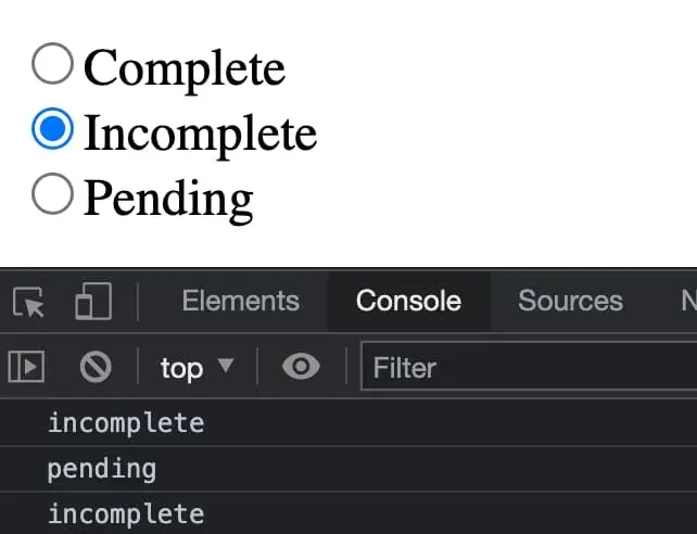
So far so good!
Styles and Layout
Now that the radio buttons are functioning, let's style them.
First, we'll add some CSS variables to control the width and X position for the background "highlight" of the selected segment. These variables will be updated dynamically in the next section and they should be added specifically within the controls-container selector. This allows us to scope the variable values to each instance of our component. We'll see how this is done later.
Next we will use flexbox to display the segments alongside each other.
.controls-container {
  --highlight-width: auto;
  --highlight-x-pos: 0;

  display: flex;
}

.controls {
  display: inline-flex;
  justify-content: space-between;
  background: white;
  box-shadow: 0 0 5px rgba(0, 0, 0, 0.1);
  border-radius: 10px;
  max-width: 500px;
  padding: 12px;
  margin: auto;
  overflow: hidden;
  position: relative;
}
Now for the radio button inputs. We'll hide them with opacity: 0 and absolutely position them to take up the full width/height of each segment.
.controls input {
  opacity: 0;
  margin: 0;
  top: 0;
  right: 0;
  bottom: 0;
  left: 0;
  position: absolute;
  width: 100%;
  cursor: pointer;
  height: 100%;
}

.segment {
  min-width: 120px;
  position: relative;
  text-align: center;
  z-index: 1;
}
When a segment becomes active, its label color should change to be white so that it can be better visible over the purple background highlight color.
.segment label {
  cursor: pointer;
  display: block;
  font-weight: 700;
  padding: 10px;
  position: relative;
  transition: color 0.5s ease;
}

.segment.active label {
  color: #fff;
}
Last, we'll use a ::before pseudo element for the segment background highlight.
.controls::before {
  content: '';
  background: #5465FF;
  border-radius: 8px;
  width: var(--highlight-width);
  transform: translateX(var(--highlight-x-pos));
  position: absolute;
  top: 8px;
  bottom: 8px;
  left: 0;
  z-index: 0;
}
The layout is complete for our segmented control component, but you'll notice that the highlight isn't working yet. Let's fix that!
Active Segment Highlight Animation
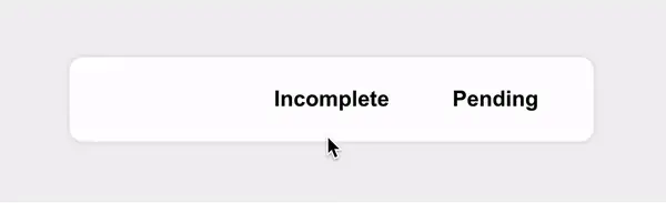
First, let's get the segment highlight to appear. It isn't working as expected yet because we need a way to update the --highlight-width and --highlight-x-pos CSS variables we added in the last section.
As its name implies, --highlight-width determines the width of the highlight.
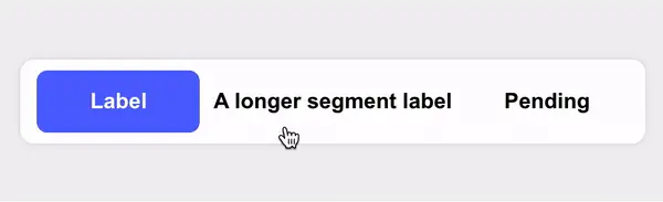
The reason we need this width variable at all is because our component should support segments that have labels of varying widths. When navigating between a smaller and larger segment, the highlight should animate to the new width, like in the example below.
The --highlight-x-pos variable will determine the X position where the highlight should appear. Because the highlight is a pseudo element not associated with a specific segment, we need to update its position whenever the active segment changes.
To accomplish this, let's run some logic when the activeIndex state value changes. Within our component, add a useEffect hook.
useEffect(() => {
  const activeSegmentRef = segments[activeIndex].ref;
  const { offsetWidth, offsetLeft } = activeSegmentRef.current;
  const { style } = controlRef.current;

  style.setProperty('--highlight-width', `${offsetWidth}px`);
  style.setProperty('--highlight-x-pos', `${offsetLeft}px`);
}, [activeIndex, callback, segments]);
Inside this hook, we need to find the ref attribute of the segment that's currently active. This is where the ref passed in for each segment becomes important!
Once we have a reference to the active segment, we can use the setProperty function (from controlRef.current.style) to update the CSS variables based on the width (offsetWidth) and left position (offsetWidth).
Recall that we're passing
controlRefas a prop and that we added the CSS variables earlier under thecontrols-containerselector.
Because we're setting these variables in the context of thecontrolRefelement (controls-container), this lets us scope variables for each individual use of the component. We couldn't do this if they were added at the root level and referenced fromdocument.documentElement, which is a very common way CSS variables are used.
Now that the highlight appears, add some transition properties for transform and width.
.controls::before {
	...
  transition: transform 0.3s ease, width 0.3s ease;
}
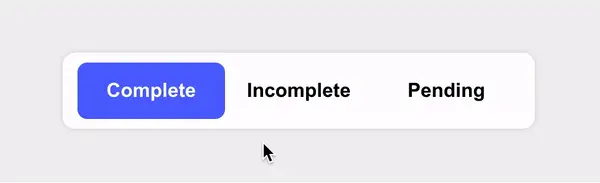
The highlight will now animate when a new section becomes active!
Preventing Animation on Component Mount
We are almost finished! There is just one slight bug that should be addressed. You may notice that when the component initially mounts, the highlight animation will run. It becomes more obvious if you pass a defaultIndex other than 0.
This animation could be confusing for users because it feels unexpected, so we should prevent it from happening until necessary.
There are likely a few ways to fix this, but one way is to add a ref that will store whether or not the component is "ready". We can then use this value to add a CSS class once the component mounts. This CSS class will contain the transition properties so that they're not yet available when the component first mounts.
Begin by adding a ref named componentReady.
const SegmentedControl = (...) => {
  const [activeIndex, setActiveIndex] = useState(defaultIndex);
  const componentReady = useRef();
}
Next, add a useEffect hook that only runs when the component mounts. We want to set componentReady to true here.
// Determine when the component is "ready"
useEffect(() => {
  componentReady.current = true;
}, []);
Now use this value to add a CSS class of ready onto the controls div.
return (
	<div className="controls-container" ref={controlRef}>
	  <div className={`controls ${componentReady.current ? 'ready' : 'idle'}`}>
	    ...
	  </div>
	</div>
)
Finally, move the transition off of the psudeo element we added it to previously, and into a new selector that includes the ready class.
/* Only allow transitions once component is ready */
.controls.ready::before {
  transition: transform 0.3s ease, width 0.3s ease;
}
The transition should now only occur once the active segment changes.
Summary
In this article, we built a React segmented control component that can be used in a variety of different scenarios. Since it uses native HTML radio buttons as the primary markup, it is accessible using the keyboard by default, and can handle segment labels with varying lengths.