
Building a React Confetti Component
Partying hard with React hooks, CSS and the js-confetti library.
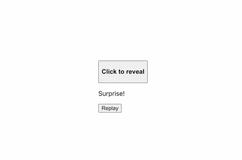
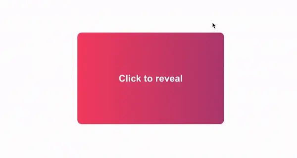
In this article, we’ll be building an animated card component. When clicked, it flips over and a blast of confetti reveals the content on the back of the card.
For this component, we’ll leverage the useEffect, useState and useRef hooks in React, as well as the js-confetti library. We’ll also learn how to write CSS transform animations.
This type of animation effect should be used sparingly. Please consider suppressing the animation if your users have accessibility settings enabled. You can learn more about this topic here - Reducing Motion in Animations.
Getting Started
Start by creating a new component named ConfettiCard.
This component takes two props - frontContent which in our example is some text to be shown on the front of the card, and backContent for text shown on the back.
import { useEffect, useState, useRef } from 'react';

const ConfettiCard = ({
  frontContent,
  backContent,
}) => {
  return ( ... );
};

export default ConfettiCard;
At this point, be sure to import useEffect, useState and useRef from React as well.
Next, our component needs some state. We want to track whether the card is in a “flipped” position or not, so a state value of isFlipped will tell us that.
We also need a click handler. Name it handleClick. For now, all it does is update the isFlipped state, but when we add the confetti effect later, the click handler will determine when to run it.
const ConfettiCard = ({
  frontContent,
  backContent,
}) => {
  const [isFlipped, setIsFlipped] = useState(false);

  const handleClick = () => {
    setIsFlipped(!isFlipped);
  };

  return ( ... );
};
Now for some HTML markup.
The component should return a div with a class of card at the outermost level. This div should receive an additional class of active when the isFlipped state value is true.
Within card, add another div with a class of card-front and inside that, a button. This button serves as the trigger for the card flip via the handleClick function we just wrote.
return (
  <div className={`card ${isFlipped ? 'active' : 'inactive'}`}>
    <div className="card-front">
      <button
        type="button"
        onClick={handleClick}
        className="trigger icon"
      >
        {frontContent}
      </button>
    </div>
  </div>
);
Within the button, frontContent will output the text passed in through the prop.
Why are we using a button element above? Generally, a
divshould not have a click handler assigned to it. Instead, a button allows the card to be keyboard focusable and trigger any React onClick events via the keyboard. These are easy accessibility wins.
For the back of the card, add an adjacent div to card-front with a class of card-back.
return (
  <div className={`card ${isFlipped ? 'active' : 'inactive'}`}>
    <div className="card-front">...</div>
    <div className="card-back">
      {backContent}
      <button type="button" className="reset" onClick={handleClick}>
        Replay
      </button>
    </div>
  </div>
);
This outputs the backContent prop value, and a reset button to flip the card back into its original state. We can leverage the same handleClick function we already wrote to do that.
Our markup is finished for now. It doesn’t really resemble a card yet though, so let’s move on to some CSS.
CSS
We'll start with the styles for the outermost card div.
Not every line is explained in detail below. Please experiment with any of the styling to see how it applies to your specific use case.
For this demo, we'll define a max-width of 400px and min-height of 250px. These can really be as large or small as you want and depend on the amount of content you need to display on either side of the card.
We add a transition property of transform for the card animation and a transform-style of preserve-3d to correctly display the content on the back of the card once it’s flipped. Otherwise, the content will appear backwards.
The
transformhere will make more sense towards the end of this section.
The rest of the .card styles are mostly for alignment and display of the front/back text.
.card {
  background: linear-gradient(90deg, #F44369 0%, #B44077 100%);
  min-height: 250px;
  max-width: 400px;
  width: 100%;
  transition: transform 0.5s ease;
  transform-style: preserve-3d;
  display: flex;
  justify-content: center;
  align-items: center;
  height: 100%;
  width: 100%;
  position: relative;
  border-radius: 12px;
  text-align: center;
}
Next, we have some basic styles for the card buttons and the hover state.
.card button {
  background: none;
  border: none;
  padding: 0;
  cursor: pointer;
  font-weight: 700;
}

.card:hover {
  transform: scale(0.96);
}
Some button styling should be added for the trigger and reset buttons too!
.trigger {
  width: 100%;
  height: 100%;
  color: #fff;
  font-size: 22px;
  font-weight: 700;
}

.reset {
  position: absolute;
  bottom: 15px;
  right: 15px;
  color: #fff;
  font-size: 14px;
}
Next we have some CSS to apply to both card-front and card-back.
Both of these divs are absolutely positioned, have a height and width of 100% and have the backface-visibility property of hidden. This is important because without backface-visibility, you can see through to the content on the other side of the card.
.card-front,
.card-back {
  position: absolute;
  backface-visibility: hidden;
  height: 100%;
  width: 100%;
  font-size: 20px;
  color: #fff;
  font-weight: 700;
}
Now we have some styles specifically for the card-back div.
.card-back {
  transform: rotateY(180deg);
  overflow: hidden;
  width: 100%;
  height: 100%;
  display: flex;
  justify-content: center;
  align-items: center;
  flex-direction: column;
}
Notice the transform property here. This is important. The content on the back of the card needs to be rotated to the same value as the card itself, which is 180deg.
Finally, we have the active class. This is what actually rotates the card to the flipped state.
We’ll be transforming two CSS properties: perspective and rotateY.
From the MDN docs:
The
perspectiveCSS property determines the distance between the z=0 plane and the user in order to give a 3D-positioned element some perspective.
A value of 700 is used for this property.
Experiment with the
perspectivevalue and you’ll see a visual difference in the way the card rotates. Arriving at700was mostly just trial and error.rotateYis a little more straightforward. All it does is rotate the card along the Y axis. This value should match the180degadded to.card-back.
.card.active {
  transform: perspective(700px) rotateY(180deg);
}
Now we’ve got a card that flips 180 degrees to show the content on the back. Let’s move on to the most exciting part!
Adding the Confetti Effect
It’s time to party! Let’s add some confetti to our card.
As mentioned earlier, we’ll be using the js-confetti library for this effect.
npm install js-confetti
The API for this library is pretty simple: define a canvas for the confetti, instantiate a new instance of the JSConfetti class, and add the confetti to the canvas.
To get started, import the library into the component.
import JSConfetti from 'js-confetti';

const ConfettiCard = ({ ... }) => {}
Next, we leverage the useRef React hook. Two refs are needed: one is a reference to the canvas element that the confetti is rendered to, and the other holds a reference to the JSConfetti instance.
const ConfettiCard = ({ ... }) => {
  const canvasRef = useRef();
  const confettiRef = useRef();
}
To initialize JSConfetti, we want to add a useEffect that runs when the component first mounts. We'll provide it the canvasRef, and save the instance to confettiRef.
const ConfettiCard = ({ ... }) => {
  const canvasRef = useRef();
  const confettiRef = useRef();

  useEffect(() => {
    confettiRef.current = new JSConfetti({ canvas: canvasRef.current });
  }, []);

  return (...);
}
Let’s revisit the handleClick function we wrote earlier.
In addition to updating the state, we should check if the card hasn’t been flipped yet, and configure the confetti using the addConfetti method.
const handleClick = () => {
  if (!isFlipped) {
    confettiRef.current.addConfetti({
      confettiRadius: 5,
      confettiNumber: 300,
    });
  }

  setIsFlipped(!isFlipped);
};
You can set
confettiRadiusandconfettiNumberto any number you want. Experiment with these options to see what works best for your use case.Finally, add acanvaselement within thecard-backdiv. Be sure to includecanvasRefon the element.
<div className="card-back">
  {backContent}
  <canvas className="canvas" ref={canvasRef} />
  <button className="reset" onClick={handleClick}>
    Replay
  </button>
</div>
There’s one last CSS adjustment before we can see all of this in action!
The canvas should be positioned absolutely and stretch the full width/height of the card. Be sure to also set a z-index value of 0 so that any content on the back of the card can still be selected and not covered by the canvas.
.canvas {
  position: absolute;
  height: 100%;
  width: 100%;
  z-index: 0;
}

/* Make sure text can still be selected */
.card-back :not(.canvas) {
  z-index: 1;
}
The :not() selector adds a slightly higher z-index to everything besides the canvas.
Summary
In this article, you learned how to use some common React hooks - useState, useEffect and useRef in order to build an animated confetti card. You also leveraged js-confetti for the confetti effect and some CSS to create a card flipping animation.