
Building a Heatmap Chart Component
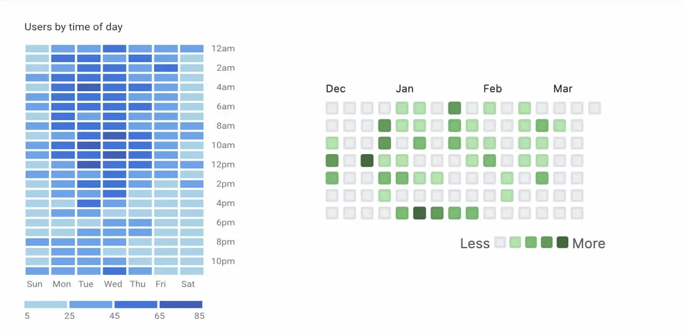
Making a heatmap chart like those seen in Github or Google Analytics.
Heatmaps are a type of chart that use colorized cells to represent data on two axes. If you’ve ever used Google Analytics or viewed a Github contribution history, you’ve interacted with two popular examples of them. After seeing both so much over the years, I decided to explore how to build something similar.
In this article, we’ll build a basic heatmap chart that visualizes how often the days and hours in the chart data overlap.
The component we build supports vertical and horizontal orientations using CSS Grid and uses HSL colors to dynamically lighten/darken the cell colors. We’ll also be using the reduce function quite a bit, so if you need to, please brush up on it.
I am by no means an expert in data visualization, so there are most likely scenarios that aren’t considered in this article. Feel free to expand this code as you see fit!
Whether dates and times are relevant to your needs or not, you can definitely take pieces of this article to apply them to your own unique chart.
Getting Started
Before anything else, let’s define how the component should work.
The days of the week will be rendered along one axis, and the other axis represents the hours of that day. Each cell becomes a slightly darker shade the more times it’s repeated in the data set.
An outline of what we’ll need to do:
- Format the chart data to get clear day and hour values from each string.
- Create a mapping of hours associated with specific days. For example,
Saturday: 5pm, 6pm, 5pm. - Output all of the labels supplied to the chart, and use that information with the day/hour mapping.
- Write a function that outputs a color of varying darkness.
- Create a basic tooltip showing the specific cell information when someone hovers over the chart.
- Set up a legend so that the chart is easier to discern.
Next let’s define the component props.
<Heatmap
  orientation="vertical"
  data={data}
  xAxisLabels={dayLabels}
  yAxisLabels={hourLabels}
/>
data- An array of strings to display in the chart. Each item in the array in our example contains both a date and a time. For example,"2021-03-27 12:30".orientation- A string value to display the chart either vertically or horizontally. The default is vertical.xAxisLabels- An array of strings to use as labels for the X-axis data. These are the days of the week in our example.yAxisLabels- An array of strings to use as the labels for the Y-axis data, which will be hours between midnight and 11 PM.
For the purposes of this tutorial, we’ll assume the format of the strings in the data is valid.
Formatting the Chart Data
First, we should format the data prop that our chart component receives in a way that separates the day from the hour.
We’ll use the date-fns format function in one part of our code. Be sure to install it as a dependency or use another alternative.
Begin by making a new file named Heatmap.jsx.
Inside the file, we need a basic object with an index relating to a day of the week. For example, Sunday = 0, Monday = 1, and so on.
const DAY_INDEXES = {
  0: 'Sun',
  1: 'Mon',
  2: 'Tue',
  3: 'Wed',
  4: 'Thu',
  5: 'Fri',
  6: 'Sat',
};
Next, add a new function named formatDayAndHour. We’ll use reduce to return an object that contains the days and hours.
function formatDayAndHour(chartData) {
  return chartData.reduce((dates, dateString) => {
    return dates;
  }, {});
}
The idea of this function is to take the array of data passed into the chart component, format each value into an hour of the day, then segment the hours based on the day. It will look like below:
{
  "Sat": [
    "12pm",
    "12pm",
    "1pm",
    "12pm",
    "3pm",
    "5pm",
    "3pm",
  ],
  "Mon": [
    "6pm",
    "6pm",
    "7pm",
    "5pm",
    "5pm",
  ],
	...
}
Depending on the dataset, you will have duplicate values in the output of this function. We’ll count these duplicates later on to create the chart colors.
To achieve the above, create a new date object based on the dateString value, and save it to a const named date. We’ll call getDay() on that to get the day. The value returned is a number, starting with 0 for Sunday. So if we use the DAY_INDEXES object created earlier, we’ll end up with a day constant like Sun, Mon, etc.
function formatDayAndHour(chartData) {
  return chartData.reduce((dates, dateString) => {
    const date = new Date(dateString);
    const day = DAY_INDEXES[date.getDay()];

    return dates;
  }, {});
}
Now let's use the format function provided from the date-fns library to format the hour value to something like 12pm.
import format from 'date-fns/format';

function formatDayAndHour(chartData) {
  return chartData.reduce((dates, dateString) => {
    const date = new Date(dateString);
    const day = DAY_INDEXES[date.getDay()];
    const hour = format(date, 'haaa');

    (dates[day] = dates[day] || []).push(hour);

    return dates;
  }, {});
}
We look to see if the day exists as a key on the dates object. If it doesn’t, then we create a new key with the day as a value and push the hour onto that array. If it already exists, then we just push the value.
Adding the Chart Component UI
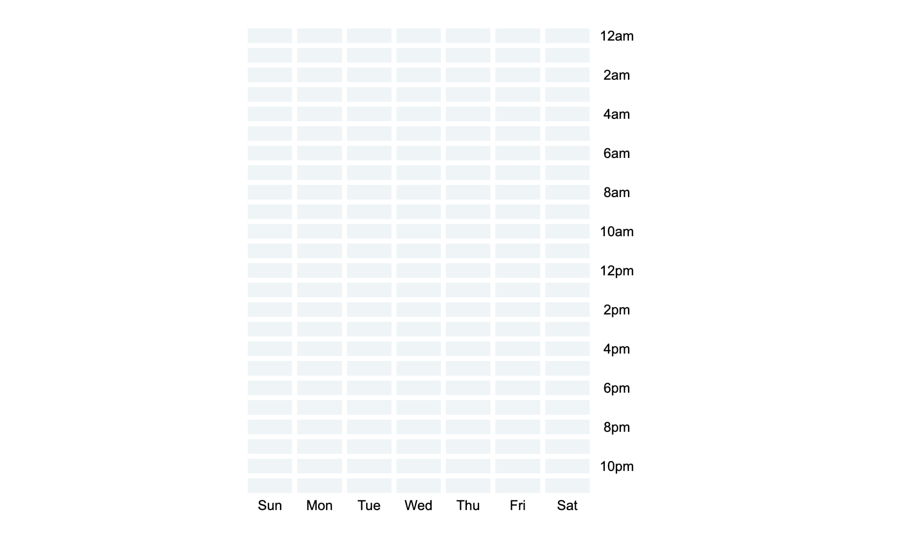
Now, let’s start building the component UI! We’ll focus on showing an empty chart – just a grid of cells along with the X- and Y-axis labels.
const Heatmap = ({
  data = [],
  xAxisLabels = [],
  yAxisLabels = [],
  orientation = 'vertical',
}) => {
  return ( ... );
};
For the component props, we’ll set default values for each. Feel free to adjust them however you’d like.
Now that we’re setting the component up, pass the data prop into the formatDayAndHour function we just added. We’ll use the formattedData constant it returns later.
const Heatmap = ({
  data = [],
  xAxisLabels = [],
  yAxisLabels = [],
  orientation = 'vertical',
}) => {
	const formattedData = formatDayAndHour(data);

  return ( ... );
};
Now we need to generate the chart cells, which are based on the X and Y label props.
The function we write needs to collect the days of the week as object keys. Beneath that, an hours array should contain a count of how many times that day and hour occurred, and a dayHour label that is used in the tooltip.
Here’s an example.
{
  "Sun": {
    "hours": [
      {
        "dayHour": "Sun 12am",
        "count": 0
      },
      {
        "dayHour": "Sun 1am",
        "count": 2
      }
      ...
    ]
  },
  "Mon": {
    "hours": [
      {
        "dayHour": "Mon 12am",
        "count": 10
      },
      {
        "dayHour": "Mon 1am",
        "count": 4
      }
      ...
    ]
  }
  ...
}
To accomplish this, we’ll use reduce to iterate the xAxisLabels and collect them into an object.
const Heatmap = (...) => {
  const gridCells = xAxisLabels.reduce((days, dayLabel) => {
    return {
      ...days,
      [dayLabel]: {
        hours: dayAndHour,
      }
    }
  }, {});

  return (...);
};
Inside of that, we again use reduce for the yAxisLabels. This will collect the Y axis labels into an array of objects with dayHour values.
const gridCells = xAxisLabels.reduce((days, dayLabel) => {
  const dayAndHour = yAxisLabels.reduce((hours, hourLabel) => {
    return [
      ...hours,
      {
        dayHour: `${dayLabel} ${hourLabel}`,
      }
    ];
  }, []);

  return {
    ...days,
    [dayLabel]: {
      hours: dayAndHour,
    }
  }
}, {});
Next, let’s add some HTML markup to make use of the gridCells data we just generated.
We’ll loop over each day in the gridCells object using Object.keys and then map to create a column for each day. For each column, map over the array of hours to output a cell for each hour.
return (
  <div className="container">
    <div className={`heatmap ${orientation}`}>
      {Object.keys(gridCells).map((day) => (
        <div key={day} className="cells col">
          {gridCells[day].hours.map(({ dayHour, count }) => (
            <div
              key={dayHour}
              className="cell"
            />
          ))}
          <span className="label">{day}</span>
        </div>
      ))}
    </div>
  </div>
);
After that, we will iterate over the yAxisLabels and make use of the Javascript remainder (modulo) operator to output a label for every other index, like 12am 2am 4am, etc.
return (
  <div className="container">
    <div className={`heatmap ${orientation}`}>
      {Object.keys(gridCells).map((day) => (
        ...
      ))}
      <div className="col">
        {yAxisLabels.map((label, index) => (
          <span key={label} className="label">
            {(index % 2 === 0) ? label : null}
          </span>
        ))}
      </div>
    </div>
  </div>
);
You should now see a bunch of labels, but not much else. Let’s fix that with some CSS.
Chart Layout and Styles
A heatmap chart is very grid-like in the first place, so it’s a great candidate for CSS grid.
.heatmap {
  display: grid;
  grid-gap: 5px;
  align-items: start;
}

.col {
  display: grid;
  grid-gap: 5px;
}

.cell {
  height: 15px;
  width: 100%;
  position: relative;
  background: hsl(196deg 36% 95%);
}

.label {
  text-align: center;
  height: 15px;
  font-size: 14px;
}
The align-items property above is used to control the spacing of the Y-axis labels so that they align with the start of the chart.
Since we want to support both vertical and horizontal layouts, this can be done with minimal code.
.vertical {
  max-width: 400px;
  grid-template-columns: repeat(8, 1fr);
}

.vertical .col {
  flex-direction: column;
}

.horizontal {
  max-width: 900px;
  grid-template-rows: repeat(8, 1fr);
}

.horizontal .col {
  display: grid;
  grid-template-columns: repeat(25, 1fr);
}

.horizontal .cells .label {
  text-align: left;
}
Adding Color to the Chart
Now that we’ve got a chart of empty cells, let’s finally get to the core of our heatmap chart: the colorized cells!
First we need a count of how many times each day and hour in the dataset overlap.
To do that, we’ll need to make a change to the function we just wrote that generates the gridCells constant.
We’ll use reduce again to iterate the formattedData constant we created earlier and count how many times the hourLabel (12am, 1am, etc.) matches the hour values contained in the formattedData. If there’s a match, we’ll increment the total value.
const gridCells = xAxisLabels.reduce((days, dayLabel) => {
  const dayAndHour = yAxisLabels.reduce((hours, hourLabel) => {
    const count = formattedData[dayLabel]?.reduce((total, hour) => {
      return hour === hourLabel ? total + 1 : total;
    }, 0);

    return [
      ...hours,
      {
        dayHour: `${dayLabel} ${hourLabel}`,
        count,
      }
    ];
  }, []);

  return ...
}, {});
The total count we have in the constant is added into the object that’s returned from the outer reduce function.
With a count value for each hour in hand, we need to interpret it as a color that gets increasingly dark depending on how large it is. This can be done by using HSL colors in CSS. We won’t get into too much detail on how they actually work, but here’s a good primer.
Start with the basic HSL color we added earlier in our CSS hsl(196deg 36% 95%);.
Each time a count value increases, we want to slightly change the lightness of the cell to a darker shade. For this, we’ll need a new function: generateBackgroundColor.
const generateBackgroundColor = (count) => {
  return `hsl(196deg 36% ${count > 0 ? 95 - (count * 5) : 95}%)`
}
This function checks the value of count. If it’s greater than 0, it adjusts the last value of the HSL color (the lightness) by a multiple of 5.
Experiment with the above to find a color that you might like better.
Now let’s make use of this function on the cell div.
<div
  key={dayHour}
  className="cell"
  style={{ backgroundColor: generateBackgroundColor(count)}}
/>
This should give us darker cell colors the higher the count value is.
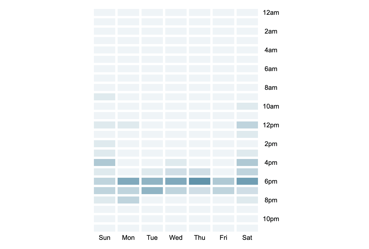
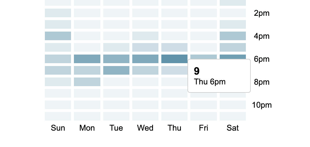
Chart Tooltip
Now let’s add a basic tooltip so that we can get a quick view of the data each cell represents on hover.
First, start by adding some HTML into the cell div. The tooltip should show the count value, and also the day and hour values themselves, like Sat 5pm.
This should be simple because we already have the count and dayHour in the gridCells constant.
{Object.keys(gridCells).map((day) => (
  <div key={day} className="cells col">
    {gridCells[day].hours.map(({ dayHour, count }) => (
      <div
        key={dayHour}
        className="cell"
        style={{ backgroundColor: generateBackgroundColor(count)}}
      >
        <div className="tooltip" role="tooltip">
          <span className="count">{count}</span>
          <span>{dayHour}</span>
        </div>
      </div>
    ))}
    <span className="label">{day}</span>
  </div>
))}
One tradeoff with the way we’re doing this is that the tooltip is rendered once for each cell. An alternative way to handle it would be to add an event listener for each cell and render a single tooltip based on the cell that was hovered. That’s a bit beyond the scope of this article.
Finally, let’s add some styles for the tooltip.
.tooltip {
  position: absolute;
  display: none;
  background: white;
  border: 1px solid #ccc;
  padding: 10px;
  z-index: 1;
  top: 50%;
  left: 100%;
  font-size: 18px;
  border-radius: 4px;
  min-width: 110px;
}

.tooltip span {
  display: block;
  font-size: 14px;
}

.tooltip .count {
  font-size: 18px;
  font-weight: 700;
}

.cell:hover .tooltip {
  display: block;
}
Generating a Chart Legend
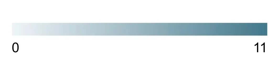
Last but not least, we should create a basic legend for our chart to help users better understand what’s being displayed. The legend should display labels for the low and high end count values in the chart and a gradient that demonstrates the range of colors between them.
In the previous sections, we iterated over the labels and the formattedData, but we don’t have a list that contains only the count values. We need that in order to determine a min and max.
We can do this by adding a React ref named minMaxCount.
import { useRef } from "react";

const Heatmap = (...) => {
  const minMaxCount = useRef([]);
}
Next, let’s revisit the function generating the formattedData constant from earlier. We want to use the ref to store the contents of each count as we get it.
const gridCells = xAxisLabels.reduce((days, dayLabel) => {
	const dayAndHour = yAxisLabels.reduce((hours, hourLabel) => {
		...
    minMaxCount.current = [
      ...minMaxCount.current,
      count,
    ]

    return [ ... ];
  }, []);

  return {
    ...days,
    [dayLabel]: {
      hours: dayAndHour,
    }
  }
}, {});
This gives us an array containing each count value. There will likely be duplicate numbers, but we’ll deal with that in a second.
Next let’s make a new function outside of our component named generateLegend.
This function returns the legend markup and takes the minMaxCount ref we just created as a param.
function generateLegend(data) {
  return (
    <div className="legend">
      <div className="cell" />
      <div className="labels">
        <span className="label">{minValue}</span>
        <span className="label">{maxValue}</span>
      </div>
    </div>
  )
}

const Heatmap = (...) => {
	...
  return (
    <div className="container">
      <div className={`heatmap ${orientation}`}>
        ...
        ...
      </div>
      {generateLegend(minMaxCount.current)}
    </div>
  );
};
First we need to deduplicate the values by creating a new Set and saving that to constant. We’re left with an array containing only unique values.
function generateLegend(data) {
  const deduped = [...new Set(data)];
  const minValue = Math.min(...deduped);
  const maxValue = Math.max(...deduped);

  return (...)
}
We can use the Math.min() and Math.max() functions on this array to determine the min and max values.
Next we will reuse the generateBackgroundColor function we created earlier and pass both the minValue and maxValue to it. This generates colors for the values exactly the same as they appear in the chart.
function generateLegend(data) {
  const deduped = [...new Set(data)];
  const minValue = Math.min(...deduped);
  const maxValue = Math.max(...deduped);
  const minColor = generateBackgroundColor(minValue);
  const maxColor = generateBackgroundColor(maxValue);

  return (
    <div className="legend">
      <div className="cell" />
      <div className="labels">
        <span className="label">{minValue}</span>
        <span className="label">{maxValue}</span>
      </div>
    </div>
  )
}
Now create a gradient background to display these colors.
function generateLegend(data) {
	...
  return (
    <div className="legend">
      <div
        className="cell"
        style={{
          background:
          `linear-gradient(90deg, ${minColor} 0%, ${maxColor} 100%)`
        }}
      />
      <div className="labels">
        <span className="label">{minValue}</span>
        <span className="label">{maxValue}</span>
      </div>
    </div>
  )
}
Some basic styling is needed for the layout of the legend.
.legend {
  margin-top: 30px;
  max-width: 300px;
}

.legend .cell {
  height: 15px;
  width: 100%;
}

.legend .labels {
  display: flex;
  justify-content: space-between;
  margin-top: 5px;
}

.legend span {
  font-size: 16px;
}
We now have a dynamic legend that adjusts its colors and labels based on the information displayed in the chart.
Summary
In this article, you learned how to build a React heatmap chart. The power of CSS grid allowed us to easily create the layout, and using HSL colors, we were able to dynamically colorize each cell in the chart.