
Building a Dark Mode Theme Toggle
Learn how to build an interesting dark mode animation.
Today we will be building a toggle component that animates between a light and dark theme. I was inspired by this Dribbble shot, and it was a fun experiment to try and recreate.
This article is split into four sections, each exploring a concept that builds up to our end result.
- Building a basic toggle component.
- Modifying that component for use with dark mode.
- Using CSS variables to apply dynamic theming.
- Adding the dark mode "wave" animation.
The code we'll be writing will be in React, using a few React hooks, but the overall idea can be implemented in your library or framework of choice.
This article will assume you are at least familiar with the concept of CSS Variables (AKA CSS Custom Properties). I recommend checking out this article for a basic intro, or this one for a deeper dive.
Let's get started!
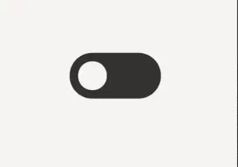
Basic Toggle Component
The first thing we'll do is build our toggle component. Start by making a new file named ThemeToggle.jsx.
Since the value we want to toggle is either enabled or disabled (true or false), we'll use a single checkbox element and build up from that.
If you wanted to use a radio or button element instead, those may work too.
Our component should have one state value, isEnabled, that tracks a value being enabled or disabled.
export default function ThemeToggle() {
  const [isEnabled, setIsEnabled] = useState(false);

  const toggleState = () => {
    setIsEnabled((prevState) => !prevState);
  };

  return (
    <label className="toggle-wrapper" htmlFor="toggle">
      <div className={`toggle ${isEnabled ? "enabled" : "disabled"}`}>
        <span className="hidden">
          {isEnabled ? "Enable" : "Disable"}
        </span>
        <input
          id="toggle"
          name="toggle"
          type="checkbox"
          checked={isEnabled}
          onClick={toggleState}
        />
      </div>
    </label>
  );
}
In our JSX, a label wraps all of the markup. This helps make the entire toggle clickable, whereas we'd otherwise need to position the label to take up the width and height of the element. This saves us a few lines of CSS.
We swap between an enabled or disabled CSS class depending on the state. These classes will control the position of the toggle handle, or "dot".
We also want to make sure there is some text within the label, which helps with accessibility. We'll hide this text visually via a hidden class when we apply our styles.
One last addition: we want to actually do something when the toggle state updates! For this, we'll add a useEffect hook. More on this later.
export default function ThemeToggle() {
  const [isEnabled, setIsEnabled] = useState(false);

	useEffect(() => {
    console.log('TODO more on this later');
	}, [isEnabled]);

  const toggleState = () => {
    setIsEnabled((prevState) => !prevState);
  };
Believe it or not, this is all the markup we need at the moment.
Now for some CSS. First adjust the box-sizing for all elements to border-box, and add a few CSS variables to store some colors and a transition value.
* {
  box-sizing: border-box;
}

:root {
  --black: #333333;
  --white: #f5f5f5;
	--transition: 0.5s ease;
}

.hidden {
  clip: rect(0 0 0 0);
  clip-path: inset(50%);
  height: 1px;
  overflow: hidden;
  position: absolute;
  white-space: nowrap;
  width: 1px;
}

.toggle-wrapper {
  width: 130px;
  display: block;
}

.toggle {
  height: 65px;
  width: 130px;
  background: var(--black);
  border-radius: 40px;
  padding: 12px;
  position: relative;
  margin: auto; // Optional to center the toggle
  cursor: pointer;
}
We'll add a hidden class to visually hide the label text, and then add in the styles for the .toggle div itself.
Now for the rest of the toggle styles. The toggle handle consists of a ::before pseudo element and it's transformed 62px to the right when the .right class is applied.
.toggle::before {
  content: "";
  display: block;
  height: 41px;
  width: 41px;
  border-radius: 30px;
  background: var(--white);
  position: absolute;
  z-index: 2;
  transform: translate(0);
  transition: transform var(--transition);
}

.toggle.enabled::before {
  transform: translateX(65px);
}

.toggle input {
	position: absolute;
	top: 0;
  opacity: 0;
}
The last thing is to hide the checkbox by setting it to an opacity of 0 and updating the positioning slightly.
With that, you should have a minimal toggle component!
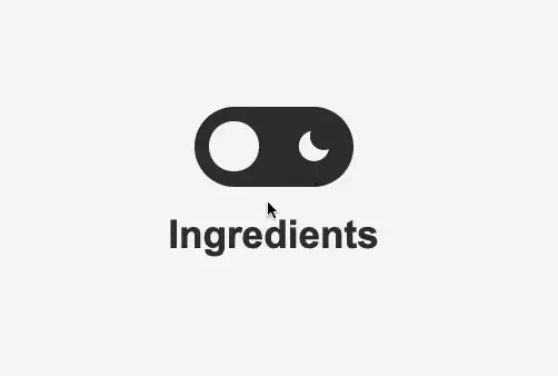
Updating the Toggle Component
With the base toggle done, let's make a few updates so it's more suitable for our end goal: toggling a dark theme.
Adding some icons should make this a little more obvious, and while we're add it, updating the label text to be a bit more descriptive.
import { ReactComponent as MoonIcon } from "./assets/svg/moon.svg";
import { ReactComponent as SunIcon } from "./assets/svg/sun.svg";

return (
  <label className="toggle-wrapper" htmlFor="toggle">
    <div className={`toggle ${isEnabled ? "enabled" : "disabled"}`}>
      <span className="hidden">
        {isEnabled ? "Enable Light Mode" : "Enable Dark Mode"}
      </span>
      <div className="icons">
        <SunIcon />
        <MoonIcon />
      </div>
      <input
        id="toggle"
        name="toggle"
        type="checkbox"
        checked={isEnabled}
        onClick={toggleState}
      />
    </div>
  </label>
);
Depending on your development environment, the way you import and use SVGs might be different than the above.
Next the styles for the icons.
.toggle .icons {
  display: flex;
  justify-content: space-between;
  align-items: center;
  height: 100%;
  margin: 0 5px;
}

.toggle .icons svg {
  fill: var(--white);
  height: 30px;
  width: 30px;
  z-index: 0;
}
The icon fill color will be updated in the next section to be dynamic. For now, we'll set it as white.
Using CSS Variables
Next let's see how we can use CSS variables in our dark mode implementation.
CSS variables can be set using Javascript with the setProperty function.
For example:
document.documentElement.style.setProperty("--orange", 'blue');
With the above line of code, anywhere the --orange variable is used, it will now be blue.
This means that we can use two variables in our CSS: --foreground and --background and set them to a specific color depending on the state of our toggle component.
Let's add a function to do that.
const updateTheme = (isDarkEnabled) => {

  // Get all available styles
  const styles = getComputedStyle(document.body);

	// Get the --black and --white variable values
	const black = styles.getPropertyValue("--black");
  const white = styles.getPropertyValue("--white");
};
The first thing our function does is get the color values we've defined in our CSS. This prevents us from needing to store hex color values for black and white in both JS and CSS. They are defined once in our CSS file, and if they need updating, only the CSS needs to be changed.
We can do this with the getComputedStyle function and passing in document.body. This returns all the style properties on the body.
Next we use the getPropertyValue to get the values of --black and --white and set them as constants.
For our logic, we want to check the value of isDarkEnabled. If it's true, set the --background variable to black and the --foreground variable to white. We do the opposite if isDarkEnabled is false.
const updateTheme = (isDarkEnabled) => {
	// Get all available styles
	const styles = getComputedStyle(document.body);

	// Get the --black and --white variable values
	const black = styles.getPropertyValue("--black");
	const white = styles.getPropertyValue("--white");

	// Optional shorthand constant for accessing document.documentElement
	const docEl = document.documentElement;

  if (isDarkEnabled) {
    docEl.style.setProperty("--background", black);
    docEl.style.setProperty("--foreground", white);
  } else {
    docEl.style.setProperty("--background", white);
    docEl.style.setProperty("--foreground", black);
  }
Finally, let's use our function in the useEffect hook we added earlier.
useEffect(() => {
	// Pass in the isEnabled state
  updateTheme(isEnabled);
}, [isEnabled]);
If you try clicking on the toggle component, you won't see anything happen yet. This is because we haven't actually defined --background or --foreground in the CSS.
Let's make some adjustments to get this working!
:root {
  --black: #333333;
  --white: #f5f5f5;
  --background: var(--white);
  --foreground: var(--black);
  --transition: 0.5s ease;
}

html {
  background: var(--background);
  color: var(--foreground);
  transition: color var(--transition), background var(--transition);
}

.toggle {
	...
  background: var(--foreground);
	transition: background var(--transition);
}

.toggle::before {
  ...
  background: var(--background);
	transition: transform var(--transition), background var(--transition);
}

.toggle .icons svg {
  ...
  fill: var(--background)
}
You can see that we aren't directly using the color variables anymore and are relying on the --background and --foreground variables to do the work for us.

I added a bit of text to better show that the text you have in the document should be changing color as well, based on the
color: var(--foreground);in the CSS we wrote above.
Now we have a nice fade in! But, we don't quite have the effect we were going for.
"Wave" Animation Effect
For our last step, let's make a few changes so that the background transitions in from the left of the screen, rather than fade in.
In order to accomplish this, we'll need to use an element that can be transitioned on the X axis for our background. A ::before pseudo element is what we'll use.
We'll also toggle a CSS class on the root of the document. This will serve two purposes:
- Let us know when to transition the pseudo element.
- Allow some flexibility for other elements to change their appearance when the dark mode is active.
Applying the class is straightforward. Just add two lines to our updateTheme function.
const updateTheme = (isDarkEnabled) => {
  ...

  if (isDarkEnabled) {
    ...
    document.querySelector("html").classList.add("darkmode");
  } else {
    ...
    document.querySelector("html").classList.remove("darkmode");
  }
};
In the CSS, set the background property of the html element back to --white. We can also remove the background transition property we added in the previous example.
html {
  background: var(--white);
  color: var(--foreground);
  transition: color var(--transition);
}

html::before {
  content: "";
  position: fixed;
  height: 100%;
  width: 100%;
  background: var(--black);
  transform: translateX(-100%);
  transition: transform var(--transition);
  z-index: 0;
}

/* When the darkmode class is applied, set the pseudo element position to 0 */
.darkmode::before {
  transform: translateX(0);
}
Finally, because we're using a pseudo element as the background, we want to make sure it doesn't display on top of other things on the page. Add a z-index and positioning to all elements to prevent this.
* {
  box-sizing: border-box;

  /* Make sure all elements are above the background */
  z-index: 1;
  position: relative;
}
Summary
The popularity of dark mode on the web has increased over the past few years, and in this article we learned just one of many different ways to implement it. Because CSS variables can be dynamically set in Javascript, it's one easy way to swap the color theme of many elements at once using very little code.