
Animated Tabs With Framer Motion
Get acquainted with Framer Motion by building an animated tab component.
While browsing Dribbble recently, I came across this mobile navigation concept. I thought it would be a fun exercise to build something like it, so I explored further and wrote this article. Today we are going to be building a React Tab component using hooks, Framer Motion, and CSS variables.
We'll begin by writing a basic tab component, then layer on animation and other functionality as we progress.
If you haven't, please check out the intro article about Framer Motion. This tutorial will assume you are familiar with some of the concepts discussed there. Familiarity with CSS variables will help too!
Requirements
If you check the demo above, you can see that there are quite a few interactions happening at once! Let's define exactly what we need to accomplish.
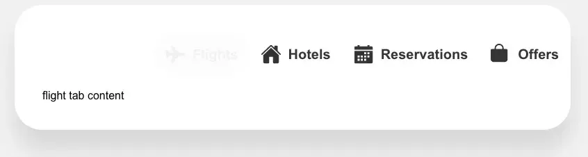
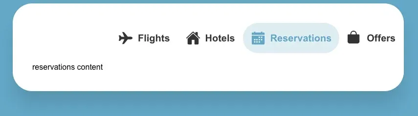
- We need a tab component that displays a list of links and associated content.
- Each tab has a different color and when it's clicked, we need to update the "active" color. This will allow use of that color wherever we want via a CSS variable. For example, we'll use that variable to change the page background color.
- When a tab is clicked, we want to transition the active tab text in while transitioning the previous tab text out.
- The tab content should transition in when it becomes visible.
- We want a way to set a default tab.
Tab Component and Props
To start, let's make a new file named TabComponent.jsx.
This is our main component and it receives two props. The first one is tabs, which is the content we want to display for the tabs. The second prop is defaultIndex, which is the tab to display when the page loads.
import React, { useState } from "react";
import cn from "classnames"; // Optional but helpful library

const TabComponent = ({ tabs, defaultIndex = 0 }) => {
  const [activeTabIndex, setActiveTabIndex] = useState(defaultIndex);

  const onTabClick = (index) => {
    setActiveTabIndex(index);
  };

	return ( ... )
}
The component only requires one piece of state, activeTabIndex.
Finally, we have a function, onTabClick, that updates the state to a specific index when a tab is clicked.
I chose to store an index as the active tab state, but you could likely use a tab ID value as well.
Now we need some data to feed into the component. This data can either live inside of the component file, or in a separate tabs.js file.
The tabs prop will be an array of objects, each object containing info about the tab:
- Title (string) - The title for each tab.
- ID (string) - The tab ID.
- Icon (React component) - An icon to display next to the title.
- Color (string) - A color to use when the tab is active.
- Content (React component or string) - A component or string containing some tab content.
For now, just add a string as the tab content if you'd like. We'll come back later and add a component for each tab.
const tabs = [
  {
    title: "Flights",
    id: "flights",
    icon: ,
    color: "#5d5dff",
    content: "flight tab content",
  },
  {
    title: "Hotels",
    id: "hotels",
    icon: ,
    color: "#67bb67",
    content: "hotel tab content",
  },
	... additional tabs here
];
Now pass this data into the TabComponent.
<TabComponent tabs={tabs} />
With our tab data in place, let's start adding some markup.
The tabs themselves will consist of an unordered list of anchors. We want to use anchors in this case instead of buttons because the URL should update when a tab is clicked.
return (
	<div className="tabs-component">
    <ul className="tab-links" role="tablist">
      {tabs.map((tab, index) => (
        <li
          key={tab.id}
          className={cn("tab", { active: activeTabIndex === index })}
          role="presentation"
        >
          <a href={`#${tab.id}`} onClick={() => onTabClick(index)}>
            {tab.icon}
            <span>{tab.title}</span>
          </a>
        </li>
      ))}
    </ul>
    {tabs.map((tab, index) => (
			<div
				role="tabpanel"
		    id={tab.id}
				key={tab.id}
		    className={cn("tab-content", { active: activeTabIndex === index })}
			>
      {tab.content}
			</div>
    ))}
  </div>
);
For now, this all the markup we need. We'll revisit it soon when we add animations.
Tab Component Styles
Next let's add some styles for our tabs.
First we'll set the box-sizing of everything to border-box, and set some CSS variables. One variable in particular, --active-color, is going to be key for the color animations we'll add later on. It's defaulted to #f1f1f1.
* {
  box-sizing: border-box;
}

:root {
  --white: #fff;
  --black: #333;
  --active-color: #f1f1f1;
  --border-radius: 40px;
}
One of our requirements is to animate the background color of the page. We can easily do that by setting the --active-color variable as the background of body and adding a transition property.
body {
  -webkit-font-smoothing: antialiased;
  font-family: Arial, Helvetica, sans-serif;
  background: var(--active-color);
  transition: background 1.5s ease;
}
The styles for the tab links below are pretty straightforward. As you can see, we are again making use of our --active-color CSS variable to set the color for the active tab icon, text, and pseudo element.
.tabs-component {
  max-width: 800px;
  margin: auto;
  background: var(--white);
  padding: 40px;
  border-radius: var(--border-radius);
  box-shadow: 0 30px 30px rgba(0, 0, 0, 0.1);
}

.tab-links {
  padding: 0;
  margin: 0 auto 20px;
  list-style: none;
  max-width: 400px;
  display: flex;
  justify-content: space-between;
}

.tab {
  position: relative;
}

.tab a {
  text-decoration: none;
  color: var(--black);
}

.tab::before {
  content: "";
  width: 100%;
  height: 100%;
  opacity: 0.2;
  position: absolute;
  border-radius: var(--border-radius);
  background: none;
  transition: background 0.5s ease;
}

.tab svg {
  height: 30px;
  width: 30px;
  min-width: 30px;
  fill: var(--black);
  transition: fill 0.5s ease;
}

.tab.active::before {
  background: var(--active-color);
}

.tab span {
  font-weight: 700;
  margin-left: 10px;
  transition: color 0.5s ease;
}

.tab.active span {
  color: var(--active-color);
}

.tab.active svg {
  fill: var(--active-color);
}

.tab a {
  padding: 16px;
  display: flex;
  align-items: center;
  font-size: 20px;
  overflow: hidden;
  position: relative;
}
Finally, there are some basic styles to hide and show the content if it's active. We will eventually remove these later, (Framer Motion will handle the display property) but add them for now.
.tab-content {
  display: none;
}

.tab-content.active {
  display: block;
}
With the styles in place, we should have a tab component that functions as we would expect.
Dynamically Changing CSS Variables
Next let's get our color changing functionality in place. Fortunately, this is very easy!
We make use of the useEffect hook to change the value of our --active-color variable whenever the activeIndex state changes.
const TabComponent = ({ tabs, defaultIndex = 0 }) => {
  const [activeTabIndex, setActiveTabIndex] = useState(defaultIndex);

  const onTabClick = (index) => {
    setActiveTabIndex(index);
  };

  useEffect(() => {
    document.documentElement.style.setProperty(
      "--active-color",
      tabs[activeTabIndex].color
    );
  }, [activeTabIndex, tabs]);

  return ( ... )
}
Because we already use the --active-color variable in our CSS, clicking a tab now transitions the page background color to the active tab color, and updates the tab color itself.
With this in place, let's start using Framer Motion for the tab and content animations.
Animating Our Tabs
Now for our animated tabs. First, make sure you have Framer Motion installed and are importing the `motion` component inside TabComponent.jsx.
import { motion } from "framer-motion";

const TabComponent = ({ tabs, defaultIndex = 0 }) => {
  ...
}
Starting with the list items, we want to replace the use of <li> with <motion.li> and <span> with <motion.span>.
This opts us into using the Framer Motion API via the motion component. Check out their documentation for more on this.
<motion.li
  key={tab.id}
  className={cn("tab", { active: activeTabIndex === index })}
  role="presentation"
>
  <a href={`#${tab.id}`} onClick={() => onTabClick(index)}>
    {tab.icon}
    <motion.span>{tab.title}</motion.span>
  </a>
</motion.li>
Now that we're using the motion component, we need to tell the elements how to animate. For this, we'll use "variants". Variants are a way to list out the properties you want to transition between, based on a prop or state value.
The variant that we'll use for <motion.li> is going to be:
const tabVariant = {
  active: {
    width: "55%",
    transition: {
      type: "tween",
      duration: 0.4
    }
  },
  inactive: {
    width: "15%",
    transition: {
      type: "tween",
      duration: 0.4
    }
  }
};
When active, the tab should transition from 15% to 55% width using a tween transition and a duration of 0.4s. Now we add this variant to each list item using the variants prop, in addition to using the animate prop.
<motion.li
  key={tab.id}
  className={cn("tab", { active: activeTabIndex === index })}
  role="presentation"
  variants={tabVariant}
  animate={activeTabIndex === index ? "active" : "inactive"}
>
If the activeTabIndex is equal to the tab index, apply the active variant. Otherwise use inactive.
Next we do something similar for the tab title <motion.span>.
const tabTextVariant = {
  active: {
    opacity: 1,
    x: 0,
    display: "block",
    transition: {
      type: "tween",
      duration: 0.3,
      delay: 0.3
    }
  },
  inactive: {
    opacity: 0,
    x: -30,
    transition: {
      type: "tween",
      duration: 0.3,
      delay: 0.1
    },
    transitionEnd: { display: "none" }
  }
};
This time we animate the opacity, position, translateX, (x is a shortcut for translateX) and display properties. Yes, we actually can animate between display properties!
A few other things to note with this variant. The use of transitionEnd will wait to apply display:none until the transition is finished.
Also, because our <motion.span> is a child of <motion.li>, the animate prop we defined on our tab propagates down, so we're able to use the same "active"/"inactive" variant labels without redefining animate.
<motion.span variants={tabTextVariant}>{tab.title}</motion.span>
The end result should look like:
<motion.li
  key={tab.id}
  className={cn("tab", { active: activeTabIndex === index })}
  role="presentation"
  variants={tabVariant}
  animate={activeTabIndex === index ? "active" : "inactive"}
>
  <a href={`#${tab.id}`} onClick={() => onTabClick(index)}>
    {tab.icon}
    <motion.span variants={tabTextVariant}>{tab.title}</motion.span>
  </a>
</motion.li>

Animating the Tab Content
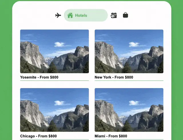
Now that our tab animation is done, it would be great to add some nicer looking tab content, and animate that too.
Let's create a new component named TabContent.jsx. We'll import and use the motion component again and use it on both the tab-content div and each content-card div.
import React from "react";
import { motion } from "framer-motion";
import cardImage from "./assets/card-image.jpg";

// Arbitrary array of items that we can map over. Could be anything!
const cards = ["Yosemite", "New York", "Chicago", "Miami"];

const TabContent = ({ id, active }) => (
  <motion.div
    role="tabpanel"
    id={id}
    className="tab-content"
  >
    <div className="cards">
      {cards.map((item, index) => (
        <motion.div key={index} className="content-card">
          <img src={cardImage} alt="view of mountain" />
          <div className="info">
            <h3>{`${item}`} - From $800</h3>
          </div>
        </motion.div>
      ))}
    </div>
  </motion.div>
);
Just like with the tabs, we'll make use of variants. Here is what our tab-content variant will look like.
const tabContentVariant = {
  active: {
    display: "block",
    transition: {
      staggerChildren: 0.2
    }
  },
  inactive: {
    display: "none"
  }
};
Note the use of staggerChildren. This lets us stagger animation on child motion components by a certain timing threshold.
Then we have the variant for each content-card div.
const cardVariant = {
  active: {
    opacity: 1,
    y: 0,
    transition: {
      duration: 0.5
    }
  },
  inactive: {
    opacity: 0,
    y: 10,
    transition: {
      duration: 0.5
    }
  }
};
Apply these variants to the <motion.div> components.
<motion.div
  ...
  variants={tabContentVariant}
  animate={active ? "active" : "inactive"}
  initial="inactive"
>
  <div className="cards">
    {cards.map((item, index) => (
      <motion.div
        key={index}
        className="content-card"
        variants={cardVariant}
      >
        ...
      </motion.div>
    ))}
  </div>
</motion.div>
Now we actually want to use this new component instead of the strings we were using for tab content. To do that, replace the content value with the TabContent component in your data prop.
Note that for this demo, I'm just reusing the same TabContent component for each tab. In a real scenario, you'd have multiple components here but would still import and use them the same way.
import TabContent from "./TabContent";

const tabs = [
  {
    title: "Flights",
    id: "flights",
    icon: ,
    color: "#5d5dff",
    content: TabContent,
  },
  {
    title: "Hotels",
    id: "hotels",
    icon: ,
    color: "#67bb67",
    content: TabContent,
  },
	... additional tabs here
];
Back in TabComponent.jsx, replace the .map output that we had previously with <tab.content>. This allows passing down the id and active prop to the TabContent component where we need it.
{tabs.map((tab, index) => (
  <tab.content
    key={tab.id}
    id={`${tab.id}-content`}
    active={activeTabIndex === index}
  />
))}
Finally, we need to add a few styles for the tab content. You'll want to remove the styles we added earlier for .tab-content and .tab-content.active, as those are being handled by our tabContentVariant variant now.
.cards {
  display: flex;
  flex-wrap: wrap;
  justify-content: space-between;
  margin-top: 40px;
}

.content-card {
  width: 48%;
  margin-bottom: 26px;
}

.content-card .info::after {
  content: "";
  display: block;
  width: 100%;
  height: 3px;
  bottom: -5px;
  background: var(--active-color);
  opacity: 0.5;
}

.content-card img {
  border-radius: 6px;
}

.content-card h3 {
  margin: 0 0 5px;
}

.content-card .info {
  padding: 10px 0;
}

img {
  max-width: 100%;
  vertical-align: middle;
}
That's it! You can stop reading here if you'd like, or continue on for one extra addition you could add to the component to handle a common scenario.
Defaulting to a Specific Tab
Consider a situation where you might want to dynamically change what the default tab is. It could either be to persist the users last viewed tab if they reload the page, or to send a link and have the page open to a specific tab.
We can do this pretty easily by adding another useEffect hook in the TabComponent.jsx file.
Within the hook body, we'll determine if we have a tab with an ID that matches the value we get from window.location.hash, using the findIndex array method.
const TabComponent = ({ tabs, defaultIndex = 0 }) => {
  const [activeTabIndex, setActiveTabIndex] = useState(defaultIndex);

  const onTabClick = (index) => {
    setActiveTabIndex(index);
  };

  // Default to a tab based on the URL hash value
  useEffect(() => {
    const tabFromHash = tabs.findIndex(
      (tab) => `#${tab.id}` === window.location.hash
    );
    setActiveTabIndex(tabFromHash !== -1 ? tabFromHash : defaultIndex);
  }, [tabs, defaultIndex]);

	return ( ... )
}
If the value returned from findIndex is not -1 (which is what is returned if no tab is found), then we set that value as the state. Otherwise, we set the state to our defaultIndex prop.
Note that this will override the
defaultIndexprop if one is passed.
Now you have two ways to control the default tab: via the defaultIndex prop and via a URL hash.
Summary
This tutorial covered a lot of ground, and if you made it this far, thanks for reading! This combo of Framer Motion and CSS variables is one that I've found very useful for creating many different types of animation.