
Animated Page Transitions in Next.js
Use Framer Motion to animate route changes in your Next.js project.
In this article, you’ll learn how to animate page transitions in Next.js using Framer Motion. We'll work through three examples, and along the way you'll learn about some of the core components of Framer Motion. After you're finished, you'll have a good understanding of how animations like these work, and use your newfound knowledge to craft your own.
This article won’t cover all of the basics of Framer Motion, but it’s detailed enough for anyone to follow along even if you haven’t used it before. For a more in-depth intro, check out Getting Started with Framer Motion.
If Next.js isn’t your jam, the overall approach this article demonstrates can be used in other React frameworks like Gatsby, or Create React App.
Getting Started
Make sure you have an instance of Next.js set up and running. You can do this by installing Next locally on your computer or using a service like Codesandbox to spin up a new instance.
Once you have Next.js set up, install Framer Motion as a dependency of your project npm install framer-motion.
To start, we need to make some changes to the page and component hierarchy so that the animation we create only runs when a route change happens.
Add a new file named _app.js inside of a /pages directory. You can learn more about this “custom app” file from the Next docs here, but what it does is give us an entry point at the very top of the component tree.
function MyApp({ Component, pageProps }) {
  return <Component {...pageProps} />
}
Next, add and import a new CSS file named transition.css. Even though Framer Motion will do a lot of the heavy lifting for us, we’ll still need some light styling.
import '../styles/transition.css';

function MyApp({ Component, pageProps }) {
  return <Component {...pageProps} />
}
Now add a new component named Transition.js. This is where the all of the Framer Motion code we write will go.
const Transition = ({ children }) => {
  return children;
};

export default Transition;
Make sure to wrap <Component /> with this new Transition component.
import Transition from '../components/Transition';
import '../styles/transition.css';

function MyApp({ Component, pageProps }) {
  return (
		<Transition>
			<Component {...pageProps} />
		</Transition>
	);
}
This is the main trick to animating route changes, whether it’s in Next or any other framework. The animation needs to be done as high up in the component tree as possible, and should ideally be contained in a component that wraps the entire page.
If you’re using providers via the Context API, be sure those are below the transition component. Otherwise, you might have animations running when state changes occur in the providers.
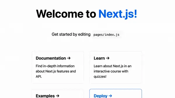
Finally, add a few other pages into the pages directory. The page names can be anything, but a few of the animations we build will require that the page content is wrapped in a page className. More on that later.
const Examples = () => (
  <div className="page">
    <h1>Examples</h1>
  </div>
);

export default Examples;
None of the changes we’ve made so far should impact the way the app is navigated. Click around to a few different pages to make sure everything still works.
We haven’t covered actually adding links to other pages. Make sure you have some example pages that link to others by using the Next.js
<Link>component. Please refer to the demo to see how this is done.
Motion and AnimatePresence
Before we get too far into the examples, let's define what the Framer Motion motion and AnimatePresence components are. We’ll be using them in each example.
Motion
To animate things in Framer Motion, you need to use a motion component. It's used in place of a regular HTML element, and it surfaces several new props to define exactly how you want the animation to function.
You can read more about the
motioncomponent in the docs.
AnimatePresence
The AnimatePresence component allows us to animate elements when they’re removed from the DOM. It will run an exit animation defined on child motion elements before unmounting.
There are two props that AnimatePresence can include:
initial- Setting this asfalseprevents the animation from running when the page loads for the first time. In a lot of cases, this can be preferred.exitBeforeEnter- Setting this astruewill only render a single child component at a time. For us, this means either the previous or new page.
See the docs for more about the
AnimatePresencecomponent.
Animation Effect #1
Back in the Transition component, let’s start working on the first animation.
First, import motion and AnimatePresence from framer-motion and use these components to wrap the children prop.
import { motion, AnimatePresence } from 'framer-motion';

const Transition = ({ children }) => {
  return (
		<div className="effect-1">
			<AnimatePresence
	      initial={false}
	      exitBeforeEnter
	    >
	      <motion.div>
	        {children}
	      </motion.div>
	    </AnimatePresence>
		</div>
	);
};

export default Transition;
To define how the animation should work, we’ll use what Framer Motion calls variants.
Variants let us animate several properties at once, and are defined as objects that are passed to a motion component as a prop.
The first variant we write will have two states: in and out.
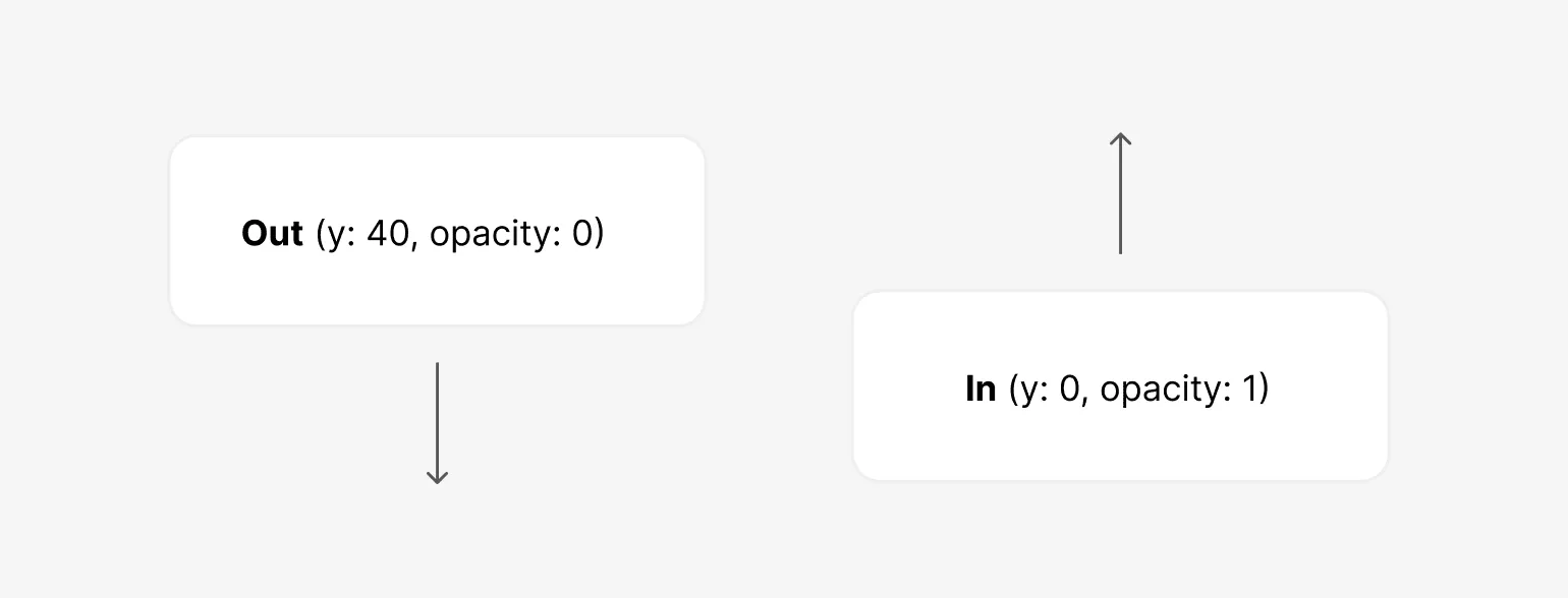
The out state is what occurs first when the page route changes, and in will describe what the final end state of the animation is.
const variants = {
  out: {
  },
  in: {
  }
};
Starting with out, the opacity should fade out to 0 and the y position of the page should move downwards slightly by 40 px. This is over a duration of 0.75 seconds, as defined by a transition object.
const variants = {
  out: {
    opacity: 0,
    y: 40,
    transition: {
      duration: 0.75
    }
  }
};
You’ll see this
transitionobject used throughout this article. You can do a lot with it: set durations, delays, types of transitions (easings), and more. See this page in the Framer Motion docs for more info. It applies to variants as well.
The in state is almost exactly the opposite, except that we define a slight 0.5 second delay.
const variants = {
  ...
  in: {
    opacity: 1,
    y: 0,
    transition: {
      duration: 0.75,
      delay: 0.5
    }
  }
};
Please note that the order in which the variants are defined doesn’t matter. The only thing that matters is which prop on the
motioncomponent they’re used in.
Next, pass the variant info to the motion component we already defined, and specify the initial, animate and exit props to describe exactly what to do at each phase.
<motion.div
  variants={variants}
  animate="in"
  initial="out"
  exit="out"
>
  {children}
</motion.div>
The initial prop defines the starting state and it will take the out variant as a parameter.
The animate prop defines what values the component should animate to. It’ll be the difference between the values of in and out.
The exit prop defines what to do when the component unmounts when the next page loads. This works because our motion.div element is a child of AnimatePresence.
Note that a variant defined in the
initialprop normally runs when the page first loads, but we have specifically setinitial={false}on theAnimatePresencecomponent to prevent it. This is because in our examples, we only want the animations to run when a route changes.
One last thing to add – Recall that we have a div with a class of example-1 containing our changes. Let’s set overflow: hidden there so that any scrollbars on the page aren't moving around during the transition.
.example-1 {
  overflow: hidden;
}
With all of this in place, you might notice that nothing is happening yet when you click around to other pages. What could be missing?
The AnimatePresence component needs to know that a route change occurred so it can track the child components it has.
This can be done by getting the path value from useRouter and passing that as a key to the motion component. Now AnimatePresence knows what to animate out and what to animate in.
import { useRouter } from 'next/router';

const Transition = (...) => {
	const { asPath } = useRouter();

  return (
		<div className="effect-1">
			<AnimatePresence
	      initial={false}
	      exitBeforeEnter
	    >
	      <motion.div
	        key={asPath}
	        variants={variants}
	        animate="in"
	        initial="out"
	        exit="out"
	      >
	        {children}
	      </motion.div>
	    </AnimatePresence>
		</div>
	);
};
With this in place, the animation should work when transitioning to another page.
Animation Effect #2
Now that you have a feel for how to use variants, the next example is similar but slightly more advanced.

Let’s define the variants.
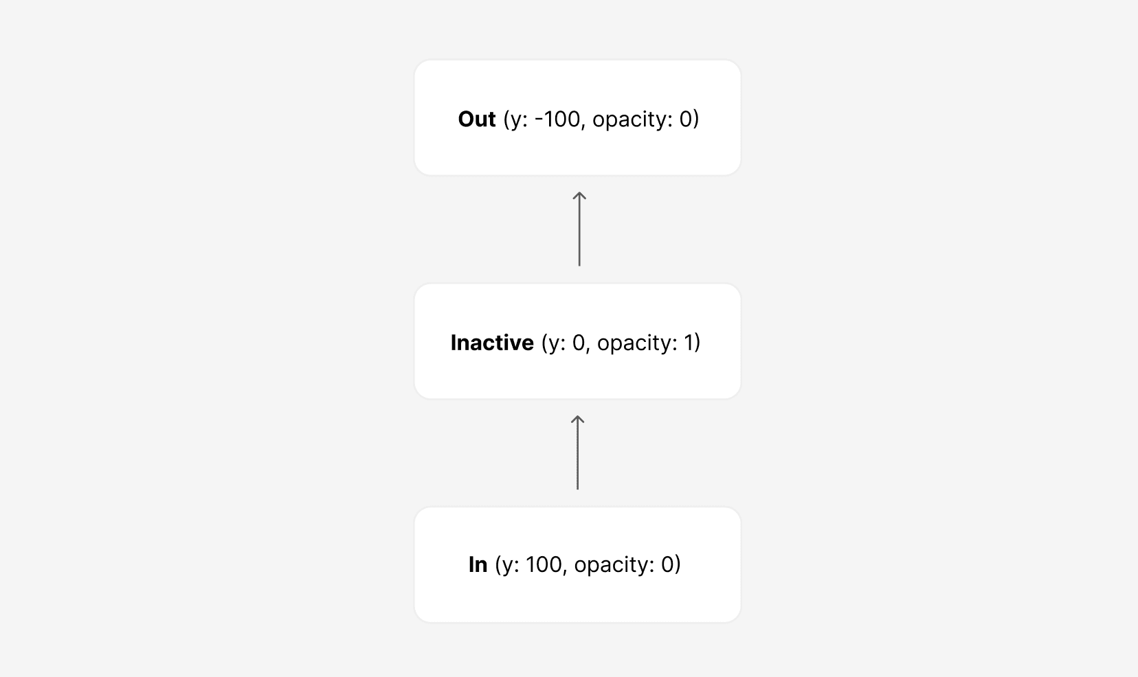
First, we’ll start with inactive. This describes how the page should display either before animating out or after animating in. It’ll be passed to the animate prop.
const variants = {
  inactive: {
    opacity: 1,
    y: 0,
    transition: {
      duration: 1,
      ease: 'easeInOut'
    },
  },
};
Next, the out variant describes what happens as part of the exit prop when we are transitioning to a new page and the current one is unmounting.
const variants = {
  ...
  out: {
    opacity: 0,
    y: -100,
    transition: {
      duration: 1,
      ease: 'easeInOut'
    }
  }
};
Last we have the in variant that describes the animation when the new page mounts. It’ll be passed to the initial prop.
const variants = {
  ...
  in: {
    y: 100,
    opacity: 0,
    transition: {
      duration: 1,
      ease: 'easeInOut'
    }
  },
};
Each of these variants has an
easeInOuteasing function value defined. Experiment with this to see how it changes the overall feel of the animation.
With the variants complete, everything else is similar to the last example. You can either create a new component, or replace the previous one with the additions below.
const Transition2 = ({ children }) => {
  const { asPath } = useRouter();

  return (
    <div className="effect-2">
      <AnimatePresence initial={false} exitBeforeEnter>
        <motion.div
          key={asPath}
          variants={variants}
          initial="in"
          animate="inactive"
          exit="out"
        >
          {children}
        </motion.div>
      </AnimatePresence>
    </div>
  );
};
Like in the last example, we should prevent scrollbars from appearing during the animation using the effect-2 CSS class.
.effect-1,
.effect-2 {
  overflow: hidden;
}
Animation Effect #3
Now let’s take everything we’ve learned so far, and apply it to one last animation. An example of one that’s similar can be found here.

For more animation ideas using a slightly different technique, check out this video from Frontend Horse.
In the previous examples, we used single variant strings. However, it’s important to know that motion components can accept an array of variants, like animate={["center", "scaleUp"]}. This is exactly what we want to do.
Using arrays of variants let us define multiple animation states or steps, and it’s especially common once an animation becomes more complex.
Now let’s define the states in our variant, in the order they occur: scaleDown, out, in, center, and scaleUp.
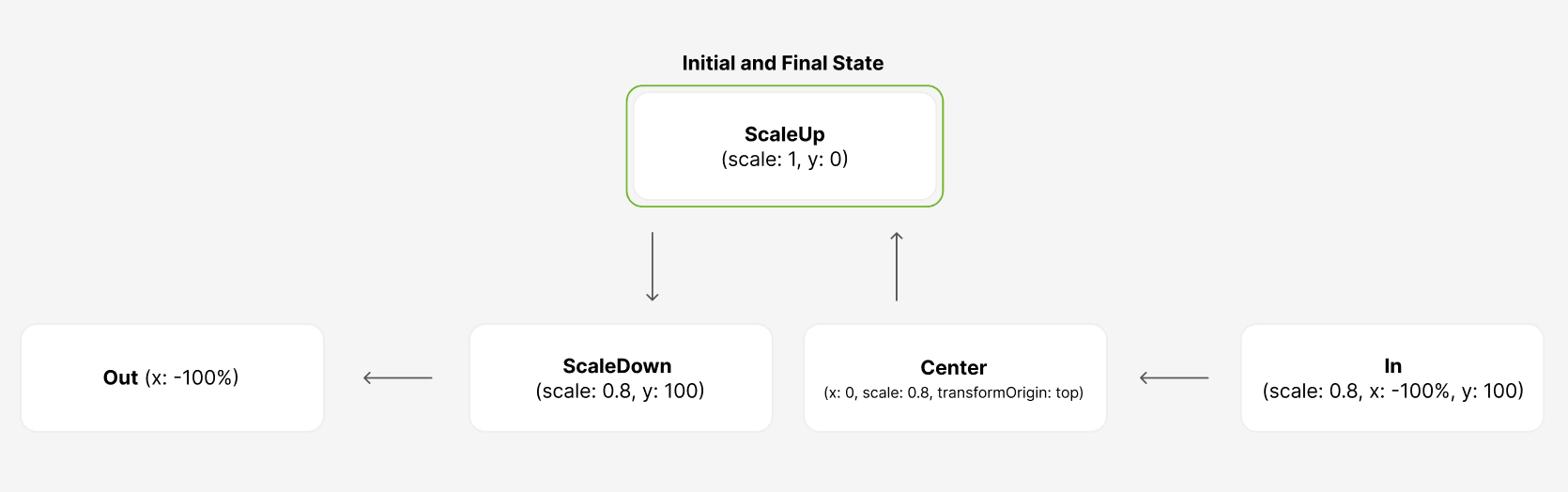
Starting with the exit animation, there are two parts: scaling down the page content (scaleDown) and animating it out of view from right to left (out).
const variants = {
	scaleDown: {
    scale: 0.8,
    y: 100,
    transition: {
      duration: 0.4
    }
  },
  out: {
    x: "-100%",
    transition: {
      duration: 0.4,
      delay: 0.5
    }
  }
};
The y property defined above is a shortcut in Framer Motion that ends up as translateY. We’re setting this so that the page content appears down slightly from the top.
We also add a slight delay before the out part of the animation happens. Using delay is important to help orchestrate animations that have multiple steps.
Next, there’s the in state.
const variants = {
	...
	in: {
    scale: 0.8,
    y: 100,
    x: "100%",
    transition: {
      duration: 0.4
    }
  },
};
Finally, we have the center and scaleUp states of the animation.
In the center state, we move the page into its final x position and set the transformOrigin to top. We do this to keep the page towards the top of the screen.
const variants = {
	...
	center: {
    x: 0,
    scale: 0.8,
    transformOrigin: 'top',
    transition: {
      duration: 0.4
    }
  },
  scaleUp: {
    scale: 1,
    y: 0,
    transition: {
      duration: 0.4,
      delay: 0.5
    }
  },
};
Last we have scaleUp, which does what the name describes: scales the page up to its original size by setting scale back to 1, and moves the y position back to 0. We’ll delay this by 0.5.
These variants are then passed to the motion component, just like in the previous examples.
const Transition3 = ({ children }) => {
  const { asPath } = useRouter();

  return (
    <div className="effect-3">
      <AnimatePresence
        initial={false}
        exitBeforeEnter
      >
        <motion.div
          key={asPath}
          variants={variants}
          initial="in"
          animate={["center", "scaleUp"]}
          exit={["scaleDown", "out"]}
        >
          {children}
        </motion.div>
      </AnimatePresence>
    </div>
  );
};
All we have left is the CSS for our animation.
This example requires a bit more CSS than the previous ones, but the styles aren’t actually needed for the animation itself. They just help make it look a bit nicer.
First, we need overflow: hidden applied just like the previous examples. Without it, you’d see a brief horizontal scrollbar appear.
.effect-1,
.effect-2,
.effect-3 {
  overflow: hidden;
}
Next, we need some basic styles for the pages themselves. This makes the pages feel “card-like”, which is the effect we’re going for. Make sure this class is applied to all of your pages so you can see the effect.
.page {
  background: white;
  z-index: 1;
  min-height: 100vh;
  padding: 4rem 0;
}
The
min-heightproperty is not strictly required. It’s just used in this example to make the page height fit the height of the viewport in case there is not enough content.
Finally, let’s add a background for the effect. This makes the pages stand out more as they’re animating.
.effect-3::after {
  content: "";
  display: block;
  position: fixed;
  height: 100%;
  width: 100%;
  top: 0;
  left: 0;
  right: 0;
  bottom: 0;
  background: linear-gradient(
    135deg,
    hsla(0, 100%, 76%, 1) 0%,
    hsla(237, 100%, 73%, 1) 100%
  );
  z-index: -1;
}
Accessibility
It’s important to remember that certain animations (especially the one in our last example) can be jarring for users, especially people prone to motion sickness.
We can craft our animations in a way that they’re easily disabled or reduced if a user prefers.
Fortunately, Framer Motion gives us a few different ways to do this.
We’ll use the useReducedMotion hook to disable the page transitions from the previous example when necessary.
For more information about this topic in general, check out Reducing Motion in Animations.
Start by importing the useReducedMotion hook from framer-motion.
Then, adjust the variants prop value to only pass the variant object if the value of shouldReduceMotion is false. Otherwise, we opt out of any animations.
import { motion, AnimatePresence, useReducedMotion } from 'framer-motion';

const Transition3 = ({ children }) => {
  const { asPath } = useRouter();
  const shouldReduceMotion = useReducedMotion();

  return (
    ...
      <motion.div
	      ...
        variants={!shouldReduceMotion ? variants : null}
        ...
      >
        {children}
      </motion.div>
    ...
  );
};
This is all that’s needed to disable the page transition animation.
To test this out, go into your operating system accessibility settings and select “Reduce Motion” on MacOS, or the Windows equivalent. You may need to reload the page after doing so.
As an alternate approach, instead of removing it completely, you could also pass a variant object with a much more subtle animation, like an opacity change.