Adding Click Animations to Anything
Use React hooks and CSS variables to add animation effects.
In this short article, we’ll be covering how to add a click animation to any HTML element.
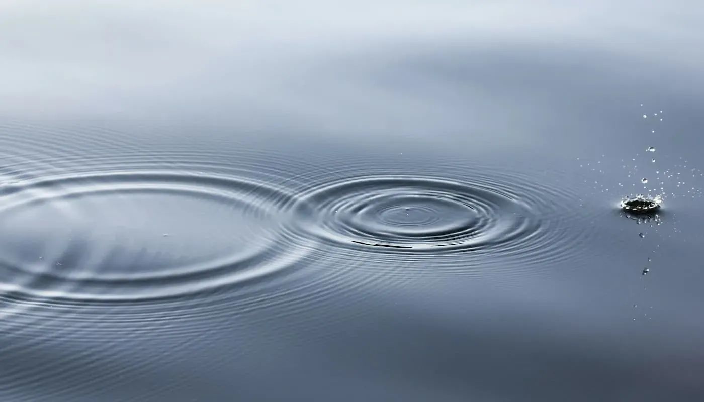
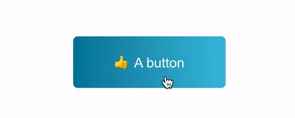
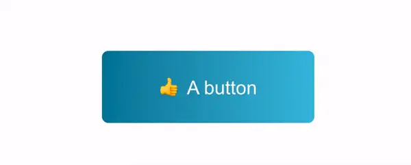
The end result looks like a “ripple” effect, much like what is seen with Material Design buttons. We’ll take it a step further by making our animation configurable, and packaging it up as React hook to be used in any React project — whether it be for a button, card, link, whatever!
As is the case when adding any kind of animation, be sure to ask yourself, “What purpose does this serve?” Just because we can add animation doesn’t always mean that we should. A good article on this topic can be found here: Empathetic Animation
Getting Started
First, let’s define how this React hook should work.
The hook should apply an animation to the HTML element passed to it and only when the element itself has been clicked. For example, if we add the animation to a button, clicking on that particular button should run the animation. A different element right next to it should not be impacted.
In order to apply the animation, we’ll need to give our hook a React ref associated to an HTML element.
To make the animation configurable, we can pass an object containing color, size, duration, and effectName properties.
Using the hook in our React code would look like this.
useClickAnimation(buttonRef, {
	size: 100,
  duration: 1000,
  color: 'red',
  effectName: 'ripple',
});
Let's start by making a new file named useClickAnimation.js that contains a function with the same name. This function should take two params: element and config.
The config object can be destructured to set some default values.
export const useClickAnimation = (element, config) => {
  const {
    size = 100,
    color = '#fff',
    duration = 800,
    effectName = 'ripple',
  } = config;
}
CSS Variables
Before we get too far, let’s quickly define some CSS variables.
Since this hook can potentially be used many times for different types of elements on the same page, we need the ability to have unique values for each instance. For example, we should have the flexibility for a button with a white colored ripple animation right next to a card with a blue colored effect, and they shouldn't affect each other.
The variables will be scoped to a class named effect-container in order to give us this ability.
.effect-container {
  --effect-name: ripple;
  --effect-duration: 500ms;
  --effect-top: 0;
  --effect-left: 0;
  --effect-height: 100px;
  --effect-width: 100px;
  --effect-color: 'fff';
}
Some descriptions of these variables:
effect-name- A default effect to use.effect-duration- The amount of time in milliseconds the animation should last for.effect-top- The top position of where the animation should occur, relative to where the user clicked on the element.effect-left- The left position of where the animation should occur, relative to where the user clicked on the element.effect-height- The height of the animation.effect-width- The width of the animation.effect-color- The animation color.
Now that we’ve defined them, create a new CSS file and add them to it.
Click Functionality
Let’s revisit our hook to add the remaining functionality. There’s only a few things we need to do:
- Add a mouseup (click) event
- Dynamically set CSS variables based on the configuration values
- Determine when to apply the animation styles
First, add a useEffect hook where all of the functionality will live.
import { useEffect } from 'react';

export const useClickAnimation = (element, config) => {
	const {
    size = 100,
    color = '#fff',
    duration = 800,
    effectName = 'ripple',
  } = config;

	useEffect(() => {
    ...
	}, [
	  color,
    duration,
    effectName,
    element,
    size,
  ]);
}
The
useEffectshould have color, duration, effectName, element and size as dependencies.
Inside the useEffect , add a function named applyContainerProperties.
useEffect(() => {
  const applyContainerProperties = () => {
    element.current.classList.add('effect-container', effectName);
  }
}, [...]);
This function adds two CSS classes: effect-container which serves as a container for the animation styles, and effectName which is the effect passed in the configuration.
Next, we want to call the applyContainerProperties function and add a mouseup event listener to the ref that's passed into the hook.
useEffect(() => {
  const applyContainerProperties = () => { ... }

	// Apply the styles and classname to the element
  applyContainerProperties();

  // Add an event listener
  element.current.addEventListener('mouseup', onClick);
}, [...]);
When adding an event listener, we also need to remember to remove it when the component unmounts.
useEffect(() => {
  ...
	...

	// Needed for referencing the ref in the return function
	const cleanupRef = element.current;

	return () => {
	  cleanupRef.removeEventListener('mouseup', onClick);
	}

}, [...]);
Notice the usage of
cleanupRef. Settingelement.currentto a constant this way is a suggestion from thereact-hooks/exhaustive-depseslint rule.
Now we'll add a function named onClick. This is what runs in the event listener we just added.
useEffect(() => {
  ...
	const onClick = (e) => {};
}, [...]);
Within the onClick function, we need to do three things in order.
- Remove any
activeclass that might already be on the element. This might be the case if the element was clicked previously, or is already in the process of animating. - Calculate and set the CSS variable values.
- Add the
activeclass to kick off the animation.
const onClick = (e) => {
  element.current.classList.remove("active");
  applyStyles(e);
  element.current.classList.add("active");
};
Note that once the target element is clicked, the
activeclass will remain after the animation is finished. This is mostly just to simplify the implementation a bit for the purposes of this article. If you wanted to remove this class, you could either use asetTimeoutto remove it after a certain amount of time, or you could use ananimationendevent. To learn more about animation events in CSS, check out this article.
Finally, we need to add the animation. We'll do this in the applyStyles function. This is where the CSS variables we added earlier are set based on where the target element was clicked and the configuration options that have been passed.
First, access the offsetX and offsetY values from the click event.
Then, we take the size config value and divide it by 2 to find the offset.
const applyStyles = (e) => {
  const { offsetX, offsetY } = e;
  const sizeOffset = size / 2;
  const { style } = element.current;
}
Next we'll set all the CSS variables using the setProperty method.
Some of the values like duration, color and size are based directly on the configuration passed into the hook.
const applyStyles = (e) => {
	...

  style.setProperty('--effect-duration', `${duration}ms`);
  style.setProperty('--effect-top', `${offsetY - sizeOffset}px`);
  style.setProperty('--effect-left', `${offsetX - sizeOffset}px`);
  style.setProperty('--effect-height', `${size}px`);
  style.setProperty('--effect-width', `${size}px`);
  style.setProperty('--effect-color', color);
}
The effect-top and effect-left properties are calculated based on the mouse click position and the sizeOffset value.
Completing the CSS
Now we just need the rest of the CSS, and our click animation is done!
First, revisit the effect-container class and set position: relative and overflow: hidden on it so the animation doesn’t spill over onto other elements.
.effect-container {
  position: relative;
  overflow: hidden;

  /* We already set these earlier */
  --effect-name: ripple;
  --effect-duration: 500ms;
  --effect-top: 0;
  --effect-left: 0;
  --effect-height: 100px;
  --effect-width: 100px;
  --effect-color: 'fff';
}
Next we have the animation effect itself. We are using an absolutely positioned pseudo element, and applying several variables to determine where it’s displayed, how large it is, and what color it should be.
.effect-container::before {
  content: '';
  position: absolute;
  opacity: 0.3;
  top: var(--effect-top);
  left: var(--effect-left);
  height: var(--effect-height);
  width: var(--effect-width);
  background: var(--effect-color);
}
Now we can add the CSS animation to be used for this particular “ripple” effect. Recall that this animation is only applied once the effect-container element has the active class added to it, which happens when it's clicked.
.effect-container.ripple.active::before {
  border-radius: 50%;
  animation: ripple var(--effect-duration) linear forwards;
}
Last, define the ripple animation effect keyframes. The animation itself is pretty simple. It starts from a scale value of 0, and expands outwards to a scale of 6, all while the opacity gradually reduces to 0.
@keyframes ripple {
  from {
    transform: scale(0);
  }

  to {
    transform: scale(6);
    opacity: 0;
  }
}
Our animation is now complete!
Bonus Effect
You’re probably wondering why we bothered adding an effectName config option if we’re only going to have a single effect. To demonstrate that there are lots of possibilities, let’s add another!
This effect looks like a rotating square and it's not too different from the original "ripple" effect. It’s straightforward, but shows that you can easily tweak these values to create your own.
.effect-container.square-rotate.active::before {
  animation: square-rotate var(--effect-duration) linear forwards;
}

@keyframes square-rotate {
  from {
    transform: scale(0) rotate(0);
  }

  to {
    transform: scale(6) rotate(180deg);
    opacity: 0;
  }
}
To use it, add the CSS class we just created as the effectName along with whatever configuration options you want.
useClickAnimation(yourElement, {
	size: 50,
  color: 'white',
  duration: 600,
  effectName: 'square-rotate',
});
Summary
In this article, you learned how to add a click animation effect to pretty much any HTML element. Since we built it as a React hook, you can use it in any project that supports hooks. You should also be able to target many different elements on a page without worrying about them impacting each other.