A 3D Hover Effect Using CSS Transforms
Creating a hover interaction with Javascript and CSS.
While browsing through Dribbble recently, I found a 3D hover effect that I thought would be interesting to try to build. This effect tilts the element being hovered towards the direction of the mouse cursor.
In this short article, we will be creating this 3D interaction using HTML, the CSS transform property, and good old Javascript.
The HTML
Overall, the HTML we need is very basic. For our purposes, we'll use an article element as the main container for our content, but any type of HTML would work.
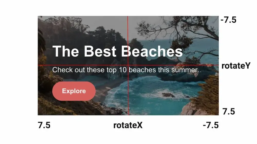
Inside of the article there's a div containing an h2 heading, some paragraph text, and a button.
The end result should look like below.
<article class="card">
  <div class="content">
    <h2>The Best Beaches</h2>
    <p>Check out these top 10 beaches this summer.</p>
    <button type="button">Explore</button>
  </div>
</article>
The CSS
Now for the CSS. This is where things start to get more interesting!
Let's start by defining some base styles.
p {
  margin-top: 0;
  font-size: 20px;
}

a {
  text-decoration: none;
}

h2 {
  font-size: 42px;
  margin-bottom: 15px;
}

button {
  background: #e85757;
  border: none;
  border-radius: 30px;
  cursor: pointer;
  display: block;
  font-size: 18px;
  font-weight: 700;
  padding: 16px;
  width: 120px;
  color: #fff;
}
Next we have the styles for the card.
We will apply a very slight CSS transition (0.1s) when the card is hovered so that it has a more fluid motion, especially when hovering off. We also want to set the transform-style and will-change properties.
If you aren't familiar with the
will-changeCSS property, it's a newer addition to CSS. It basically allows you to signal to the browser, "This property is likely going to change, please try and optimize it!" Learn more here.
.card {
  background: url("src/card-bg.jpg") no-repeat;
  background-size: cover;
  max-width: 500px;
  margin: auto;
  height: auto;
  padding: 40px;
  position: relative;
  color: #fff;
  transition: transform 0.1s ease;
  transform-style: preserve-3d;
  will-change: transform;
}

/* Slight parallax effect on hover */
.card:hover .content {
  transform: translateZ(12px);
}
Notice that we set the
transform-styleproperty topreserve-3don the card element. This gives the card content a sort of "parallax" effect where it pops off of the card towards the screen. This property is what makes thetransform: translateZ(12px)above work.
We'll also add a pseudo-class on the card to create a slightly transparent background that helps with text readability.
/* Darker layer to make text more readable */
.card::before {
  content: "";
  background: rgba(0, 0, 0, 0.4);
  position: absolute;
  height: 100%;
  width: 100%;
  left: 0;
  right: 0;
  top: 0;
  bottom: 0;
}
Last we have some styles for the inner content div. The z-index value here ensures that the content appears above the transparent background we just applied.
.content {
  position: relative;
  z-index: 1;
  transition: transform 0.3s ease;
}

With these styles in place, you should now have a complete styled card. But nothing happens when you hover over it. Let's add that next!
The 3D Effect
Now for the Javascript to complete our 3D hover interaction. We will divide it up into a few short steps.
- Get the element from the DOM.
- Set a constant that serves as a maximum threshold value, in degrees, that the element can be "tilted".
- Set some event listeners to determine when the mouse cursor is moving over the element and when it leaves.
- Write some logic to get the mouse position and turn it into a CSS transform value.
- Last, we need a cleanup function to set the transform styles back to an initial state.
First for our DOM querying and constant.
const card = document.querySelector(".card");
const THRESHOLD = 15;
Now that we have the card constant to work with, let's add event listeners and some functions to go with them.
function handleHover(e) {
	// TODO
}

function resetStyles(e) {
	// TODO
}

card.addEventListener("mousemove", handleHover);
card.addEventListener("mouseleave", resetStyles);
Starting with the handleHover function, let's get some properties off of the mousemove event.
We will use the clientX, clientY, and currentTarget properties. These tell us the mouse cursor location and the element being hovered, which is our card.
function handleHover(e) {
  const { clientX, clientY, currentTarget } = e;
  const { clientWidth, clientHeight } = currentTarget;
  const offsetLeft = currentTarget.getBoundingClientRect().left;
  const offsetTop = currentTarget.getBoundingClientRect().top;
}
Once we have the currentTarget, we can get the clientWidth and clientHeight properties from it. These give us the width and height of the card, and the distance it is from the left and top of the screen. We can also access the left and top positioning using getBoundingClientRect.
With all of these variables, now we need to do some math.
First we need a horizontal constant which will be the mouse clientX position minus the offsetLeft value, divided by the width of the card. The value is between 0 and 1.

We'll do something similar for the vertical constant.
function handleHover(e) {
  const { clientX, clientY, currentTarget } = e;
  const { clientWidth, clientHeight } = currentTarget;
  const offsetLeft = currentTarget.getBoundingClientRect().left;
  const offsetTop = currentTarget.getBoundingClientRect().top;

	const horizontal = (clientX - offsetLeft) / clientWidth;
  const vertical = (clientY - offsetTop) / clientHeight;
}
Now that we have horizontal and vertical, we will use them to calculate two more constants.
function handleHover(e) {
  ...

  const rotateX = (THRESHOLD / 2 - horizontal * THRESHOLD).toFixed(2);
  const rotateY = (vertical * THRESHOLD - THRESHOLD / 2).toFixed(2);
}
For rotateX, take the threshold we set earlier and divide by 2. Then subtract the result of horizontal * threshold from it. For rotateY the formula is reversed.
This essentially cuts the card in half vertically and horizontally, returning a positive or negative number depending on where we are hovering on the card.
These numbers are the degrees of tilt to apply to the element, which we'll do next.

Now that we have rotate values to work with, we can apply the following properties to our card as a transform via the style property:
- CSS rotate functions for
rotateXandrotateY. - A
scale3dfunction. - A
perspectivefunction.
Why are we using the
rotateYconstant in therotateXfunction and vice versa? Doing so makes the element tilt towards the mouse cursor, rather than away from it. Experiment by replacing these values and you'll notice a difference.
We should now have the 3D hover effect we were looking to achieve!
Finally, let's complete the resetStyles function.
function resetStyles(e) {
  card.style.transform =
		`perspective(${e.currentTarget.clientWidth}px) rotateX(0deg) rotateY(0deg)`;
}
All this function does is set the rotateX and rotateY styles back to 0deg to put the hovered element into an initial "un-tilted" position.
Regarding Accessibility
With our hover effect complete, there's one addition we can make. We should consider users that prefer less motion, as our 3D effect could be disorienting for them. We can suppress the hover effect, depending on the user's device settings.
The way to do this is with the CSS prefers-reduced-motion media query.
This method requires the use of
!important;to override the inline styles on the card.
@media (prefers-reduced-motion) {
  .card {
    transform: none !important;
  }
}
This effectively overrides any transform property on the card element.
You can also access this prefers-reduced-motion value in Javascript with a few changes to our code.
const card = document.querySelector(".card");
const motionMatchMedia = window.matchMedia("(prefers-reduced-motion)");

...

if (!motionMatchMedia.matches) {
  card.addEventListener("mousemove", handleHover);
  card.addEventListener("mouseleave", resetStyles);
}
Now the event listeners are only applied if the user does not have any reduced motion preferences set on their device.
If you'd like to learn more about this media query, please refer to this article.
Summary
The 3D hover effect we built can help add some extra spice to an otherwise bland page. You could take this concept a bit further by applying it to a grid of images, buttons, or other calls to action. You would also likely want to add support for touch devices.
As is the case with most animations on the web, try to use them sparingly!